Short answer A trade business logo is read on the move: on a van in traffic, a site board across the street, a polo shirt at the door and a tiny circle next to your reviews. Design it to be bold, simple and readable from a distance, with a version that works in one colour for embroidery and vinyl. Skip the roofline, wrench, lightning bolt and water drop that every competitor uses. And plan for what the law asks you to show next to your logo: in California, your licence number has to be on your vehicles and ads.
What should customers feel from a trade logo?
Most people call a tradesperson when something is broken, leaking or overdue, and they’re letting a stranger into their home. Before they call, they check you: in BrightLocal’s 2026 Local Consumer Review Survey, 97% of consumers said they read reviews for local businesses, and 47% said they won’t use a business with fewer than 20 reviews.
Your logo is part of that check. It sits next to your star rating, on the van parked outside and on the shirt of whoever knocks on the door. Three feelings matter:
- Reliable. You turn up, you finish, you stand behind the work.
- Professional. A clean, consistent identity says you run a proper business, not a side job.
- Local and approachable. Customers want someone they can call back, not a faceless call centre.
Where does a trade logo actually have to work?
| Touchpoint | Challenge | What it needs |
|---|---|---|
| Vans and trucks | Seen from 15 metres away, at speed, often for two seconds | Big, simple shapes, strong contrast, a name you can read |
| Workwear | Embroidered or printed small on a chest or cap | A one-colour version with no fine detail or tiny text |
| Site boards and yard signs | Read from the street, in all weather | A horizontal layout with a short name and a phone number |
| Google, Facebook and review sites | A small circle beside your reviews | A square version (symbol or initials) that survives a circular crop |
| Quotes, invoices and job sheets | Printed, photographed or sent as PDFs | A clean letterhead layout with your licence or registration details |
| Stickers, tools and equipment | Tiny, scratched, often on uneven surfaces | A compact mark in one colour |
The circle is smaller than you think. Google Ads shows a business logo “in a circular shape by default at a final size of 28x28 pixels”, and Facebook crops your profile picture to a circle shown at 176 x 176 pixels on computers. A full company name won’t survive that. See our logo sizes guide for the rest.
 A brand that works outside an office: badges, apparel and a billboard (Origena, a garden brand designed by Logomint).
How do you design a logo that works on a van?
A van is the biggest ad most trade businesses will ever buy, and it’s read in a glance. A few rules help:
- Make the name the hero. People need to remember who you are and look you up later. A short, well-spaced name beats a detailed symbol.
- Use contrast, not effects. Gradients, thin outlines and drop shadows disappear on a moving vehicle. Strong light-on-dark or dark-on-light works.
- Keep the symbol simple. If it can’t be cut from one sheet of vinyl, it’s probably too detailed.
- Leave room for the essentials. A phone number, website and, where required, your licence number all need space. Design the layout, not just the logo.
- Think in three versions: a horizontal logo for van sides and signs, a stacked one for the back doors, and a symbol or initials for small spaces.
What rules apply to a trade logo, van or ad?
Logos themselves are rarely regulated, but what you show next to them often is. A few examples:
- California (CSLB). The Contractors State License Board reminds contractors to include their licence number “on all commercial vehicles and advertisements”, including websites and online listings. On commercially registered vehicles, the business name and licence number must be clearly visible, in print of at least 72-point, or three-quarters of an inch high and wide (Business and Professions Code 7029.6). Plumbing, sign and well-drilling contractors have stricter rules under section 7029.5. CSLB also says contractors may not advertise that they are bonded.
- United States (FMCSA). If your vehicles count as commercial motor vehicles under federal rules, 49 CFR 390.21 requires your legal or trade name and USDOT number on both sides, in a colour that contrasts sharply with the background, readable from 50 feet in daylight. Check FMCSA’s definition of a commercial motor vehicle to see whether it applies to you.
- United Kingdom (Gas Safe and trust marks). Gas Safe Register’s brand policy says only registered gas businesses may display its brand, and only next to their registered trading name. Under consumer protection law, displaying a trust or quality mark you aren’t authorised to use is banned, and the government-backed Business Companion guidance singles out the Gas Safe logo for “particular care”.
Two lessons for your design: plan space for licence and registration numbers from the start, and never let your own logo look like an accreditation badge. This guide isn’t legal advice; your licensing board and scheme operators are the reference.
What colours work for a trade business?
Trade logos are full of navy, red and safety yellow, and most of them use them in the same way. Colour on a van matters more than almost anywhere else, because it’s what people remember when they’ve forgotten the name.
- Pick for the street. Bright, saturated colours on a white or dark van are easier to spot than mid-tones. Test the colours on a photo of your actual vehicle.
- Own one colour. A distinctive green, orange or teal that nobody else in your town uses becomes your signature.
- Check one-colour versions. Embroidery, vinyl cutting and engraved tools often allow only one colour.
Our guide on how to choose logo colours goes through it step by step.
Which fonts suit a trade business?
- Strong sans serifs are the safe default: sturdy, legible at a distance and easy to embroider.
- Slab serifs feel solid and hands-on, and suit builders, carpenters and heritage trades.
- Avoid thin, script and condensed fonts. They disappear on a van and fill in when embroidered.
For workwear, size matters as much as the font. Custom Ink, for example, recommends embroidered text at least 0.25 inches (about 6 mm) high. If your name or tagline won’t fit at that size on a chest logo, use your symbol or initials there instead.
What should a trade logo avoid?
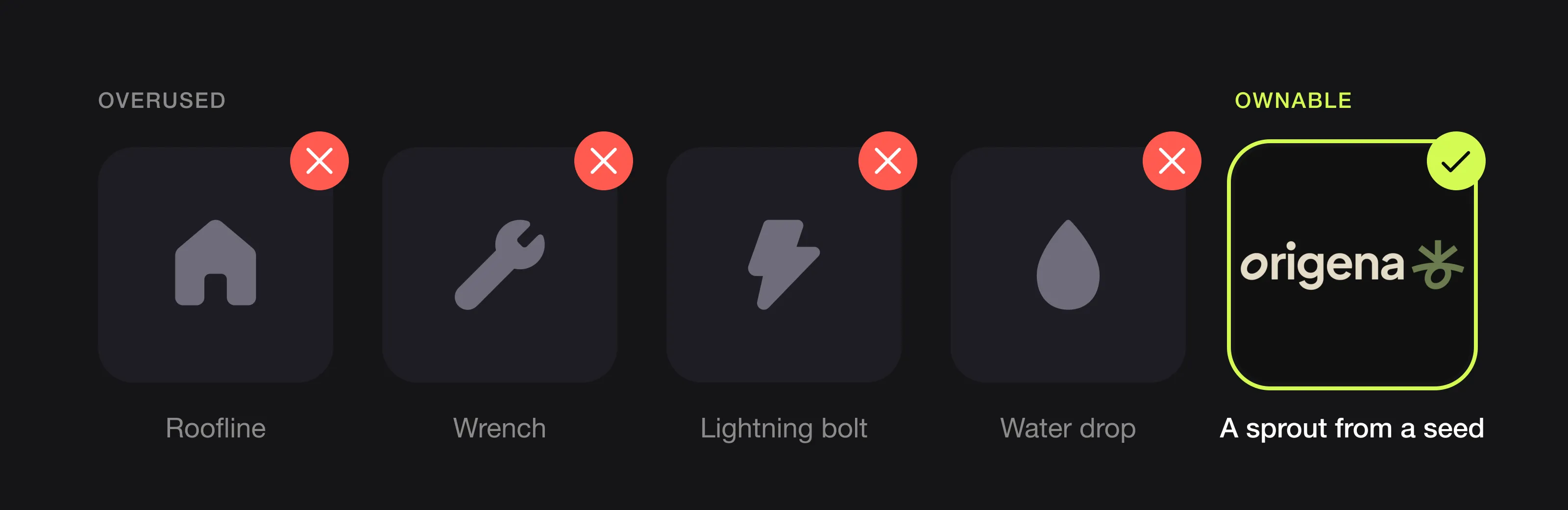 The symbols every trade uses, and one idea drawn simply instead (Origena, designed by Logomint).
- Rooflines and house outlines. Every builder, roofer and estate agent uses one.
- Wrenches, hammers and spanners. They say “trade” but not which one, or why you.
- Lightning bolts and water drops. The default for electricians and plumbers, and easy to confuse with energy and water companies.
- Too much information. A list of every service inside the logo makes it unreadable. Put services on the van, not in the mark.
- Anything that looks like a badge or certificate. It can be mistaken for an accreditation you don’t hold.
If a customer could swap your van with a competitor’s without noticing, your logo isn’t working. More in our logo red flags.
Your name, your trade or a brand name?
Your own name (Davies Plumbing, Martin Électricité) builds trust in a local, owner-led business. It’s harder to sell or grow beyond you.
A descriptive name (City Roofing, Bright Spark) tells people what you do, but it’s hard to own and can box you in.
A brand name gives you room to grow. In 2024, Go-Forth Pest Control renamed itself Go-Forth Home Services after adding HVAC companies, a sign that a trade-specific name can become a limit as you expand.
Whatever you choose, keep it short enough to read on a van at a glance.
What can you learn from recent trade rebrands?
Mr. Appliance (2018). The Neighborly brand unveiled a new logo, new fonts and colours, and an updated tagline, the first time it had revamped its image since its founding in 1996. The lesson: a refresh can show growth without losing a name people already know.
Service Experts (2025). When Service Experts moved four Dallas-area HVAC and plumbing companies it had acquired onto its brand, local press reported that the new branding would go on trucks and billboards, while their contact phone numbers would stay the same. The lesson: change the look, keep what customers already rely on.
Go-Forth Home Services (2024). A pest control company renamed after expanding into HVAC. The lesson: think about where the business is heading before you paint the name on ten vans.
A brand we designed that works outdoors: Origena
Origena is a garden brand, not a trade, but its identity was built for the same conditions: outdoor signage, apparel and staff on the move. The symbol compresses the idea into one shape: a sprout reaching up, a seed curled below and the soil line between them. It works as a standalone mark, as an oversized graphic on T-shirts and tote bags, and as a cropping device on signage. The palette (olive, terracotta, warm bone white and near-black) stays readable on a billboard, and a clean geometric sans holds up from far away.
The identity covers the logo, brand guidelines, posters and a billboard, social media ads, staff ID badges, an app icon and favicon, and merchandise. See the Origena case study.
Trade logo checklist
- A short name you can read on a van from across the street
- One clear idea, with no roofline, wrench, bolt or drop
- A horizontal version, a stacked version and a symbol or initials
- A one-colour version for embroidery, vinyl and engraving
- A square version that survives a circular crop on Google and Facebook
- Space planned for your phone number, website and any required licence or registration number
- One colour that’s yours on the street
- Vector source files for sign makers, van wrappers and embroiderers
FAQ
What makes a good logo for a trade business?
A good trade logo is bold, simple and readable from a distance. It has a short name, strong contrast, a one-colour version for embroidery and vinyl, and a square version for review sites and social profiles. It avoids generic symbols like wrenches, rooflines and lightning bolts.
What should I put on my work van?
Your logo, your phone number and your website, laid out so they can be read in a few seconds. Check local rules too: in California, contractors must show their business name and licence number on commercially registered vehicles, and US vehicles that count as commercial motor vehicles need a name and USDOT number on both sides.
Can I use the Gas Safe logo on my van?
Only if your business is on the Gas Safe Register, and only next to your registered trading name, according to Gas Safe Register’s brand enforcement policy. Using a trust mark you’re not authorised to use is banned under UK consumer protection law.
What colours are best for a trade logo?
Bright, high-contrast colours stand out on vans and signs. Navy, red and yellow are common, so a distinctive colour you can own locally often works better. Always check your logo in one colour for embroidery and vinyl.
How much does a logo for a trade business cost?
From around €130 for a custom logo from a design service to several thousand euros with an agency. Van wraps, signage and workwear cost extra, so a logo that’s simple to reproduce saves money every time you print it. See how much a brand identity costs, or try our logo cost calculator.
Sources
Checked on 28 October 2026.
- BrightLocal, Local Consumer Review Survey 2026
- Contractors State License Board, Industry Bulletin #20-21: Include license number on vehicles and advertisements (September 2020)
- California Business and Professions Code section 7029.5 and section 7029.6
- Legal Information Institute, 49 CFR 390.21: Marking of self-propelled CMVs
- Gas Safe Register, Brand Enforcement Policy (version 10, February 2026)
- Business Companion, Membership logos and claims of approval
- Google Ads Help, Business logo requirements; Facebook Help, Profile picture sizes
- Custom Ink, Embroidery design tips
- Franchising.com, Mr. Appliance unveils new logo and refreshed brand (May 2018)
- Community Impact, Four HVAC and plumbing companies rebranding under Service Experts (June 2025)
- Pest Management Professional, Go-Forth Pest Control rebrands to Go-Forth Home Services (June 2024)
The bottom line
Trade customers choose quickly, often from a van they saw or a name next to a star rating. Make yours short, bold and readable from across the street, design versions for vans, workwear and tiny circles, leave room for the licence numbers the law asks for, and skip the wrench and roofline. A small firm with one clear identity on every van and shirt looks bigger than it is.
At Logomint, a senior designer creates your custom logo from €129, with first concepts in 48 hours, all source files and a 100% money-back guarantee. See the plans.