Short answer An education logo has to convince several people at once: the learner who wants to feel capable, the parent or employer who is paying, and sometimes a school or company that needs to approve you. Design it to look credible and friendly at the same time, and test it where it really lives: course thumbnails, video corners, certificates, slides and app icons. Skip the graduation caps, books and owls, and give people one clear idea they can remember.
What should an education logo make people feel?
Buying education is buying a promise. A parent booking a tutor or a company paying for a training platform can’t test the result first, so the logo is one of the signals they use to judge whether you are serious.
Most education brands need people to feel three things:
- I can trust this. Careful, consistent drawing suggests a provider that will still be here next term.
- I can do this. Learning is stressful for many people. A friendly, open logo lowers the barrier; a cold or crowded one raises it.
- This will get me somewhere. Learners pay for progress: a skill, a job, a grade. A logo that hints at movement or growth supports that better than one that only says “school”.
The balance shifts with the audience: a maths app for children can be playful; a leadership coach selling to HR directors needs restraint.
Should an education brand look approachable or institutional?
This is the main decision in education logo design.
Institutional brands (universities, private schools, accredited training bodies) borrow authority from heritage: crests, serif type, deep colours. This works when the heritage is real.
Approachable brands (edtech apps, online course platforms, tutoring services, most coaches) want to feel open: rounded shapes, bright colours, friendly sans serifs, sometimes a mascot.
The mistake is borrowing the wrong one. A new online tutoring service with a fake crest looks like it is pretending. A corporate training firm with a cartoon mascot may struggle to get past procurement. Decide who signs off the purchase, then design for that person as well as the learner.
Where will an education or coaching logo be seen?
Education brands live on screens and on paper at once. Your logo has to work in all of these places:
| Touchpoint | What it demands | What you need |
|---|---|---|
| Course thumbnails | A small image in a grid of competing courses | A symbol or short wordmark that stays clear when the thumbnail shrinks |
| Video watermarks | A small mark in the corner of every lesson | A square symbol, ideally one-colour, with no small text |
| Certificates | Printed or downloaded as a PDF, kept for years and shown to employers | A formal lock-up that prints well in one colour |
| Slide decks and workbooks | The logo in the corner of every slide or page | Light and dark versions that sit quietly beside the content |
| App icons | A rounded square on a phone, next to every other app | A simple symbol that fills the shape without text |
| Social avatars and community spaces | Cropped into a circle in Discord, Slack, LinkedIn or a learning platform | A square symbol that survives the crop |
On YouTube, for example, the channel watermark has to be a square image of at least 150 by 150 pixels, and you can show it for the last 15 seconds or for the whole video. A wide wordmark will be unreadable there, so plan a compact symbol from the start.
For learning apps, Apple’s guidance says simple icons tend to be easiest to recognise and text in icons is often too small to read. Our guide to logo design for tech startups covers favicons, app icons and dark mode in depth, and the logo sizes guide lists the dimensions for each platform.
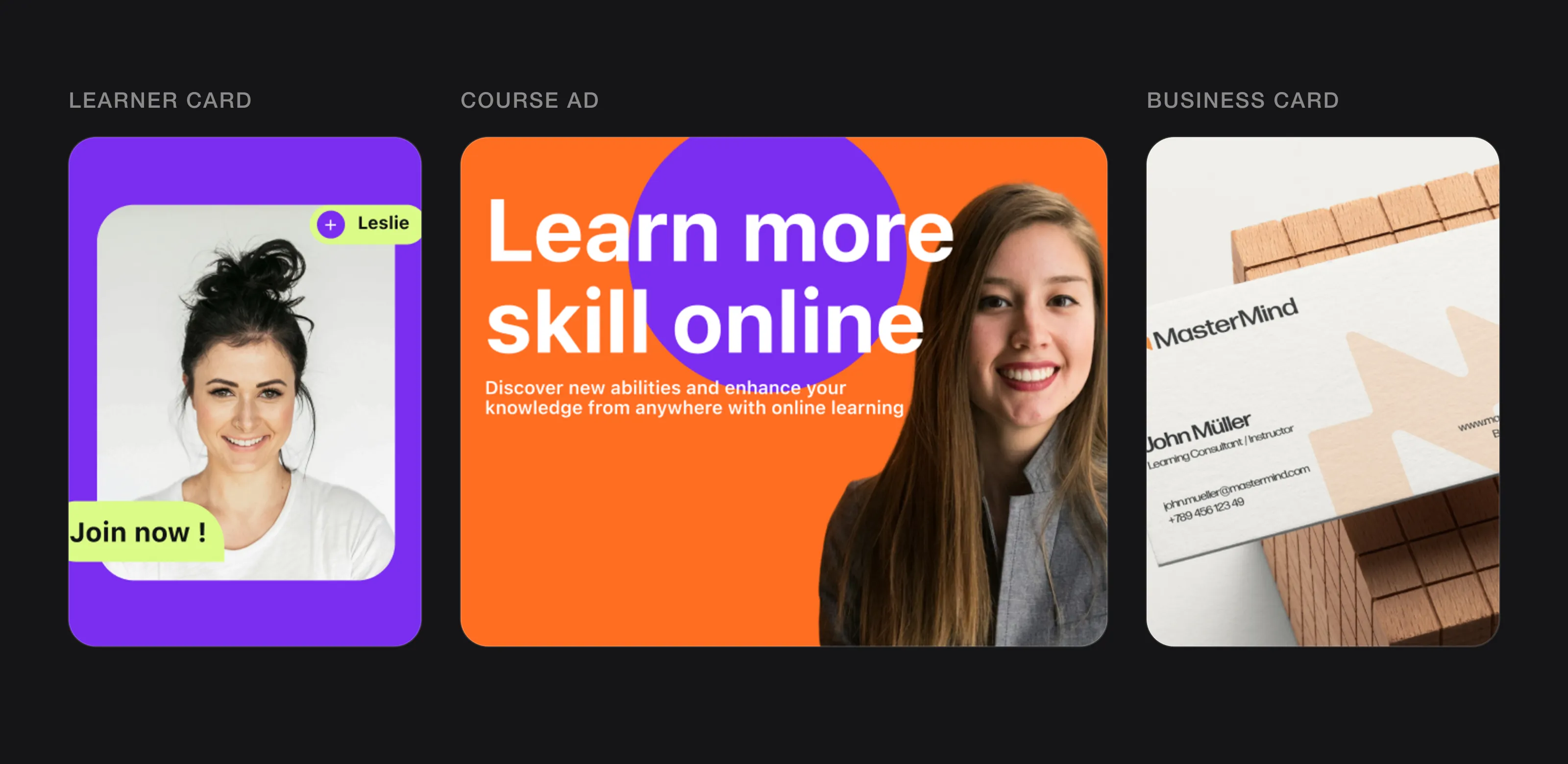 Education logos live on learner cards, course ads and stationery (Brightroots and MasterMind, designed by Logomint).
Should a coach use their own name or a company brand?
- Use your own name if people buy you: your experience, your voice, your face on video. A well-drawn wordmark of your name or a monogram keeps the focus on you.
- Use a company name if you plan to hire other coaches, sell courses that run without you, or one day sell the business. A brand built around one person is hard to hand over.
If you expect to switch later, keep colours, type and photo style consistent now, so the change feels like a step forward rather than a fresh start. Our guide to consulting logo design covers founder-name brands in more detail.
Should an education logo have a symbol?
Usually yes, because so many touchpoints are small and square: the video corner, the app icon, the avatar. The common set-up is a symbol plus wordmark: the symbol does the small jobs, the wordmark teaches people the name on the website, certificates and slides. A wordmark alone works when the name is short and one letter can stand in as the icon. If you are unsure which structure fits, our overview of the types of logos compares them side by side.
What colours work best for an education logo?
No colour guarantees trust. What matters is context: what competitors use, what your audience expects and where the logo appears.
- Look at your category. Universities lean on deep blues, burgundies and greens. Many learning apps use bright, saturated colours. Standing apart from your neighbours is the quickest way to be noticed.
- Match the age of the learner. Bright, high-contrast colours suit children’s products; adult professional training usually needs a calmer palette, even if one accent colour is bold.
- Check it on video and slides. Your colour will sit on footage, photos and charts, light and dark.
- Make sure the logo works in one colour. Certificates, embossing, stamps and photocopied worksheets often allow only one ink.
Our guide to choosing logo colours walks through the process step by step.
Which fonts suit an education or coaching brand?
Serif type reads as traditional and academic; rounded or humanist sans serifs feel friendly; geometric sans serifs feel modern and tidy.
- Choose readability first. Your learners include children, non-native speakers and people reading on small phones. Avoid very thin weights, tight spacing and decorative scripts.
- Think about young readers. In children’s products, some brands prefer a single-storey “a” and “g”, which are closer to how many children learn to write them.
- Plan how the logo sits next to course content. Your logo and your body font don’t need to match, but they shouldn’t fight on a slide.
What should an education logo avoid?
Education has some of the most worn-out symbols in branding. Each one says “learning” in general, which means it says nothing about you:
- Graduation caps and diplomas, especially on brands that don’t award degrees.
- Open books, the default icon of every library, school and course template.
- Apples, which are also tied closely to one technology company.
- Lightbulbs for “ideas”, shared with thousands of innovation and consulting brands.
- Owls for “wisdom”, now hard to use without being compared to Duolingo.
- Pencils and rulers, which feel like a primary school even when the audience is adult.
- Brains, which suggest psychology or neuroscience more than teaching.
A familiar idea can still work if it is drawn in a specific, unexpected way. The test is whether your logo would still be yours if a competitor put theirs next to it in a course marketplace.
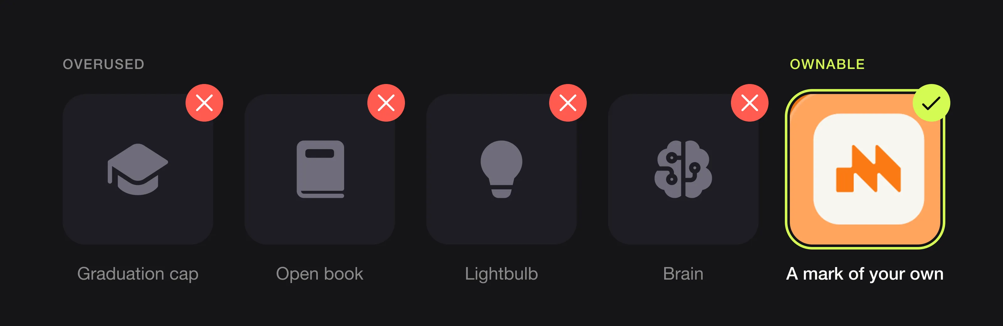 The symbols most schools and course brands reach for, and a mark of your own instead (MasterMind, designed by Logomint).
What can you learn from Duolingo, Khan Academy, Udemy and Harvard?
Duolingo: keep what works, fix what doesn’t
When Johnson Banks worked on Duolingo’s identity in 2019, its case study says the brand’s visual elements had been built for an on-screen environment and lacked guidelines for use away from the app. The owl, core colour and illustration style were broadly working, so they stayed. Instead of pairing the owl with neutral type, the team redrew the logotype from Duo’s feathery form and, with Fontsmith, extended it into a typeface, Feather Bold. The lesson: a mascot can be a real asset, and the wordmark should feel like it belongs to the same character.
Khan Academy: a shape built for many devices
Khan Academy introduced its current logo in July 2018. Its announcement says the hexagon is a fundamental building block in math, nature, and art, and that the leaf from the previous logo was kept as a metaphor for personal growth. The reason was practical: Khan Academy had grown from one desktop website into multiple apps, and needed a logo for devices, dashboards and app stores. The lesson: a contained geometric shape travels well across apps and screens.
Udemy: one simple idea, one confident colour
In its 2021 rebrand, Udemy described its logo as an arrow, “a universal symbol for growth”, which it calls the Uptick. The arrow is a purple chevron above the lowercase wordmark, and Udemy describes its brand colour as a vivid, optimistic purple. An arrow is not a rare idea, but it speaks to progress and avoids every classroom cliché. The lesson: a simple mark tied to the learner’s outcome beats a symbol of the classroom.
Harvard: heritage you can’t borrow
Harvard’s shield shows the motto VERITAS on three books. According to the university, it is based on a rough sketch found in records from 1643, and a seal based on it was adopted in 1843. That history gives the shield its authority. A new academy that copies the crest-and-books formula gets the look without the centuries behind it, and a detailed crest is hard to read in a video corner. The lesson: institutional styling is earned, not chosen.
Logos we designed for education and training brands
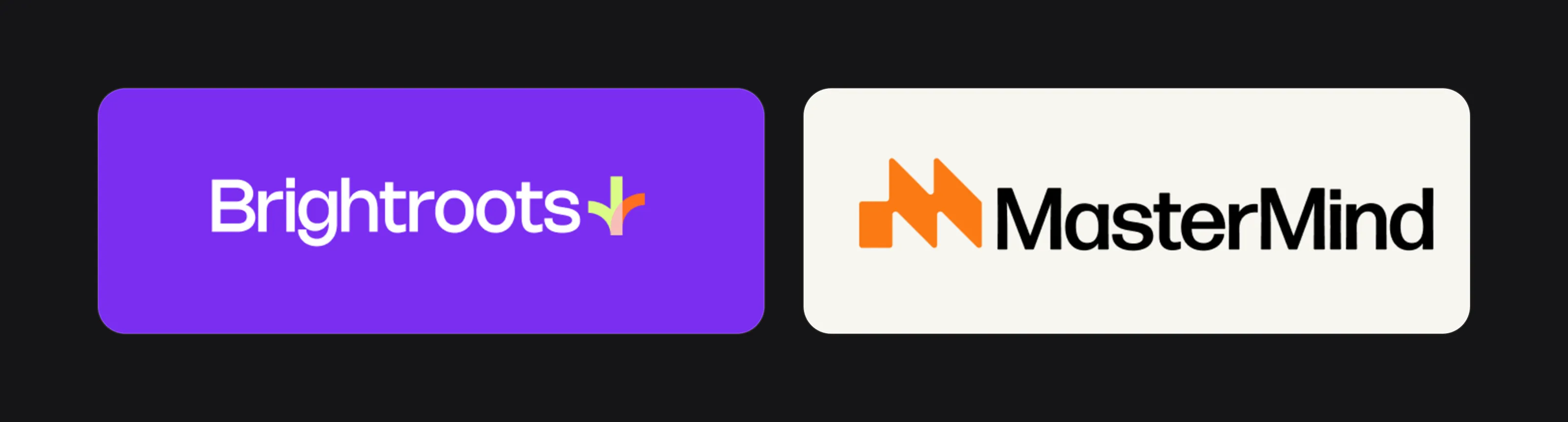 Brightroots and MasterMind.
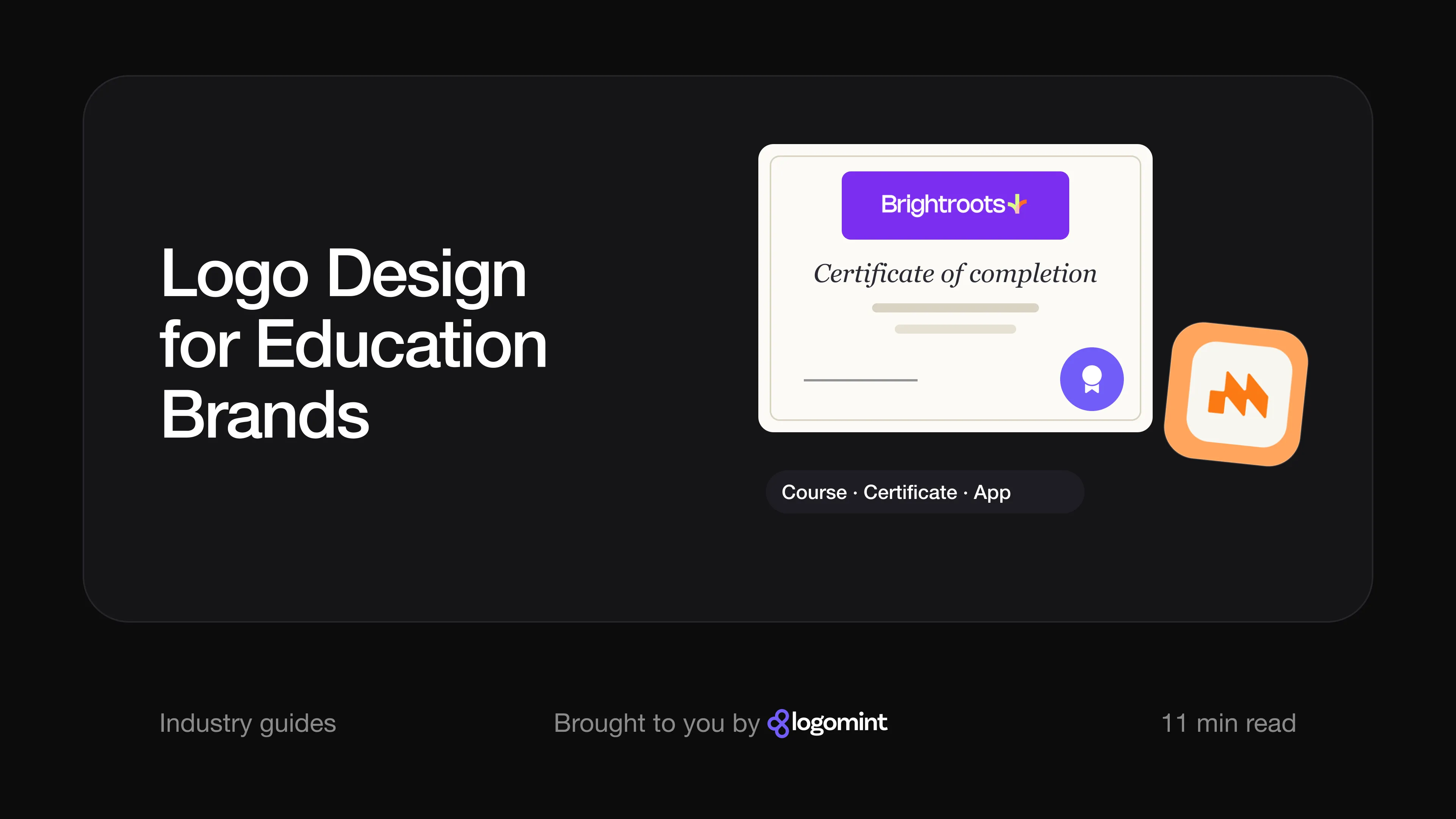
Brightroots. The board for Brightroots shows an online learning brand: a banner reads “Learn more skill online”, and a learner card carries a name tag and a “Join now” button. The wordmark is a clean, rounded sans serif in white, followed by a small symbol: a lime stem with two curved strokes growing from its base, lime to the left and orange to the right, overlapping in pale pink. It reads as a sprouting shoot, linked to the “roots” in the name, and avoids caps, books and pencils entirely. The palette (violet, orange, lime and soft pink) is bright without feeling childish. The orange carries over to round video and player buttons (camera off, pause, send, share), so the brand works inside the learning interface, not just on the homepage.
MasterMind. MasterMind’s symbol is an orange “M” made from a square block and two slanted strokes that step upwards, so the letter also reads as climbing steps, a quiet nod to progress. The wordmark is a bold black sans serif with two capital Ms. On a business card for a “Learning Consultant / Instructor”, the logo sits at the top and the symbol repeats as a large pale watermark. The board also shows it as an app icon, orange on a white rounded square, and on a promotional tile that pairs an instructor’s photo with the brand name. That is how a company brand and a personal face can work together: the logo stays fixed while the person in the photo can change.
TalentIQ. TalentIQ is not an education brand; its board (“Hire smarter, not harder”, an “HR Solution specialist” business card) places it in hiring. We include it because careers and corporate training brands sell to the same employers. It is a wordmark only: lowercase “talent” with custom-drawn “t” and “a”, shown on a construction grid, then a capital IQ. Colour lives around the wordmark, in navy, light blue and orange panels. For a brand that has to look credible to HR teams, that restraint is the point.
The education logo checklist
- Looks credible to the person paying, not just friendly to the learner
- A square symbol that reads in a video corner, an app icon and a circular avatar
- A formal lock-up for certificates that prints well in one colour
- Light and dark versions for slides, workbooks and video overlays
- No graduation caps, books, apples, lightbulbs, owls, pencils or brains used as the main idea
- Readable type for younger learners, non-native speakers and small screens
- A clear decision on personal name or company brand, with room to grow
- Vector source files for print, embroidery and every platform
FAQ
Should an online course logo include a graduation cap or book?
Usually not. These symbols are used by so many schools, templates and course creators that they make your brand harder to remember. A mark tied to your name or to the learner’s progress will stand out more.
What makes an edtech logo different from other app logos?
It has to reassure parents, teachers or employers as well as appeal to the learner. It also needs to work on certificates and printed materials, not just as an app icon.
Should a coaching logo use my name?
If clients buy your personal expertise and you plan to stay the face of the business, yes. If you plan to hire other coaches or sell courses without you, a company name will be easier to grow and sell.
What colours are best for a children’s education brand?
Bright, high-contrast colours are common and easy for children to recognise, but check what competitors use first. Make sure the logo still works in one colour for worksheets, stamps and printed certificates.
Sources
Checked on 15 October 2026.
- Johnson Banks, Everyone can Duolingo
- Khan Academy Blog, Have you seen our new look?
- Udemy, Welcome to our brand-new brand
- Harvard University, Harvard shields
- YouTube Help, Manage your channel branding
- Apple Developer, Human Interface Guidelines: App icons
The bottom line
An education logo has to earn trust from people who can’t try the product first, while still feeling open enough that learners want to start. Choose between approachable and institutional honestly, design the small square versions first, and leave the classroom clichés to everyone else.
At Logomint, a senior designer creates your custom logo from €129, with first concepts in 48 hours, all source files and a 100% money-back guarantee. See the plans.