Short answer A good beauty brand logo is simple enough to print on a 15 ml bottle, distinctive enough to be recognised on a crowded shelf or in a fast-scrolling feed, and calm enough to feel trustworthy on skin. Most new skincare brands default to a thin serif wordmark with a leaf or a drop, which is exactly why they look alike. Start from your packaging, pick one idea and draw it well.
What should a beauty brand logo make customers feel?
People put beauty products on their face, hair and lips. Before anything else, the logo has to feel safe and well made. A logo that looks rushed, crowded or cheap raises a quiet question about what’s inside the bottle.
After trust, the feeling depends on your positioning:
- Clinical skincare should feel precise and honest: plain type, lots of space, nothing decorative.
- Natural or botanical brands should feel calm and grounded without looking like a garden centre.
- Colour cosmetics can be bolder, warmer and more playful, because the product itself is about expression.
- Premium brands should feel considered: fewer elements, better proportions, quality materials.
Decide which one you are before you brief a designer. “Elegant and minimal” describes half the market.
Where does a skincare logo actually have to work?
In beauty, packaging is the main touchpoint: your customer holds the product every day, often for months. That changes the brief in four ways.
Small surfaces. Dropper bottles, lip balms, sample sachets and tube caps leave very little room. A logo that only works at the width of a website header will be squeezed into illegibility on a 10 ml vial. Test it at 15 mm wide.
Curved surfaces. On a round bottle or a tube, a wide horizontal logo wraps around the curve and the ends disappear from view. A compact logo, a stacked version, or a wordmark set vertically along the bottle (as on a tall serum) solves this.
Print finishes. Foil, embossing, debossing and screen printing on glass all lose fine detail. Hairline strokes in a delicate serif can break up or fill in, so ask your printer for their minimum line weight and check that your logo has a version that respects it.
Shelf versus Instagram. On a shelf, people see your product from a metre away, next to twenty competitors. On Instagram, they see it on a phone, often as a small round profile picture. Reading well in both usually means a wordmark for packaging and a short mark (an initial, a monogram or a symbol) for avatars and small spaces.
Selling online too? See our guide to e-commerce logo design.
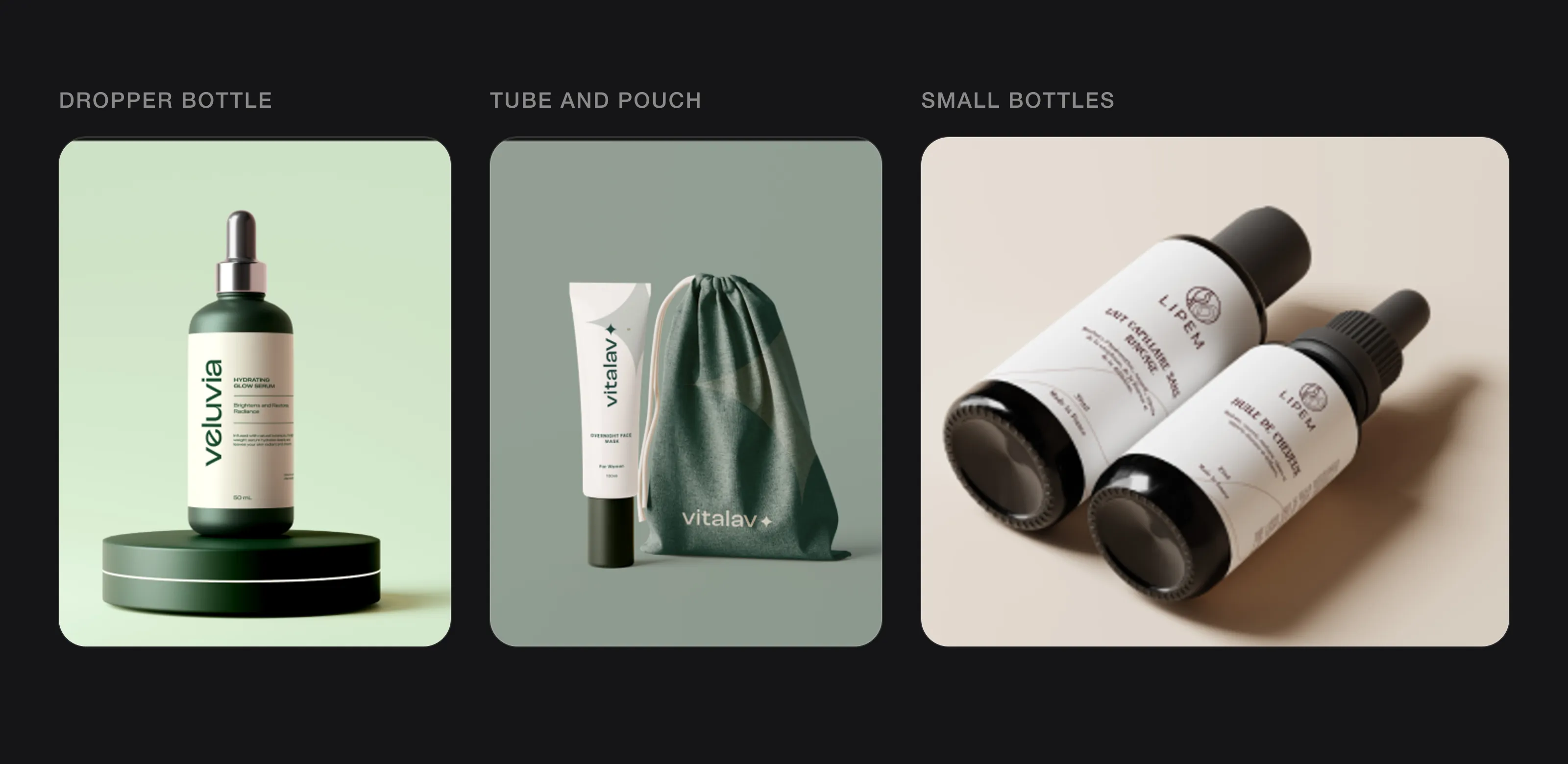 Where a beauty logo really lives: a dropper bottle, a tube and pouch, small bottles (Veluvia, Vitalav and Lipem, designed by Logomint).
What colours work best for a beauty brand logo?
There’s no colour that makes people buy skincare. What colour does is place you in a category, because shoppers have learned the codes of the shelf:
- White, cream and black read as clinical or minimal, and leave room for the product colour to show.
- Greens and earthy browns read as botanical or natural, which is useful and also very crowded.
- Soft pinks and nudes are the default for many cosmetics and skincare brands aimed at women, so they help with fit but not with standing out.
- Saturated colours such as cobalt, orange or deep red are rarer in skincare and get noticed, but need a reason behind them.
A practical approach: choose a colour that signals your category, then make it your own through a specific shade or an unexpected second colour. A crowded colour is hard to own, as Glossier found (more on that below). Also make sure your logo works in one colour, because foil and embossing will force you to use one. More on choosing a palette in how to choose logo colours.
Which fonts suit a skincare or cosmetics brand?
The two big families both work. They just say different things.
Serifs suggest heritage, femininity and luxury, and they’re the default for brands that want to look like they belong next to the department-store names. The risk is sameness: a high-contrast thin serif in spaced capitals is the most common beauty logo there is. Those thin strokes also suffer at small sizes and in foil.
Clean sans-serifs suggest clarity, science and modern simplicity. They hold up better on tiny labels and as embossing. The risk here is blandness, because a default geometric sans with no adjustments looks like a placeholder.
Either way, the font is a starting point, not the logo. Custom details (a redrawn letter, adjusted spacing, a ligature) make it memorable, and one changed letter can be enough, as one of our logos below shows.
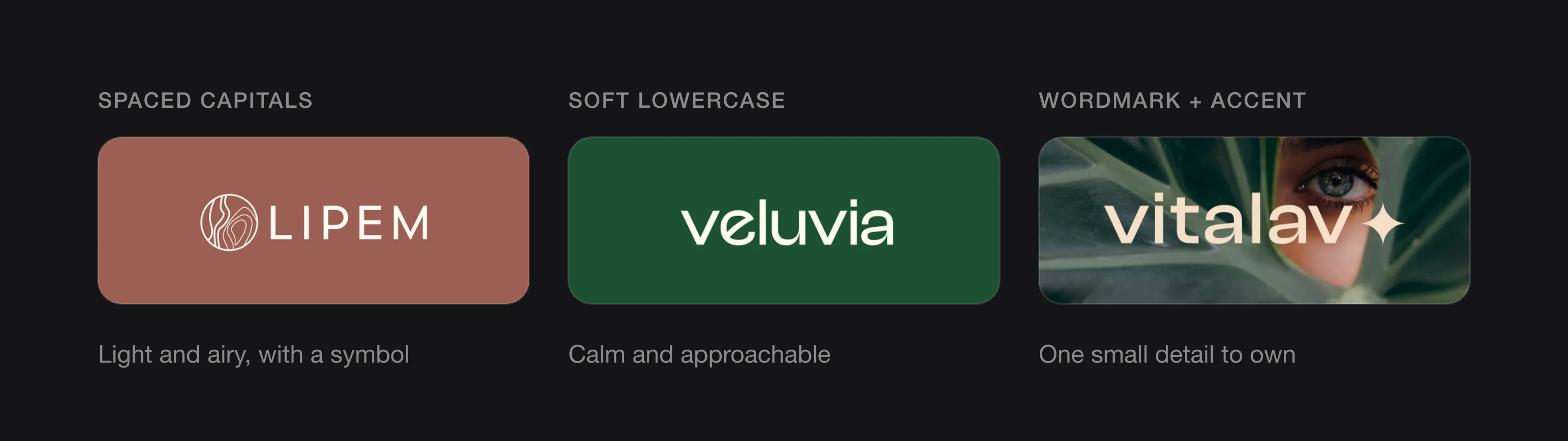 Three ways to set a beauty wordmark: spaced capitals, soft lowercase, or a wordmark with one small accent.
Should a beauty logo be minimal or ornate?
Minimal suits most new beauty brands: packaging is small, finishes lose detail, and a simple logo is cheaper to print across a growing range. Minimal doesn’t mean empty, though. It means one clear idea with nothing extra around it.
Ornate logos (crests, filigree, flourishes) can work for fragrance or gift-led brands sold in large boxes. If you go this way, have a simplified version for small products and digital use.
Should a beauty logo have a symbol?
Not necessarily. Many of the best-known beauty brands are wordmarks, because the name is printed large on every product anyway.
A symbol earns its place when:
- your name is long and you need a compact mark for caps, sachets and avatars;
- you want a pattern or graphic element to use across packaging;
- the symbol says something specific about your product, not just “beauty” in general.
A good middle ground is a wordmark with a short-form version: an initial, a monogram or a small mark taken from the logo. The Ordinary does this on its own website, where a simple “O.” stands in for the full name in a small black square.
What should a beauty logo avoid?
- The generic leaf. Almost every natural brand uses one, so it tells customers nothing about you.
- The water drop. The same problem for hydrating and serum brands.
- Lotus flowers, face silhouettes and hand-drawn botanicals that turn to mush at 15 mm.
- Thin serif plus gold on cream as an automatic choice. It can be right, but it’s the most crowded corner of the shelf.
- Script fonts that become unreadable when small or curved.
- Trend effects like gradients and glows that don’t survive one-colour printing.
If you’re worried yours already has some of these problems, our checklist on why a logo looks cheap is a useful read.
How can a small beauty brand look premium without a luxury budget?
Premium is mostly restraint and consistency, not money:
- Use one logo, one or two colours and one or two fonts, the same way on every product.
- Give the logo space. Crowded labels look cheap; empty space looks confident.
- Spend on one finish, not five. A single foil or deboss on the outer box does more than metallic ink everywhere.
- Design a system, not just a logo. Label layouts, a pattern or a graphic element taken from the logo make a range look planned.
- Get proper files. Vector files, CMYK and Pantone references keep colours consistent between suppliers. Here’s which logo file formats you need.
What can you learn from Glossier, The Ordinary, Aesop and Rare Beauty?
Glossier. The wordmark is a bold, slightly slanted sans-serif ending with a full stop: confident and simple, closer to a magazine than a cosmetics counter. Much of its recognition came from the packaging around the logo, notably pink-lined boxes and pouches. When Glossier applied to register them as US trademarks in 2019, the examiner replied that pink is common in beauty packaging and would be seen as decorative, not as a sign of origin. Lesson: a simple wordmark plus a consistent packaging system builds recognition, but a common colour on its own is hard to claim.
The Ordinary. The logo stacks a small “The” above “Ordinary.” in a plain sans-serif, again with a full stop. The packaging is just as plain: every item uses the same design, and products are named after their active ingredient and strength rather than the result they promise. Lesson: in a category full of decoration, plainness can be the distinctive choice, as long as it’s applied with total consistency.
Aesop. Founded in Melbourne in 1987, Aesop is known for what John Lewis describes as amber-coloured bottles and monochrome labels with a clean, graphic typeface, naming Helvetica and Optima Medium. The logo is never the loudest thing on the bottle; recognition comes from the whole object, repeated across the range. Lesson: you don’t need a big symbol if the system is consistent.
Rare Beauty. The wordmark is a simple title-case sans-serif. The brand’s investment has gone into the pack itself: through its Made Accessible initiative with the Casa Colina Research Institute, it studied how people with limited hand and arm mobility use its products, and reports findings such as matte finishes that prevent slipping and caps designed to open with less resistance. Lesson: in beauty, the object people hold is the main brand experience, and the logo has to sit comfortably on it.
Logos we designed for beauty and personal care brands
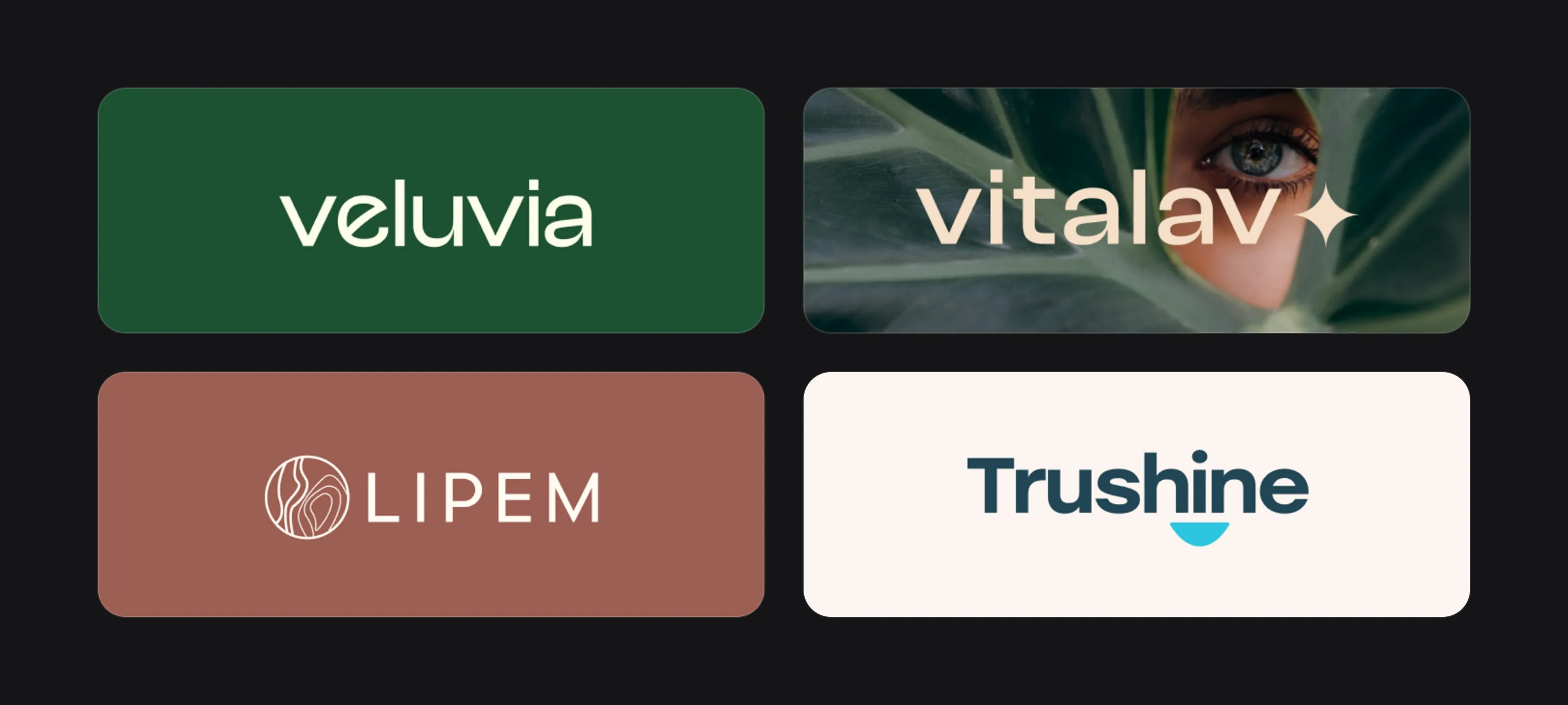 Veluvia, Vitalav, Lipem and Trushine.
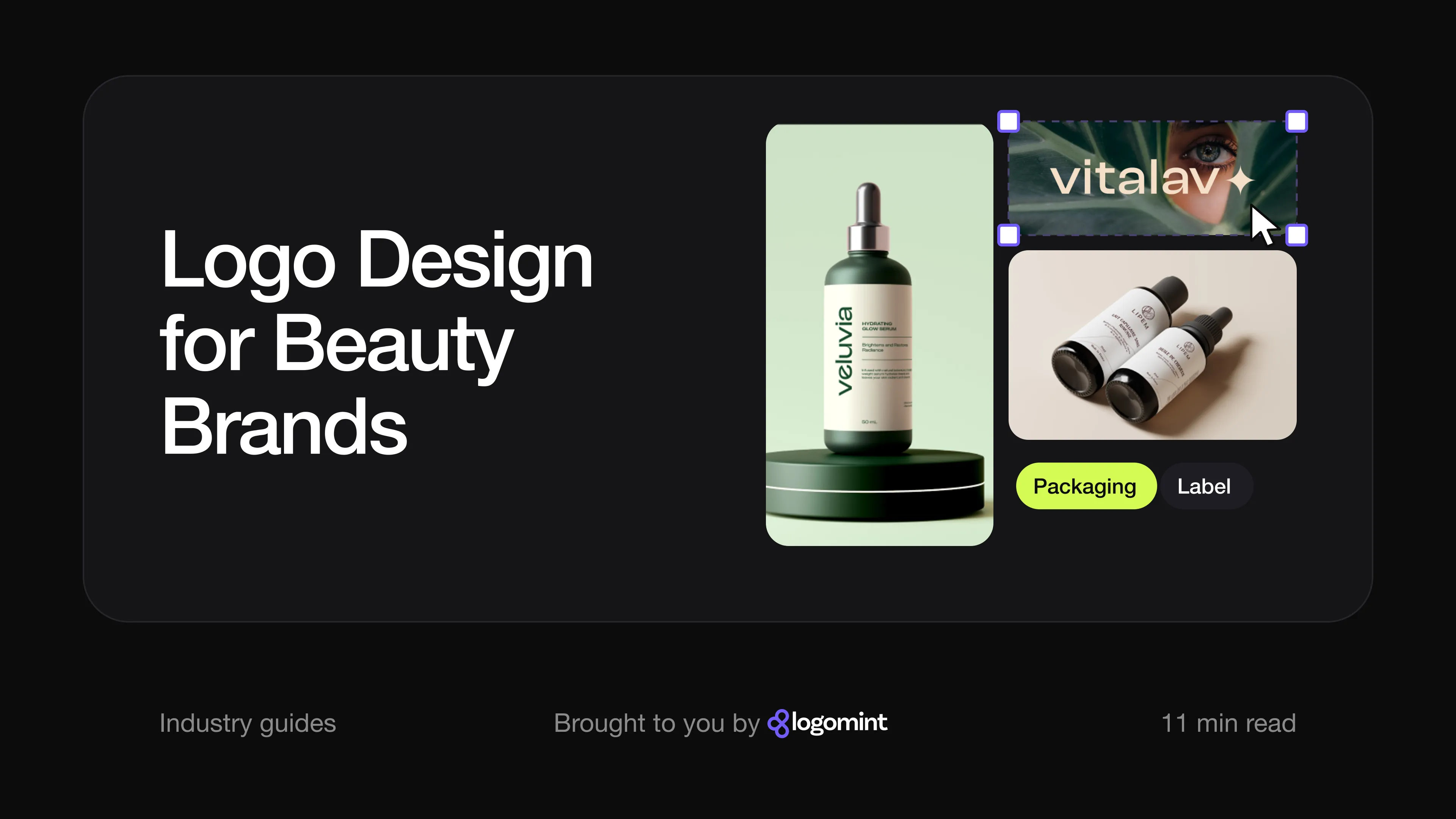
Veluvia. A lowercase sans-serif wordmark in cream on deep green. The detail that makes it is the “e”: its bar sweeps diagonally upward, so the counter of the letter takes the shape of a leaf. The “a” picks up the same angled curve. It’s a botanical reference built into the letters rather than a leaf icon added next to the name. On the hydrating serum bottle the wordmark runs vertically up the label, which suits a tall, round dropper bottle, and on the business card an oversized, cropped “e” is used as a tonal background pattern.
Vitalav. A lowercase sans-serif wordmark followed by a four-pointed star. The sparkle on its own is a familiar beauty shape; what makes it work here is how it’s used. On the overnight face mask tube, the folding box and the capsule jar, the star is blown up into a large, pale graphic that wraps around the packaging, while the wordmark runs vertically on the tube. The palette of bottle green, sage and warm off-white carries across a cotton drawstring bag as well, so the range looks like one family.
Lipem. For a hair-care brand with French product copy (the board shows a hair oil, “huile de cheveux”), the logo pairs a circular mark with spaced, uppercase sans-serif lettering. Inside the circle, flowing lines suggest strands of hair or the contours of a landscape. The colours are terracotta, cream and a dark plum-brown. On the dropper bottles the mark stacks above the name on a white label, with a single thin line running across the label to echo the symbol. Because the mark is made of fine lines, it relies on that generous label space.
Trushine. Not every beauty or personal care brand needs the hushed look. This toothpaste brand uses a heavy, rounded sans-serif in dark navy with a cyan half-circle beneath the letters, like a smile. The same half-circle becomes a graphic shape across photos and ads, and the bright pink and cyan palette sits far away from the cream-and-serif corner of the shelf. It shows the other route: bold, friendly and easy to spot from a distance.
The beauty logo checklist
- Reads clearly at 15 mm wide on a small bottle or cap
- Works on a curved surface, with a stacked or vertical version if needed
- Has a one-colour version that survives foil, embossing and screen printing
- Has a short-form mark for Instagram avatars, sachets and favicons
- Avoids the generic leaf, drop and default thin serif unless they’re reworked into something specific
- Uses colour to signal the category, with a shade or pairing that’s yours
- Comes with vector files and CMYK and Pantone references for packaging suppliers
- Has a simple system around it: label layout, a pattern or graphic element, consistent spacing
Selling health or wellness products rather than cosmetics? Our healthcare logo guide covers trust, legibility and the claims a logo must not make.
FAQ
Should a skincare logo use a serif or a sans-serif font?
Both work. Serifs suggest heritage and luxury but are very common and lose detail when small or foiled; sans-serifs feel modern and clinical and hold up better on tiny labels.
Does a beauty brand need a logo symbol?
Not always. A strong wordmark is enough for many brands, but a short-form mark or monogram is useful for caps, sachets and social media avatars.
What colour should a beauty brand logo be?
Pick a colour that places you in your category, such as green for botanical or white and black for clinical, then make it yours with a specific shade or second colour. Make sure the logo also works in a single colour.
How do I make my beauty brand look premium on a small budget?
Keep the logo simple, use it consistently, give it space on the label and spend on one quality finish rather than many. Restraint looks more premium than decoration.
Sources
Checked on 15 October 2026.
- The Fashion Law, Glossier filed 2 trademark applications this spring that say a lot about modern branding (2019)
- Raconteur, Brands with creative packaging design (The Ordinary, 2018)
- John Lewis, How has Aesop cemented its place in beauty folklore?
- Rare Beauty, Made Accessible
- The Ordinary, official website (logo and short-form mark)
The bottom line
A beauty brand logo lives on the product more than anywhere else. Design it for a small, curved bottle and a phone screen first, avoid the leaf-and-thin-serif default, and build a simple system around it so every product looks like it belongs to the same family.
At Logomint, a senior designer creates your custom logo from €129, with first concepts in 48 hours and a 100% money-back guarantee. See the plans.