Short answer A tech startup logo lives mostly inside software: a browser tab, an app icon, a sign-in screen, a dark-mode sidebar. Design it to work at 16 pixels and on dark backgrounds first, keep the symbol to a few bold shapes, and pick a colour and idea your competitors don’t already own. In a market full of blue-purple gradients and abstract nodes, being clear and distinctive matters more than looking “techy”.
What should a tech startup logo make people feel?
People trying a new SaaS or AI product are handing over their data or their workflow. Before they read a feature list, the logo helps them decide whether the product looks real. They want to feel three things:
- This is competent. Clean drawing, consistent details, nothing that looks improvised.
- This is easy. A simple mark suggests a simple product. A busy logo suggests a busy interface.
- This is different. If your logo could swap places with three competitors’ logos, your brand has to work much harder everywhere else.
Where will a tech startup logo actually be seen?
For most software companies, the product itself is the main touchpoint. Your logo is seen far more often in a browser tab than on a business card.
| Touchpoint | What it demands | What you need |
|---|---|---|
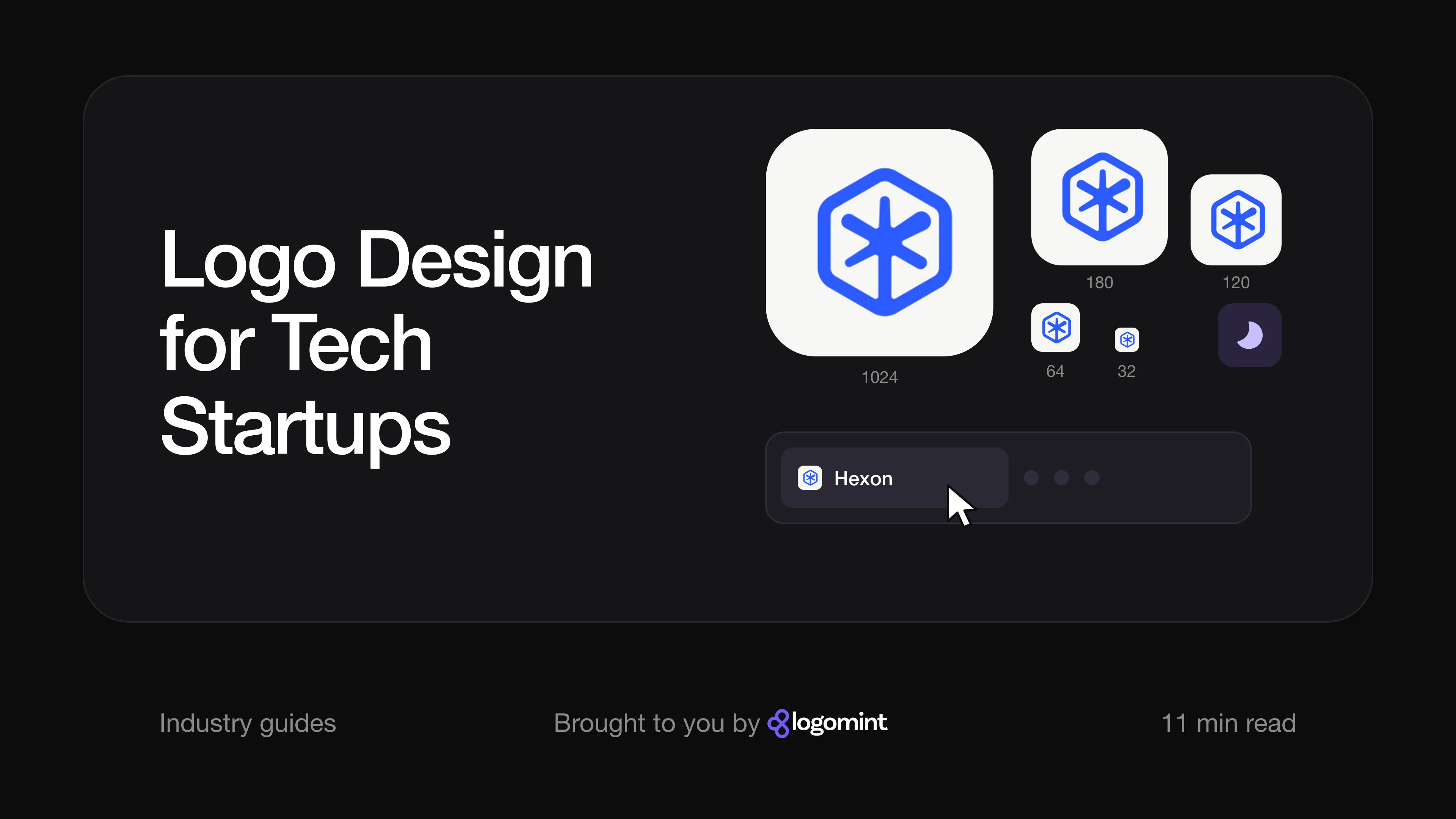
| Favicon | Shown at 16 to 32 pixels next to other tabs | A simple symbol or monogram, no text |
| App icon | Rounded square on a phone or desktop, beside the system apps | A symbol that fills the shape without fine detail |
| Product UI | Small logo in the sidebar or top bar, often in dark mode | Light and dark versions with enough contrast |
| Website and sign-in pages | The first impression for most trials and demos | A horizontal lock-up that works in a narrow header |
| Social avatars | Cropped into a circle | A square symbol that survives the crop |
| Integration marketplaces and partner pages | Your icon in a grid of other tools’ icons | A mark that stays recognisable at thumbnail size |
Google’s rules for search results say a favicon must be square and at least 8 by 8 pixels. Whatever size you supply, it will be shown tiny.
How do you make a logo work as a favicon, app icon and in dark mode?
Design the smallest version first. If the symbol reads at 16 pixels in a browser tab, it will work almost everywhere else.
Apple’s app icon guidelines put it plainly: simple icons tend to be easiest to recognise, fine details are hard to see at small sizes, and very thin lines lose crispness. Apple also advises against text in icons unless it is essential, because it is often too small to read.
Dark mode adds a second test. On iOS, iPadOS and macOS, people can now choose default, dark, clear or tinted app icons, and Apple asks developers to keep the icon’s core features the same across all of them. In practice, that means:
- Prepare a reversed version and check it on dark grey, not just black. Many dark interfaces use charcoal, where a navy or dark purple logo disappears.
- Avoid relying on a gradient. If the symbol only works with its gradient, it will fail in a one-colour tinted icon, a monochrome partner page or an embossed T-shirt.
- Test the favicon in a dark browser theme. A black favicon vanishes in a dark tab bar.
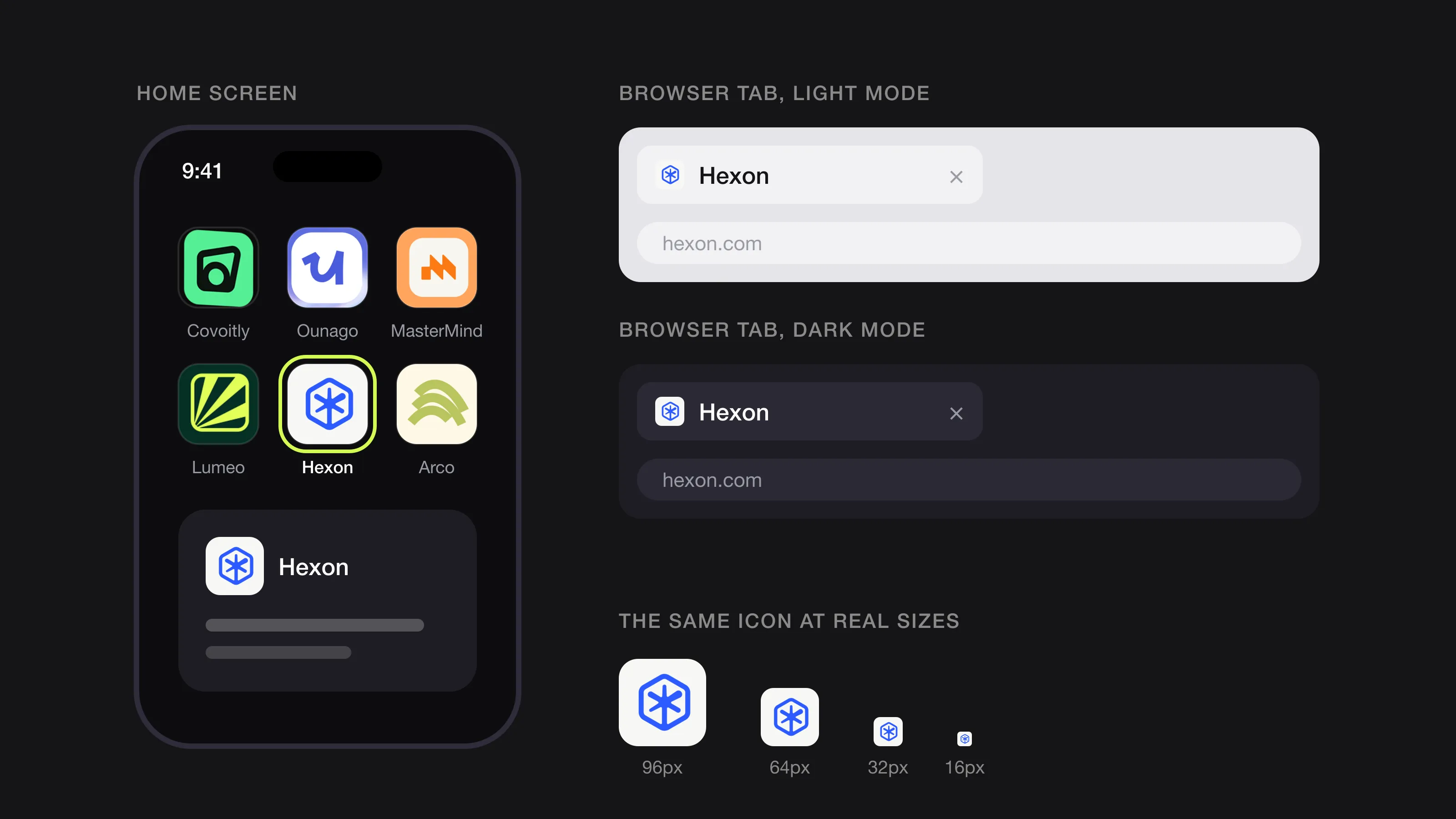 One icon, every context: home screen, browser tabs in light and dark mode, and real sizes down to 16 px (Hexon, designed by Logomint).
Should a software logo be a wordmark or a symbol?
Most tech startups end up needing both: a wordmark for the website, decks and documents, and a symbol for everything small and square.
- A wordmark alone works when the name is short and distinctive. But software almost always needs a favicon, so a pure wordmark usually ends up with its first letter cut out as the icon.
- A symbol plus wordmark is the most practical set-up for SaaS and apps. The symbol works at small sizes; the wordmark teaches people the name.
- A monogram (a designed initial) is a good middle ground, but many startups share initials, so the drawing has to be distinctive.
If the name is long or uses camel case (TalentIQ, MasterMind), test how it reads in a narrow header and decide early whether the icon will come from a letter or a separate symbol.
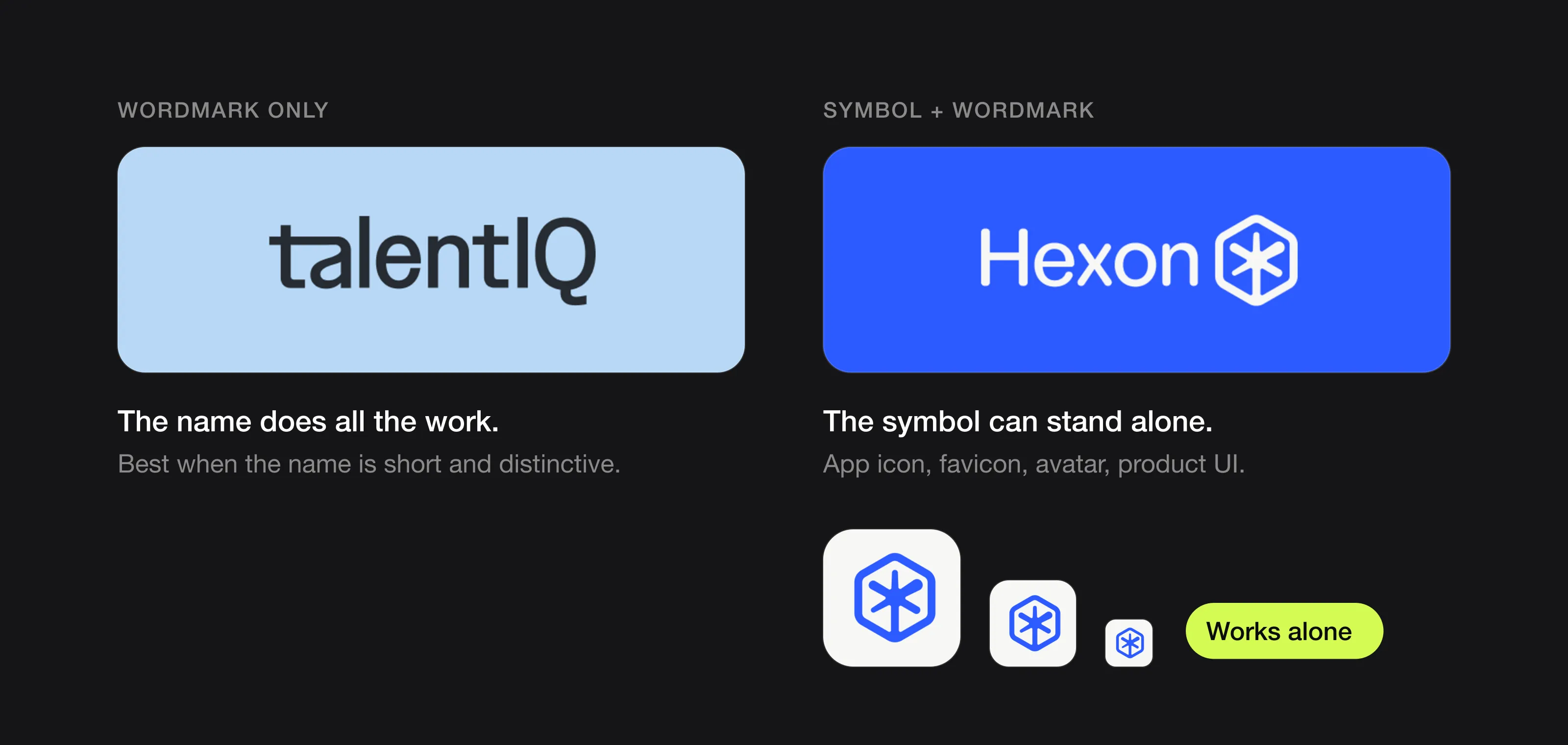 A wordmark relies on the name; a symbol gives you an icon for the app, the favicon and avatars (TalentIQ and Hexon, designed by Logomint).
What colours work best for a tech startup logo?
No colour makes a product look trustworthy by itself. What matters is how your colour sits next to your competitors and inside your own interface. Blue and purple are everywhere in software, which is exactly the problem: a mid-blue logo in a list of integrations is one of many.
- Map your category first. Put the logos of your ten closest competitors side by side. If they are all blue, a green, orange or near-black brand will be noticed faster.
- Pick a colour that works in your UI. Your brand colour will probably become your buttons and links, so it needs enough contrast against white and dark backgrounds.
- Keep it to one main colour and a neutral. Extra colours can live in illustrations and charts; the logo itself should not depend on them.
- Make sure it works in black and white. If it does not, colour will not save it.
Our full guide to choosing logo colours walks through this step by step.
Which fonts suit a SaaS or AI brand?
Clean sans serifs are the default in tech because they render well on screens and stay readable at small sizes. The risk is that an untouched geometric sans makes your wordmark look like a placeholder.
- Start from a solid sans serif, then customise. Small changes to a few letters (a cut terminal, a distinctive “a”, adjusted spacing) are often enough to make the wordmark your own.
- Check it at small sizes. Very light weights and tight spacing fall apart in a 24-pixel header.
- Think about your interface font. Your wordmark and product type do not have to match, but they should not fight each other.
What should a tech or AI logo avoid?
Some ideas are so common in software that they no longer say anything about a specific product:
- Abstract nodes and network dots connected by lines.
- Brains, circuits and neural-network motifs for AI products.
- Glowing orbs, swirls and sparkle stars that suggest “AI magic”.
- Blue-to-purple gradients used as the main idea of the logo.
- Clouds, brackets and infinity loops used without a clear reason.
A familiar shape is not forbidden: a hexagon can still work if it is drawn with a specific idea and a distinctive detail. The test is whether someone could tell your logo from a competitor’s at favicon size. Also avoid AI-generated marks for a product you plan to protect; as we explain in can you trademark an AI-generated logo, purely generated output may be hard to protect.
What can you learn from Slack, Stripe, Figma and Airbnb?
Slack: simplify for every background
In its 2019 announcement, Slack said the old mark used 11 different colours and looked wrong on any background other than white or when its colours were slightly off. The redesign, created by Slack’s in-house team with Michael Bierut and Pentagram, reduced the palette to four primary colours and rebuilt the symbol on a grid from two shapes: a speech bubble and a lozenge. Bierut also told It’s Nice That that the hashtag was a typographic symbol and not proprietary to Slack. The lesson: a symbol you can’t own, or one that only works on white, will cost you later.
Stripe: let the wordmark carry the brand
Stripe’s official logo kit centres on a lowercase wordmark. Its brand assets page says the wordmark is available in three colours: slate and blurple for light backgrounds, white for dark ones, and no other colours allowed. It is a short, strict rule set made for the light-and-dark reality of software. The lesson: a well-drawn wordmark with clear colour rules can be enough, if the name is short.
Figma: a colourful symbol that also works in one colour
Figma’s symbol is made of five rounded shapes in five colours, stacked into a figure that suggests an F. Even so, Figma’s brand page lists both a black and white logo and a coloured logo among its brand assets. The lesson: you can use several colours, as long as the shape works without them.
Airbnb: a symbol simple enough to draw
Airbnb began as a tech startup, and in 2014 it introduced a symbol called the Bélo, designed by DesignStudio. Designboom reported that it stands for people, places, love and Airbnb, and that it was meant to be easy for anyone to draw. The lesson: a symbol with a clear idea and few lines does more work than a detailed one.
Logos we designed for tech and AI brands
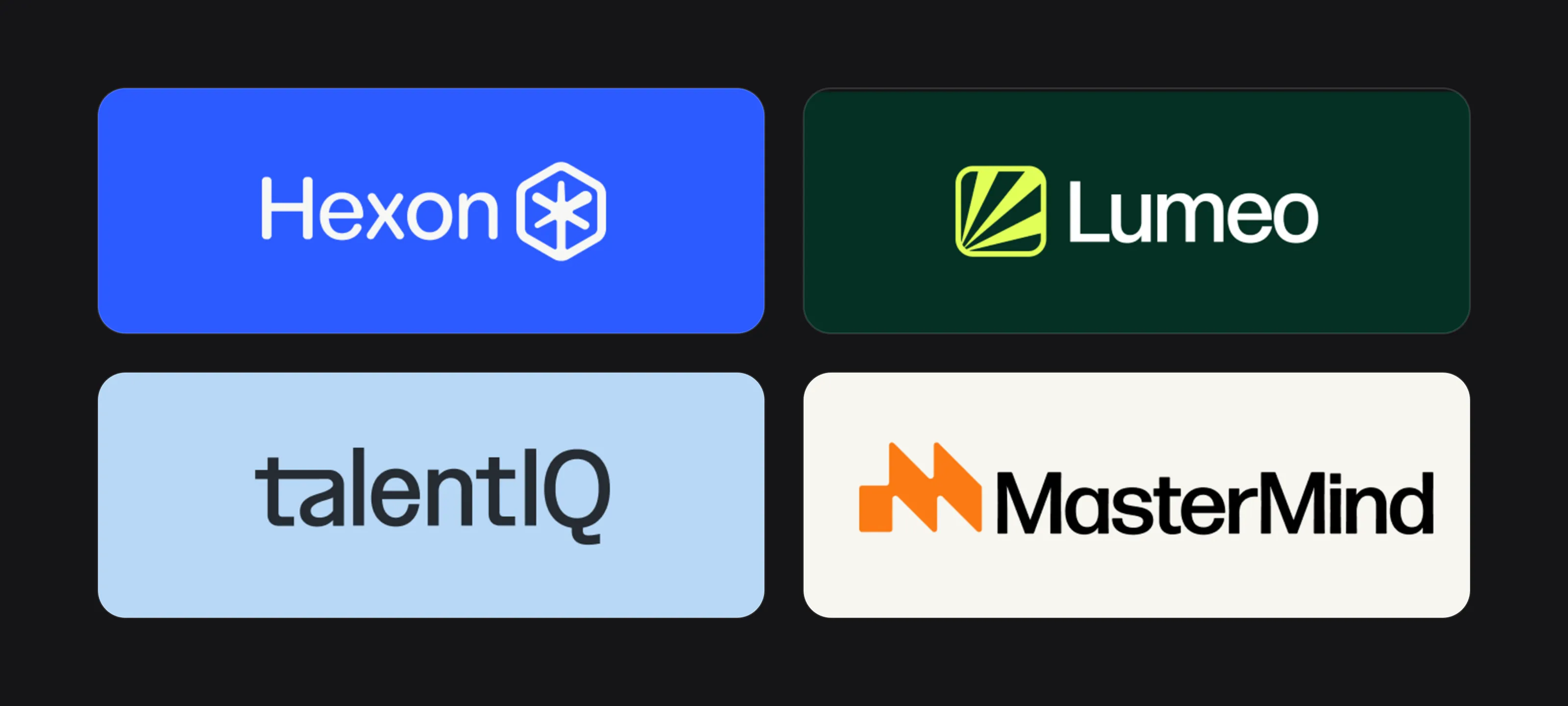 Hexon, Lumeo, TalentIQ and MasterMind.
Hexon. The board describes Hexon as “AI Automation for Enterprise Workflows”. The symbol is a rounded hexagon containing a six-armed asterisk whose lower arm runs down to meet the frame. It sits in bright blue next to a clean sans serif wordmark. Blue is common in tech, so the distinction comes from the shape and its use: on the app screen and poster, the asterisk’s arms separate into white, green and dark grey strokes and become a large graphic. The core symbol stays simple enough for a favicon while the brand gets a flexible graphic.
Lumeo. Lumeo’s symbol is a rounded square, the same shape as an app icon, with lime rays fanning out from one corner, a nod to the light in the name. The palette is deep green with bright lime, which stands out in a category crowded with blue and purple. On the board, the rays move off the logo onto the back of the business cards as a pattern, and the mark works in lime on dark green for signage and a T-shirt.
TalentIQ. TalentIQ is a wordmark with no separate symbol. The board’s own copy (“Hire smarter, not harder”, “AI-driven analytics”) places it in hiring technology. The construction grid on the board shows the custom “t” and “a”, drawn with squared-off terminals, and the capital IQ breaks the lowercase rhythm so the name reads in two parts. Colour lives around the wordmark: dark navy, light blue and orange backgrounds, and an orange wordmark on a white business card.
MasterMind. The MasterMind symbol is an orange “M” built from a square block and two slanted strokes that step upwards, so the letter also reads as rising steps. The mockups, such as “Learning Consultant / Instructor” on the business card, point to learning. The wordmark is a bold black sans serif. The board shows the symbol as a macOS app icon next to Finder, which is exactly the test a software logo has to pass: it holds up in a rounded square, at icon size, beside system apps.
For a fuller example of identity work in the tech sector, see our Apollo Studio case study: a product design partner for tech companies, where the logo came with a colour palette, typography, brand guidelines and a social media kit.
The tech startup logo checklist
- The symbol reads at 16 pixels in a browser tab, in light and dark themes
- An app icon version that fills a rounded square without text
- Light, dark and one-colour versions of every lock-up
- A horizontal lock-up for headers and a square symbol for avatars
- Colours that work in your UI and do not depend on a gradient
- Compared side by side with your ten closest competitors
- Vector source files (SVG for the web, AI or EPS for print and merch)
- A minimum size and clear-space rule for each version
If you are building the rest of the brand on a small budget, our guide to startup branding on a budget shows what to do first.
Building a learning app or course platform? See our education logo guide for thumbnails, certificates and coaching brands.
FAQ
Does a tech startup need a symbol, or is a wordmark enough?
Most software products need a square icon for the favicon, app icon and social avatars, so a symbol or monogram is usually worth having. A wordmark alone can work if the name is short and a cropped letter makes a strong icon.
What size should I test a SaaS logo at?
Test the symbol at 16 and 32 pixels, the sizes browsers use for tabs, and as an app icon on a real phone. If it is recognisable there, larger uses are easy.
Are blue and purple bad colours for a tech logo?
No, but they are crowded. If your closest competitors all use them, a different main colour will make your product easier to spot in app stores, integration lists and browser tabs.
How do I make my logo work in dark mode?
Prepare a reversed light version, check contrast on dark grey as well as black, and avoid designs that only work with a gradient. The symbol’s shape should stay the same in every version.
Sources
Checked on 15 October 2026.
- Apple Developer, Human Interface Guidelines: App icons
- Google Search Central, Define a favicon to show in search results
- Slack, Say hello, new logo
- Pentagram, Slack
- It’s Nice That, Pentagram’s Michael Bierut talks us through his Slack brand reboot
- Stripe, Brand assets
- Figma, Using the Figma brand
- Designboom, Airbnb rebrand gives its community a sense of belonging
The bottom line
A tech startup logo is judged in tiny squares: browser tabs, app icons, avatars and integration grids, often on a dark background. Get those right first, choose an idea and colour your competitors don’t own, and keep the shape simple.
At Logomint, a senior designer creates your custom logo from €129, with first concepts in 48 hours, all source files and a 100% money-back guarantee. See the plans.