Short answer A good sports brand logo is simple enough to embroider at 5 cm on a chest, bold enough to read on a jersey or a banner from across a pitch, and specific enough not to look like every other gym. Movement should come from the shape itself, not from added speed lines, flames or lightning bolts. Design for the kit first, then the screen.
What should a sports or fitness logo make people feel?
People wear sports brands. They put the logo on their chest, carry it into a gym and stand next to it at the finish line. So the first job is pride: the logo has to be something people are happy to be seen with.
After that, the feeling depends on what you sell:
- Performance apparel and equipment should feel precise and confident, like the gear won’t let you down.
- Gyms and studios should feel welcoming to the people they actually want, whether that’s serious lifters or nervous beginners.
- Clubs and teams should feel like belonging, with a hint of history even when the club is new.
- Outdoor and adventure brands should feel capable and calm. People trust them with safety in places where things can go wrong.
“Strong and dynamic” describes almost every brief in this industry. Pick the feeling that is actually yours.
Where does a sports brand logo have to work?
More than in most industries, a sports logo lives on fabric and objects. That changes the brief.
Embroidery. A small chest mark on a polo or a cap is stitched, not printed, and thread can’t hold fine detail. Printful’s embroidery guide recommends lettering at least 0.25 inches (about 6 mm) tall and lines at least 0.05 inches (about 1.3 mm) thick, and warns that small details may need simplifying to stitch cleanly. A logo with hairline strokes or tiny counters will blur.
Heat transfer and screen print. Technical fabrics often take heat-transferred logos, and these are usually one colour. Your logo needs a solid one-colour version that still looks right in white on navy, black on grey or neon on black.
Jerseys, banners and signage. A jersey is seen on a moving body; a banner is seen from 30 metres away. Both reward heavy shapes, high contrast and short names. If your logo only works when someone is standing still, close up, it doesn’t work.
Equipment and merchandise. Bottles, bags, balls and helmets are curved, small or textured. A compact mark, or a wordmark that can run vertically, helps on narrow surfaces.
Apps and social. On booking apps and Instagram the logo shrinks to a small circle, so you’ll need a short version: an initial, a monogram or a symbol.
If you sell kit online, our guide to e-commerce logo design covers the shop side.
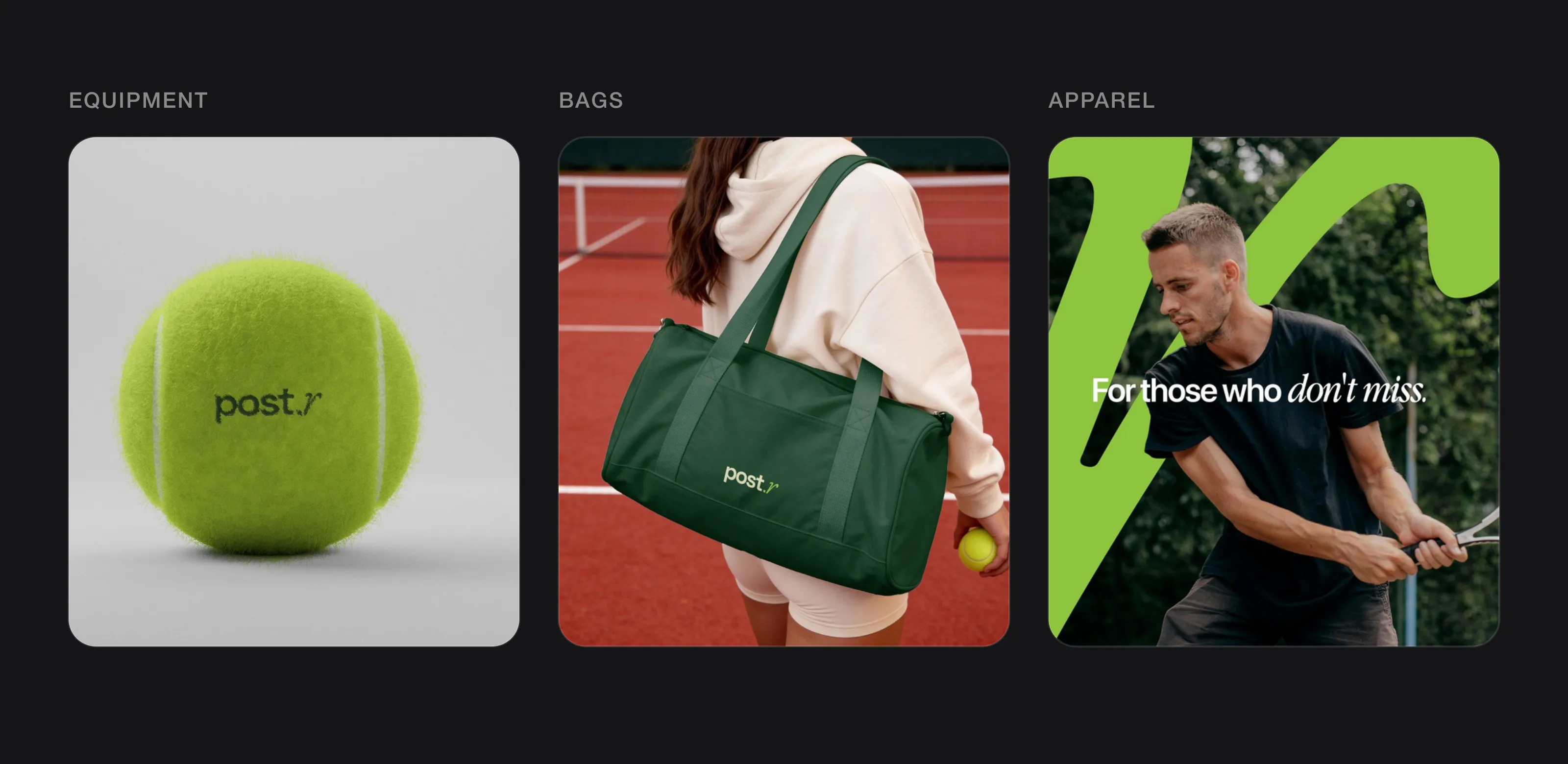 A sports logo has to work on equipment, bags and apparel (post.r, designed by Logomint).
How do you show movement and energy without clichés?
Most sports logos try to show speed by adding something: motion lines, a flame trail, a lightning bolt. The result is busy and interchangeable. Energy works better when it is built into the main shape:
- A slant or a forward lean in the symbol or a single letter, rather than italicising the whole name.
- A shape with tension, like a curve that tightens or an angle that cuts, so the mark looks like it’s mid-action.
- Asymmetry: a perfectly balanced mark looks static; a slightly unbalanced one looks like it’s moving.
- Movement in the system, not the logo: crop the mark, enlarge it, run it across a shirt or a banner. The logo can stay calm while the graphics around it move.
One clear gesture is enough. Two or three start to fight.
What colours work best for a sports brand logo?
Colour won’t make anyone run faster. What it does is place you in a category and help people spot you from a distance.
- High-contrast pairs (black and white, navy and white, dark green and lime) read best on kit and banners.
- Neon and acid colours suggest performance and technical gear. They stand out, but they’re common in running and cycling, so make the shade specific.
- Earth tones (forest green, rust, sand, stone) are the shorthand for outdoor brands. They fit the category but blend in, so pair them with one sharper accent.
- Club colours often come with the territory. If you’re a club, start from them rather than fighting them.
Whatever you choose, test it on fabric: colours look different on mesh, fleece and cotton than on a screen. Plan a reversed version for dark garments from the start. More on building a palette in how to choose logo colours.
Which fonts suit a sports or fitness brand?
The default “sport” font is a heavy, condensed, italic sans-serif. It works, which is exactly why half the industry uses it.
- Bold sans-serifs hold up best on embroidery, jerseys and at distance. Upright ones feel steadier and more premium than slanted ones.
- Collegiate and slab styles suit clubs and heritage-led apparel, but need custom details to avoid looking like a template.
- Rounded sans-serifs feel friendlier, which can suit beginner gyms, kids’ clubs or outdoor brands that want to feel approachable.
- A single contrasting letter (a serif or calligraphic letter inside a sans wordmark) can give a sports logo personality without losing legibility. One of our logos below does this.
Avoid thin weights and tight letter spacing. Both fill in when stitched or seen from far away.
Mascot, abstract mark or monogram: which should a sports brand choose?
Mascots suit clubs, teams and youth sport. They give fans and kids something to love and sell well as merchandise. The catch is detail: a full illustrated mascot rarely embroiders well at small sizes, so you’ll need a simplified head or badge version alongside it.
Abstract marks suit apparel and equipment brands that want to grow across many products. They scale from a shoe to a stadium and don’t tie you to one sport. The catch is that an abstract mark means nothing at first; recognition comes from repetition.
Monograms and initials suit gyms, clubs and premium apparel. They are compact, embroider cleanly on caps and chests, and suggest heritage. The catch is sameness, because many monograms look alike unless the letters are genuinely drawn for you.
Whichever you choose, most sports brands end up needing a wordmark for wide spaces and a compact mark for caps, sleeves and app icons.
What should a sports logo avoid?
- Swooshes and ticks. Nike made the shape famous, so a swoosh now reads as an imitation.
- Flames and lightning bolts. They suggest speed in the most generic way possible.
- Mountain peaks with a sun. The default outdoor logo; it tells customers nothing about you.
- Dumbbells and kettlebells. Every gym has one, and they often look like a stock icon.
- Running figures and stick athletes. Hard to draw well, and they turn to mush at small sizes.
- Shields with crossed equipment that look like a trophy shop template.
- Italic everything. When the whole name leans forward, nothing stands out.
If your current logo has a few of these, our checklist on why a logo looks cheap will help you see what to fix.
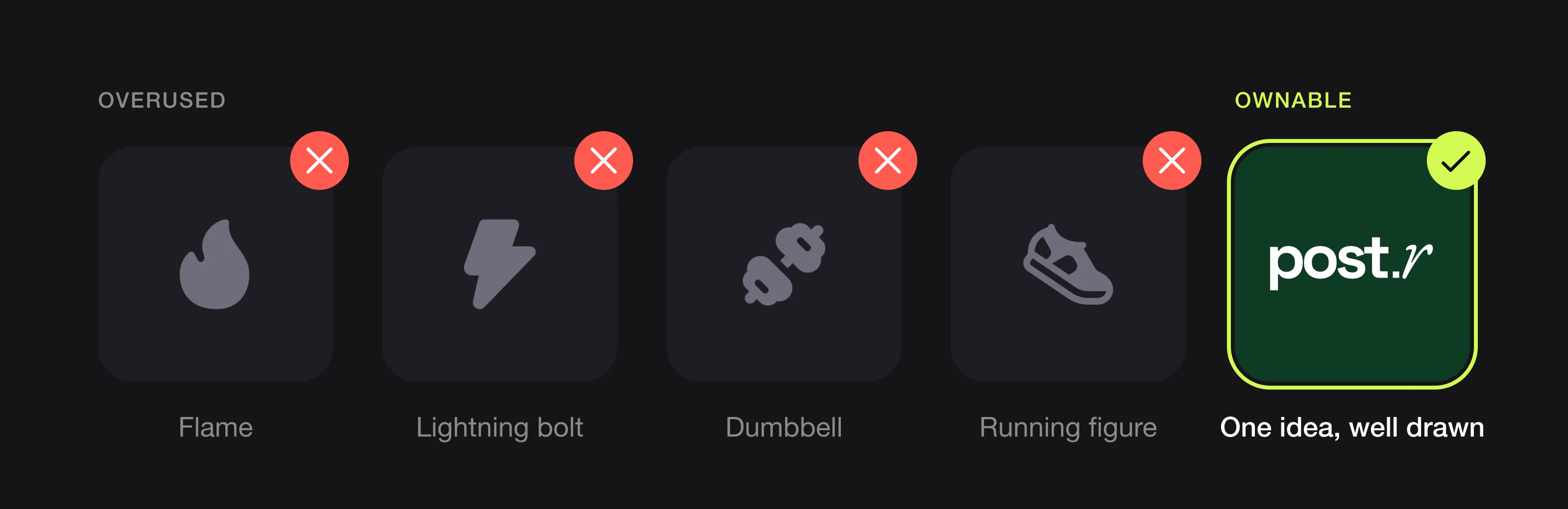 The symbols every gym and sports brand reaches for, and one idea drawn well instead (post.r, designed by Logomint).
What can you learn from Nike, Puma and The North Face?
Nike. The Swoosh is a single curved stroke with no speed lines, no figure and no ball. According to Nike, Phil Knight asked Carolyn Davidson, a Portland State design student, to design a mark in 1971 for the side of a football boot, and she invoiced $35 for it. Davidson later wrote that the logo had to show movement. Lesson: it was designed for a product surface, and the motion comes from one shape. Decades of imitation are also why a swoosh no longer works for anyone else.
Puma. Puma has two marks: the leaping cat and the Formstrip, the curved band on the side of its shoes. Puma explains that the Formstrip started as a strip of leather for lateral support in football boots, patented in 1958, and that its contrasting colours made players stand out even on black-and-white television. Lesson: a functional, repeatable graphic can do as much recognition work as the logo, especially at a distance.
The North Face. The symbol is a quarter-circle with curved lines inside it, next to the name stacked in bold capitals. It’s simple enough to sit small on the chest or shoulder of a jacket. The mark is inspired by Half Dome in Yosemite. Lesson: a mountain can work, but only when it’s a specific mountain, reduced to its most recognisable shape, not a generic triangle.
Logos we designed for sports and outdoor brands
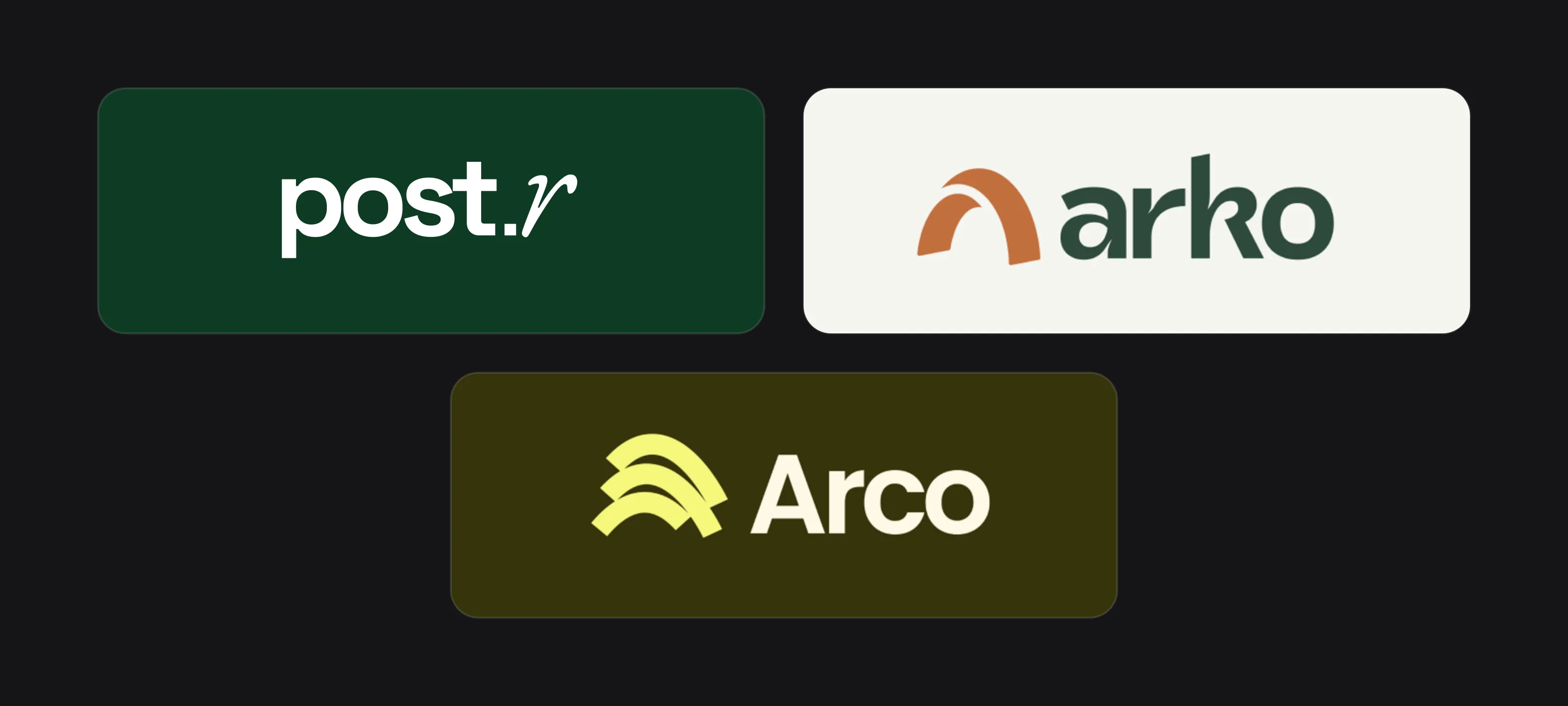 post.r, arko and Arco.
post.r. A tennis brand (see the full case study). The wordmark sets “post” in a heavy lowercase sans-serif, followed by a full stop and a calligraphic italic “r” in bright lime. That one contrasting letter carries the energy, so the rest stays calm and legible, with no ball, racket or net in sight. The “r” also works alone: it’s the Instagram avatar, and blown up, its long diagonal stroke sweeps across billboards beside tennis courts, street banners and the lower half of a T-shirt. Elsewhere the wordmark stays small: on the chest of the same shirt, on a gym bag, running vertically up a water bottle and printed on a tennis ball. Campaign headlines repeat the logo’s contrast by mixing a bold sans with an italic serif.
arko. The billboard copy describes guided treks through demanding landscapes, under the line “Some views you have to earn.” The symbol is a thick terracotta arch with a curved cut through one side, which can be read as a rock arch or a trail cresting a hill. Notice what’s missing: the photography is full of snowy peaks, so the logo doesn’t need to draw one. The wordmark is a heavy, rounded lowercase sans in dark forest green. On the billboard the logo is reversed in white on green; on a terracotta tote bag the arch is enlarged and cropped in cream, and on social posts (“Adventure, done right.”) it sits in a small circle as the avatar.
Arco. A camping brand, introduced by the line “Camp where the horizon begins.” The symbol stacks three thick arcs, offset on a diagonal, like layers of hills or a horizon seen across water. It’s compact and almost square, which suits small spaces such as an avatar or a patch. The wordmark is a bold title-case sans-serif in cream, and the main colours are a lime yellow on dark olive, with a softer sage version of the symbol on cream. On a cinema screen ad and a printed flyer, the arcs are enlarged into a background shape while the symbol sits small in the corner, so the same idea works at two very different scales.
The sports brand logo checklist
- Embroiders cleanly at around 5 cm wide on a chest or cap
- Has a solid one-colour version for heat transfer and screen print
- Has a reversed version for dark kit and a standard version for light kit
- Reads from 30 metres on a banner and on a moving jersey
- Has a compact mark for caps, sleeves, equipment and app icons
- Shows movement through its main shape, not added lines or effects
- Avoids swooshes, flames, bolts, generic peaks, dumbbells and running figures
- Comes with vector files and Pantone references for apparel suppliers (see which logo file formats you need)
FAQ
Should a sports logo be a mascot or an abstract symbol?
Mascots suit clubs, teams and youth sport, where fans want a character. Abstract symbols suit apparel and equipment brands that need one mark to work across many products and sizes.
What makes a fitness logo work on clothing?
Bold shapes, a limited number of colours and no fine detail. Test it embroidered small on a chest and printed in one colour before you approve it.
What colours are best for an outdoor brand logo?
Earth tones fit the category but are crowded, so pair them with one sharper accent colour. Make sure the logo works in a single colour on both dark and light fabric.
How do I make a sports logo look dynamic?
Build movement into the main shape with a lean, a curve or some asymmetry, rather than adding speed lines or flames. Then let your graphics, cropping and photography carry the rest of the energy.
Sources
Checked on 15 October 2026.
- Nike, The Nike Swoosh logo history
- ESPN, How college student Carolyn Davidson created the Nike swoosh
- PUMA CATch up, Don’t call our Formstrip a stripe
- Gerben Law Firm, A look at the trademark portfolio of The North Face
- Printful, How to design a logo for embroidery
The bottom line
A sports brand logo is worn, carried and seen in motion. Design it for a stitched chest mark and a distant banner first, let one strong shape carry the energy, and skip the swooshes, flames and peaks everyone else reaches for.
At Logomint, a senior designer creates your custom logo from €129, with first concepts in 48 hours and a 100% money-back guarantee. See the plans.