Short answer A healthcare logo has to reassure people who may be worried, in pain or short of time, so it needs to look calm, competent and easy to read. That doesn’t mean a blue cross on white. Good healthcare logo design picks one clear idea, stays legible for older patients and on small screens, avoids implying medical claims, and works on a clinic sign and an appointment card as well as in a patient app.
What should patients feel when they see a healthcare logo?
People meet healthcare brands when something hurts or when they’re waiting for a result. Your logo answers a quiet question: will these people look after me properly?
Two qualities have to sit together:
- Competence. You’re qualified, organised and careful. Hospitals, specialist clinics and health-tech products handling medical data lean this way.
- Warmth. You’re kind, you explain things and you won’t rush me. Family dentists, GP practices and wellness brands lean this way.
All competence feels cold and institutional. All warmth can feel unserious, which is a problem when the service involves needles or diagnoses.
For dental practices, warmth matters more than most realise. A UK Health Research Authority summary notes that around 36% of UK adults experience moderate and 12% severe dental anxiety. A dental logo that looks like an instrument catalogue confirms the fear. One that looks calm and human gives nervous patients one less reason to cancel.
What colours work best for a healthcare logo?
Blue dominates healthcare, from NHS Blue to the blue in Cleveland Clinic’s symbol. There’s no scientific law behind it: blue is familiar, rarely alarming, and patients have seen it on hospitals all their lives. Green is the other common choice; Cleveland Clinic’s guidelines say green is traditionally associated with medical science.
If every dentist on your high street is blue and white, a warm teal, soft coral or deep green will be remembered. Instead of asking which colour “means health”, ask:
- What do nearby competitors use? Patients often compare a few local practices online before booking.
- Does it carry alarm signals? In a medical setting, red reads as emergency, blood or warning. It can work as an accent, rarely as the main colour.
- Does it pass contrast checks? Pale pastels look soothing on a mood board and vanish on a white sign.
- Does it work in one colour? Your logo will be photocopied, printed on prescription bags and embroidered on uniforms.
Wellness brands, closer to retail, have more freedom. Our guide on how to choose logo colours walks through the process.
Which fonts suit a medical or dental brand?
Clear, open sans serifs are the default because they read well at a distance and at small sizes. The NHS has used Frutiger since 1999 and describes it as designed to be clear and easy to read at a distance and in small sizes. Rounded or humanist sans serifs feel friendlier for dentists and wellness products. Sturdy serifs can suit private specialists, but delicate, high-contrast styles break up on a backlit sign. Scripts and novelty fonts make a surgery door look improvised.
Legibility matters more here than in most industries, because your audience includes older patients and people with low vision. The NHS digital service manual requires WCAG 2.2 AA, meaning at least 4.5:1 contrast for small text and 3:1 for large text and graphics, and warns not to let colour carry meaning on its own. For a logo, that means checking your colours with a contrast tool, avoiding hairline strokes and very light weights, and testing the symbol in greyscale.
Should a healthcare logo have a symbol or just a wordmark?
It depends on how many places the logo has to live without words. A single practice whose name is its reputation can do very well with a clean wordmark. A brand with a patient app, a portal or a product range needs a symbol or monogram, because a full name won’t fit an app icon or favicon.
Can you use a red cross in a medical logo?
No, and this catches out many clinics, pharmacies and first aid brands. The red cross isn’t a general medical symbol; it’s a protective emblem under international humanitarian law. The ICRC explains that states must take steps to prevent and punish misuse of the emblem in wartime and peacetime alike, and lists use by commercial enterprises, medical establishments or pharmacies as misuse. Imitation counts too: a sign whose shape or colour may be confused with the emblem.
So a red cross, or a red plus close enough to be mistaken for one, is off the table. National rules and penalties differ, so check with your country’s Red Cross or Red Crescent society if you’re unsure.
What should a healthcare logo avoid?
- Crosses of any colour. Beyond the legal issue with red, a plus sign says “medical” and nothing about you.
- The caduceus and the staff of Asclepius. Patients rarely tell them apart, and they belong to the whole profession, not your clinic.
- Hearts and heartbeat lines. Used by cardiologists, care homes, fitness apps and insurers alike. On a product, a heartbeat line can imply a health benefit you can’t back up.
- Generic tooth icons. The clip-art molar with a sparkle is on thousands of dental signs.
- Leaves and cupped hands. The default for wellness and care brands, and interchangeable.
If a logo generator offers the same symbol to every clinic that types “health”, treat it as a red flag.
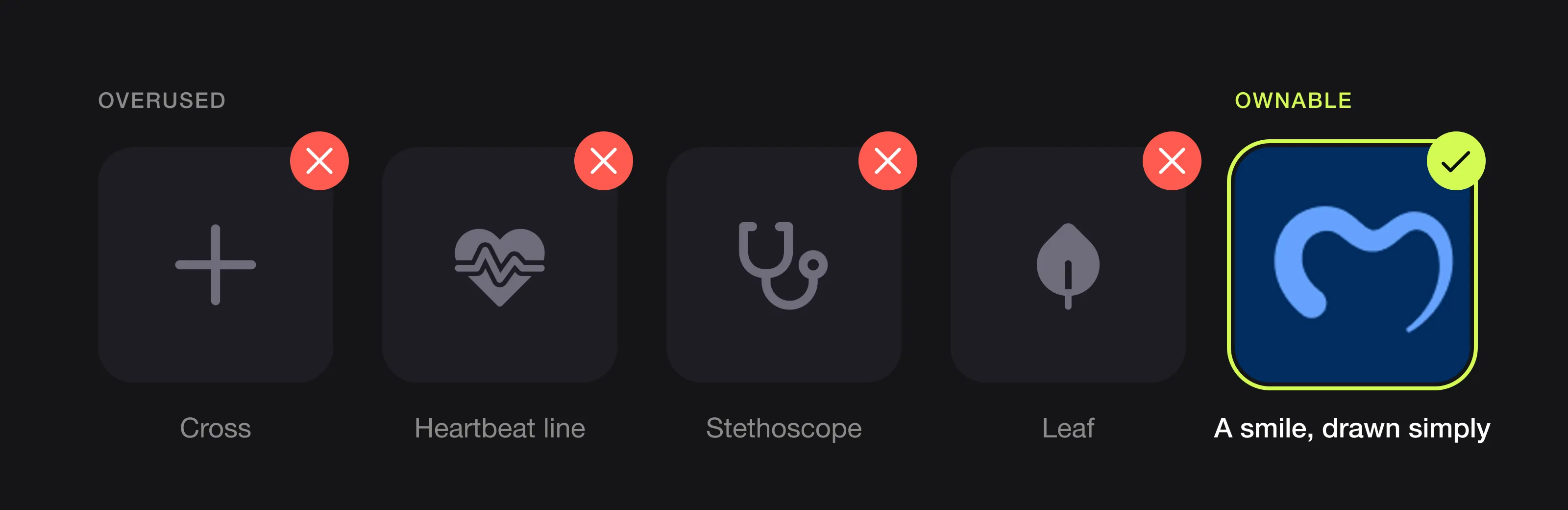 The symbols most clinics use, and a simpler idea instead (Serenity, designed by Logomint).
Can a healthcare logo make health claims?
It shouldn’t try. A logo can promise calm, care or confidence, but not a medical outcome, because outcomes are claims and health claims are regulated.
For supplements and functional foods in the UK and EU, a trade mark or brand name that may be construed as a nutrition or health claim can only be used if it is accompanied by a related nutrition or health claim which complies with the Regulation. A name or symbol that suggests “boosts immunity” can drag your whole label into regulatory territory. Clinics and medical devices have their own advertising rules, depending on the country.
Keep the logo emotional and abstract, and put substantiated claims on packaging and service pages, where they can be checked.
Where does a healthcare logo have to work?
| Touchpoint | Challenge | What it needs |
|---|---|---|
| Exterior and wayfinding signage | Read from a distance, in rain, often backlit | High contrast, sturdy type, generous clear space |
| Appointment cards and reminder letters | Small, often printed in one colour | A one-colour version with legible type |
| Patient app and portal | A tiny icon, a favicon, a login screen | A symbol or monogram that reads at a glance |
| Uniforms and scrubs | Embroidered at small sizes | Simple shapes, no hairlines or gradients |
| Wellness and dental packaging | Shares the label with ingredients and regulated text | A compact lockup that doesn’t crowd the legal information |
The NHS guidelines are a useful benchmark. They ask for clear space equal to the full height of the logo on print and signage (half the height on digital), set a minimum digital height of 30 pixels, and allow favicons as small as 15 pixels square. Our logo sizes guide lists the dimensions you’ll need.
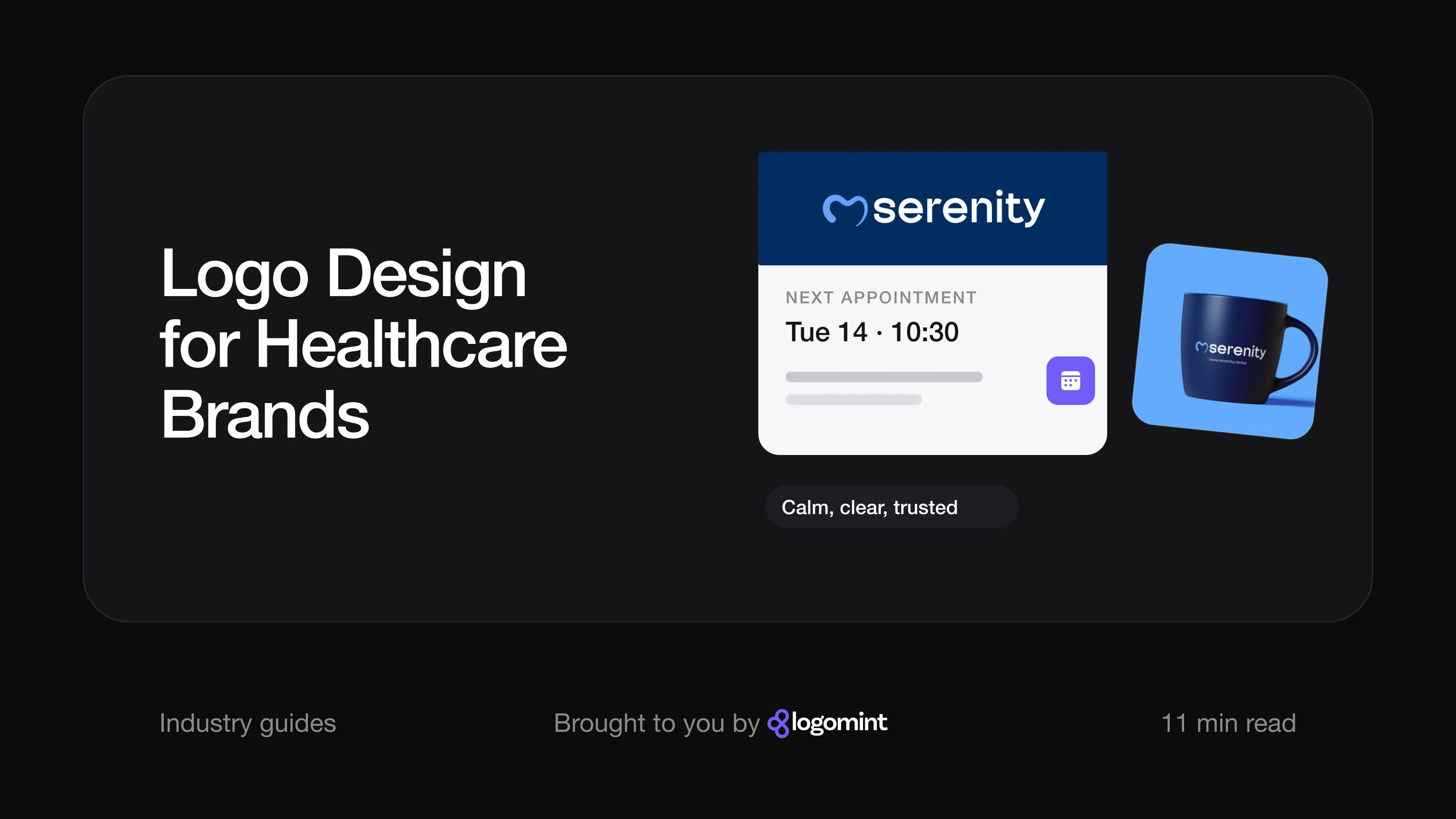
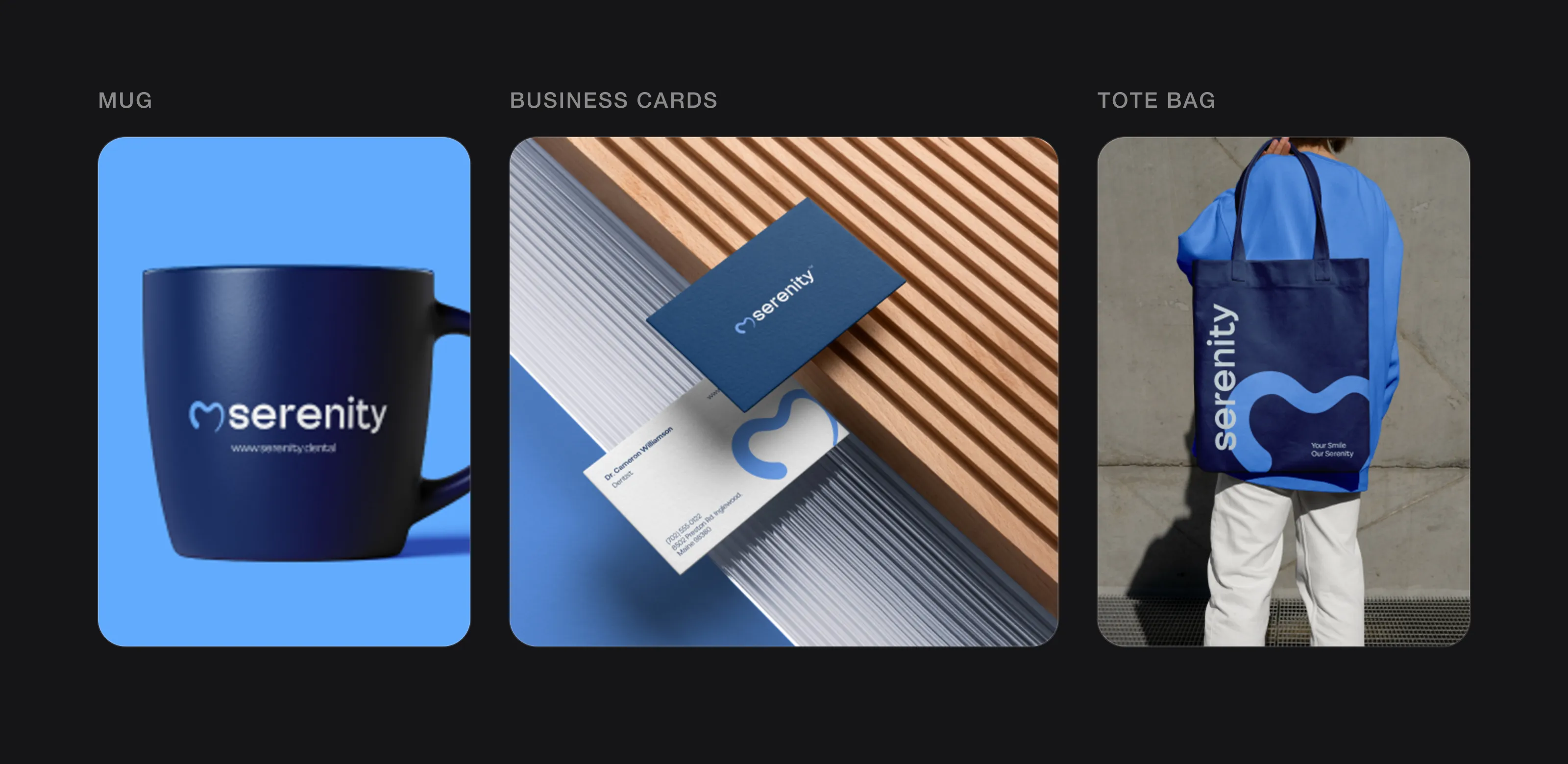 A healthcare logo travels well beyond the sign: mugs, appointment and business cards, bags (Serenity, designed by Logomint).
How well-known healthcare brands handle their logos
The NHS. The logo, which the guidelines call the lozenge, is the letters NHS in white on a blue rectangle. It’s a UK trade mark with strict rules: NHS Blue is the only colour it can be reversed out of, and one-colour printing is limited to NHS Blue or black. The guidelines say research found it evokes trust, confidence, security and dependability. The lesson isn’t the blue; it’s that consistency on every letter, sign and screen builds recognition.
Mayo Clinic. The name, set in stacked capitals, sits above three interlocking shields. A Yale School of Management case study says the shields represent education, research and clinical practice, with practice in the center. One shield is generic; three linked shields tell a specific story about how the organisation works. It also holds up in plain black, as in Mayo Clinic’s website header.
Cleveland Clinic. Four squares, blue above green, surround a white rounded square, and the white gaps between them suggest a cross without drawing one. The guidelines say the centre represents a unified focus on putting “Patients First”, and that blue suggests limitless possibility. One rule stands out: the symbol must never be used by itself in brand communications, so the name always shares the work.
Headspace. Headspace moved closer to healthcare without turning clinical. Its orange circle is simple enough to stand alone, as it does in the header of its website. When the identity was refreshed in 2024 after the company’s expansion beyond meditation, It’s Nice That reported that a custom typeface was chosen to flex from playful to clinical, while the orange still led a palette with more attention to contrast and accessibility.
Logos we designed for healthcare, dental and wellness brands
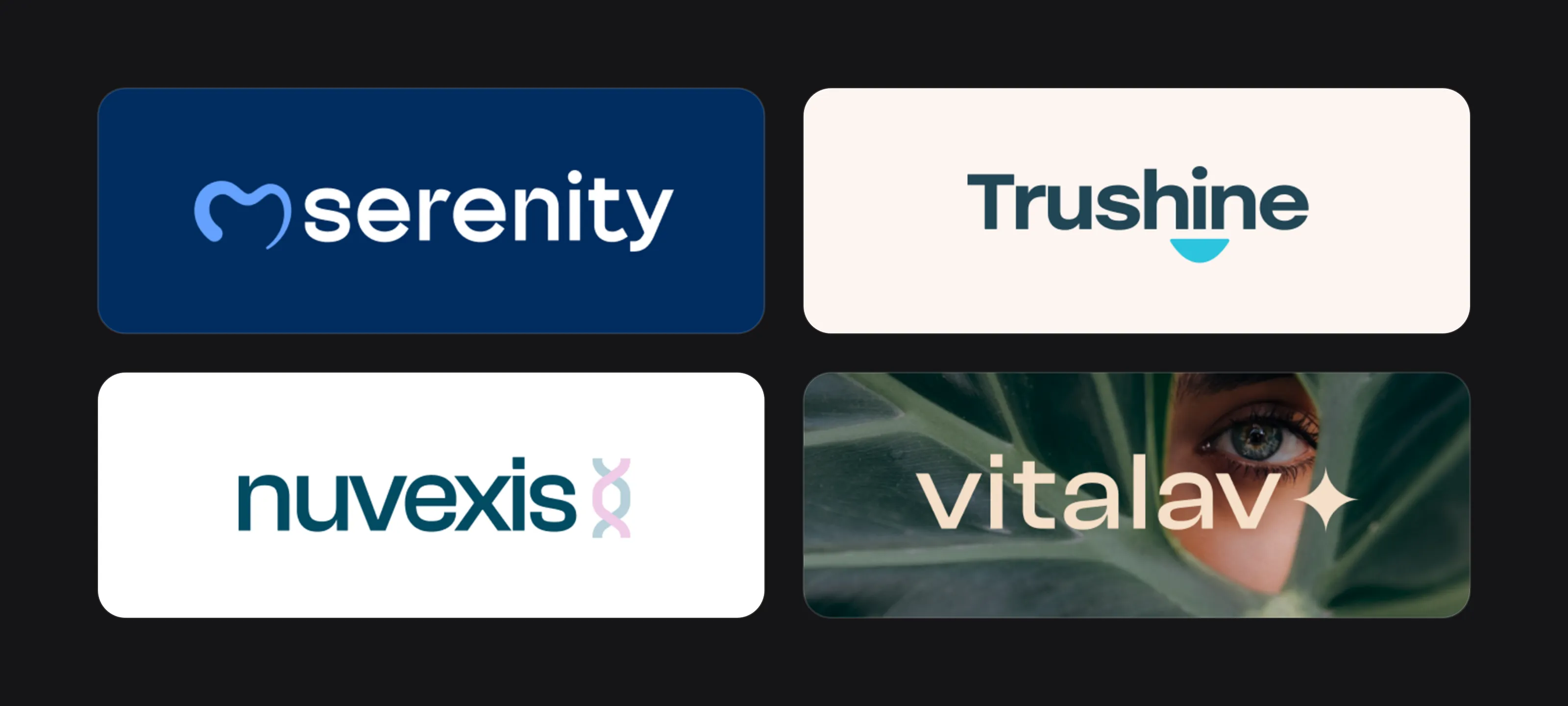 Serenity, Trushine, nuvexis and Vitalav.
Serenity, a dental practice. The symbol is a tooth, the cliché this guide warns about, drawn so it doesn’t look like clip art: one open stroke tracing the crown, thick and rounded on the left, tapering to a fine point on the right, open at the bottom. It feels hand-drawn, which softens the clinical shape. Navy and a soft sky blue read as dental without feeling sterile, with a lowercase, rounded sans serif wordmark. The mockups show it on a dentist’s business card, with the symbol oversized and cropped off the edge of the white back, and on a tote bag with the line “Your Smile Our Serenity”.
Trushine, a toothpaste brand. Trushine avoids the tooth problem by not drawing a tooth at all. A heavy, rounded sans serif in deep slate blue sits above a cyan half-disc that reads as a smile. That half-disc then becomes a graphic shape around photography, in white, pink and cyan. The emotional promise, a brighter smile, is carried by the shape and the ad line; the logo itself makes no product claim.
nuvexis, a DNA-testing product. The board shows the line “Powered by DNA. Built for tomorrow” and a test result screen with a compatibility score. The symbol is a double helix, about as literal as health-tech gets, but drawn as two soft, overlapping ribbons in pastel pink and pale blue-grey, placed after the dark teal wordmark like a full stop. The results card is a good accessibility detail: “compatible” and “not compatible” use dark teal and pale pink, which differ strongly in lightness, and both are labelled in text.
Vitalav, a wellness and skincare brand. Vitalav’s range spans an overnight face mask and a bottle of “Organic energy & focus capsules”, so the logo has to stretch from skincare to supplements. It skips every wellness cliché: no leaf, no heart, no pill, just a lowercase sans serif wordmark and a small four-pointed star, in dark forest green on cream. On the bottle, the product description sits under the logo as separate text, which is where descriptions belong. More on the skincare side in our guide to logo design for beauty brands.
Healthcare logo checklist
- One clear idea, with no crosses, caduceus, heartbeat lines or clip-art teeth
- Nothing that could be confused with the red cross
- Colours chosen against local competitors and checked for contrast
- Type that stays legible for older patients and on a backlit sign
- A symbol or monogram for the app, portal and favicon
- One-colour and embroidery-friendly versions
- No implied medical claims in the name, symbol or tagline
- Vector source files for sign makers, printers and app stores
FAQ
What is the best colour for a healthcare logo?
There isn’t one. Blue and green are familiar defaults that make small practices hard to tell apart. Choose against your local competitors, avoid red as the main colour and check contrast.
Can I use a red cross in my clinic or pharmacy logo?
No. The red cross is a protected emblem under international humanitarian law, and the ICRC lists its use by medical establishments and pharmacies as misuse, along with signs that could be confused with it.
Should a dental logo include a tooth?
It can, but a generic tooth icon makes you look like every other practice. Draw it in a distinctive way, or carry the idea through a smile, a letter or the name instead.
Can a wellness brand name count as a health claim?
Yes. In the UK and EU, a brand name that could be read as a nutrition or health claim must be accompanied by a related compliant claim. Check names and symbols with a regulatory adviser before you commit.
Sources
Checked on 15 October 2026.
- ICRC, What are the provisions of IHL governing the use and protection of the emblem? (August 2017)
- NHS England, NHS Identity Guidelines: NHS logo and Fonts
- NHS digital service manual, Colour
- Cleveland Clinic OnBrand, Choosing a logo and Using our logo
- Yale School of Management, Design at Mayo: Branding
- It’s Nice That, Headspace overhauls visual identity to become mental health all-rounder (April 2024)
- legislation.gov.uk, Regulation (EC) No 1924/2006 on nutrition and health claims, Article 1
- Health Research Authority, Concerns about dental treatment in patients awaiting sedation
The bottom line
A good healthcare logo doesn’t need a cross, a heart or a heartbeat line to say “health”. It needs to look calm and competent, stay readable for every patient, keep clear of medical claims and work from a clinic sign to a 15-pixel favicon.
At Logomint, a senior designer creates your custom logo from €129, with first concepts in 48 hours, all source files and a 100% money-back guarantee. See the plans.