Short answer A good agriculture logo tells people where the food comes from and gives them a reason to trust it. It has to print cleanly on jute sacks, crates and rubber stamps, sit next to organic or fair trade labels without looking like one of them, and stay readable on a farm sign or a van. Skip the wheat ear, the barn and the sun over the fields unless you can make them unmistakably yours.
What should a farm or food brand logo make people feel?
Farms, cooperatives, food brands, garden centres and farm-to-table restaurants all ask people to buy partly on faith: nobody can taste the coffee through the bag. The logo has three jobs:
- Trust. It should look like it comes from people who know what they’re doing and will still be around next season.
- Origin. Buyers want to know where their food was grown and by whom. A logo can carry a place or a story, even when the label carries the facts.
- The right register. A small honey producer and an export cooperative need different signals. The first can be warm and personal; the second has to look organised and dependable to a buyer reading a contract.
Where does an agriculture logo actually have to work?
Design for the roughest uses first.
- Sacks, crates and pallets. Jute, kraft paper and raw wood soak up ink and blur fine lines. The logo is often stencilled, screen-printed or stamped in one colour.
- Rubber stamps and branding irons. Small, single-colour and slightly imperfect every time. Thin strokes and tight gaps fill in.
- Packaging and labels. A jar or a seed packet leaves little space, shared with ingredients, barcodes and certification marks.
- Farm-gate signs, market stalls and vehicles. Read from a car or across a crowded market, often in bad weather, and at an angle on a van or pick-up.
- Workwear and badges. Embroidered caps, aprons, garden-centre lanyards.
- Social avatars. A tiny circle on Instagram or a marketplace listing.
A quick test: print your logo in black at 2 cm wide on brown kraft paper, then view it as a 40-pixel avatar on your phone. If it survives both, it will survive most of the job. Printers and sign makers will ask for vector files, so check which logo file formats you need.
How do certification labels affect your logo?
Organic, fair trade and sustainability marks are valuable, but each has its own rules, and together they crowd the pack.
- The EU organic logo must appear on all pre-packaged food produced and sold as organic in the EU. It can’t be smaller than 13.5 mm by 9 mm, must keep its standard green and white, and needs the control body’s code and the place of farming next to it.
- Fairtrade Max Havelaar’s packaging rules ask for clear space of half the label’s width around it and a minimum width of 9 mm, and say it must not be printed smaller than other certification labels on the same pack.
- The Rainforest Alliance seal guidelines say the seal should stand alone, never be confused with a brand name, keep a clear zone around it, and not go below 2.7 cm so its QR code stays scannable.
On a 250 g bag, your logo competes with marks you can’t shrink or restyle. So:
- Don’t look like a seal. Several of these marks are round, green and nature-themed. A round green badge with a leaf reads as another certificate, not as your brand.
- Plan a compact version. A horizontal lockup and a small symbol give the packaging designer room.
- Choose colours that contrast with the labels, so your brand is still the first thing people see.
- Test it on a real pack mock-up with the labels you hold or plan to apply for, before you sign off.
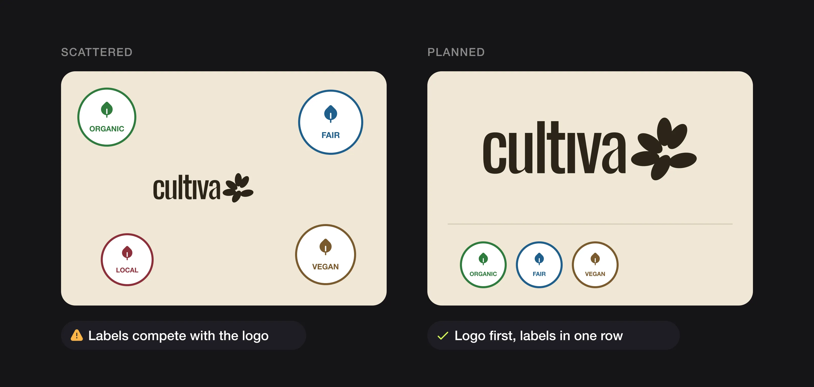 Plan the label space: logo first, certification badges grouped in one row. (Badges are generic examples.)
What colours work best for an agriculture logo?
No colour guarantees “fresh” or “natural”, whatever psychology charts claim. Green is the obvious choice, which is why it is crowded: on a shelf of organic products, or next to green certification marks, mid-green on white disappears.
- Look at the shelf or the market first, then choose something that stands apart.
- Borrow from the whole field, not just the leaf. Soil brown, terracotta, wheat yellow, the colour of your actual product. These feel agricultural without repeating every other farm.
- Use contrast for rough materials. Kraft and jute are mid-tone and absorbent; one dark ink prints far more reliably than pale tones.
- Plan for one colour. Stamps, stencils and crate printing are almost always single-colour. If the logo only works in full colour, it doesn’t work.
Our guide on how to choose logo colours walks through the process.
Which fonts suit a farm or food brand?
Legibility first: packaging is read in a second, signs from a distance.
- For rough printing, choose sturdy letters with open shapes and generous spacing. Hairlines break up on jute and wood.
- For heritage and craft producers, a robust serif or slab serif feels established and honest. Keep it solid enough to stamp.
- For modern food brands and garden centres, a soft geometric or friendly sans-serif feels current and approachable.
- Be careful with scripts. A script that looks charming on a website often turns to mush on a stencilled sack. If you want a hand-made feel, have it drawn properly and test it small.
Rustic or modern?
Rustic (distressed textures, ornate badges, chalkboard script) says small, traditional and hand-made. Modern (clean shapes, flat colour, simple type) says organised and current. Neither is wrong; it depends on whether you sell to a farmers’ market crowd, a supermarket buyer or an importer. A middle path suits many brands: a clean logo, with warmth and texture carried by packaging, photography and materials. Fake distressing baked into the logo dates quickly and prints badly, one of the reasons logos start to look cheap.
Should an agriculture logo have a symbol?
Often, yes. So many uses are small or single-colour (stamps, crate ends, caps, avatars) that a compact symbol earns its place. A wordmark alone works when the name is short. Either way, ask for horizontal, stacked and symbol-only versions.
What should an agriculture logo avoid?
The clichés: wheat ears, single leaves, tractors, barns, a sun rising over striped fields, a generic sprout, a hand cradling a plant. They are the first idea anyone has. Cover the name and ask: could this belong to any farm, organic shop or garden centre? If yes, it isn’t helping you.
They aren’t banned. They work when you do something specific with them:
- Tie the symbol to your name or story, so it says something only you can claim.
- Draw it your own way, with a distinctive shape rather than a realistic clip-art leaf.
- Pick a different subject, such as your actual product, a local landmark or a letterform.
Also avoid detailed illustrations that won’t stamp and gradients that can’t be printed on a crate.
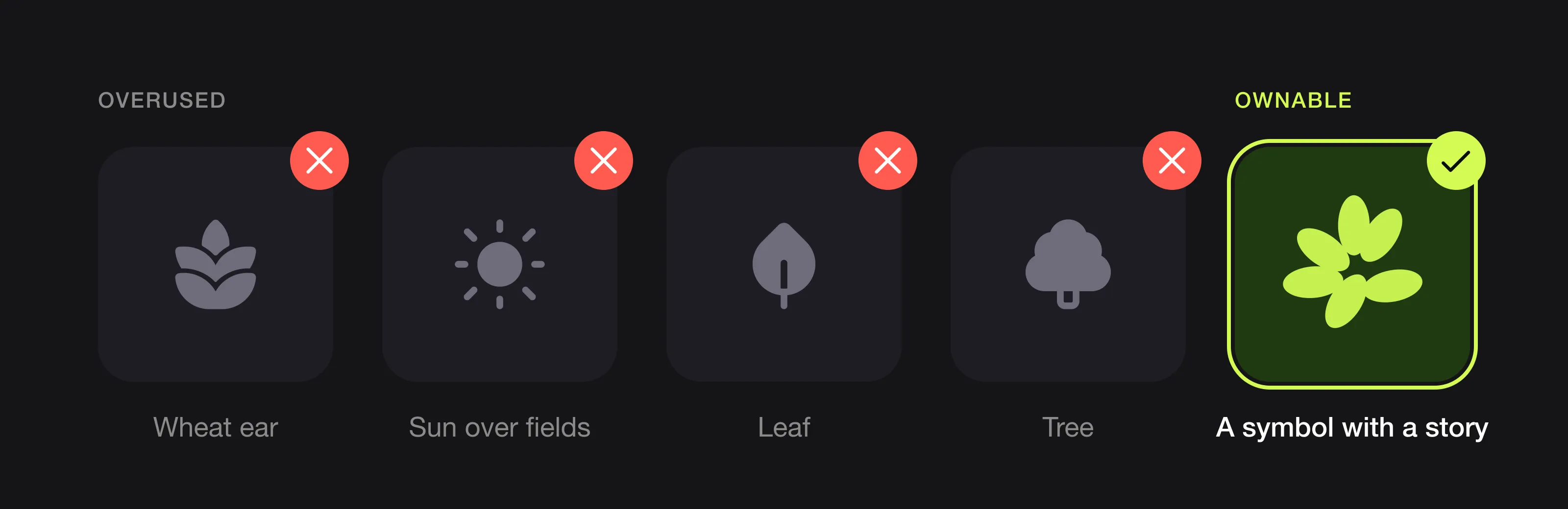 The symbols most farm and food brands use, and a symbol with a story instead (Cultiva, designed by Logomint).
What can you learn from John Deere, Oatly and Tony’s Chocolonely?
John Deere: simplify for the stencil
According to John Deere’s own logo history, the first deer logo appeared as early as 1873, and the company registered its first trademark in 1876 because of the threat of fraud. Later versions turned the deer into a smooth silhouette that was easier to stencil, then a straight-sided shape that was easy to draw. In 2000 the deer was shown leaping instead of landing for the first time. A logo printed on machines and rough surfaces lasts when it is simplified.
Oatly: let the packaging do the talking
Oatly’s 2015 redesign by Forsman & Bodenfors treated the carton as the brand’s main media channel, according to Fonts in Use, which quotes the creative director wanting packs that looked made “in the basement”. The headlines mix custom lettering and typefaces, and the wordmark has the same slightly irregular, hand-made feel. A food brand can feel warm and personal without wheat or leaves: the voice and lettering do the work.
Tony’s Chocolonely: put the story in the product
Tony’s Chocolonely bars are divided into unequal pieces. The company’s FAQ says this highlights that profits in the chocolate industry are unequally divided, and that the bottom of the bar depicts the West African coastline, with the pieces above standing for countries on the Gulf of Guinea. The wrappers use bold flat colours and large type. The origin story lives in the product, not in a cocoa-pod icon.
Logos we designed for farm, food and garden brands
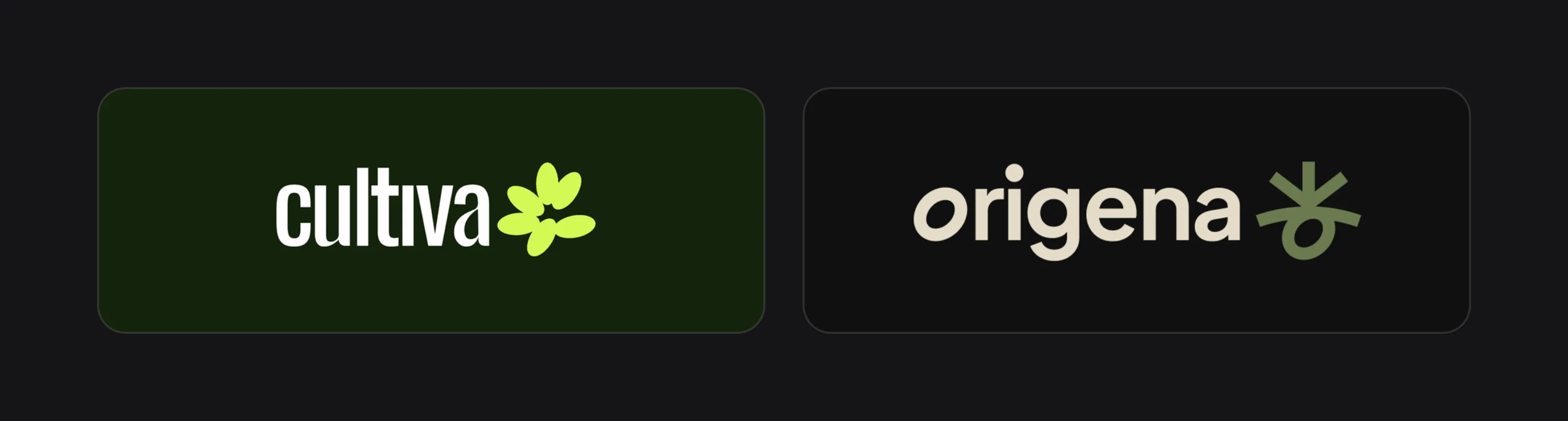 Cultiva and Origena.
Cultiva
Cultiva is an agricultural cooperative growing certified, sustainable cocoa. The symbol is a loose cluster of six rounded, oval leaves around a small open centre, more playful than a botanical leaf, beside a tall, condensed, bold wordmark whose “i” has no dot. The palette is a very dark forest green with a bright lime accent, plus a cocoa brown on some social posts. It feels modern rather than rustic, matching posters that speak of “l’Afrique contemporaine”. The mockups show the symbol painted on a building wall, used as a faint outline pattern behind posters, and inside a dark circle as the social avatar, where its chunky shapes stay readable. It is a leaf, but one with enough character and colour not to be mistaken for a certification seal.
Origena
Origena is a garden brand built around the idea of origin. Its symbol uses a cliché from the list above, a sprout, but it explains the name: a sprout reaching up, a seed curled below as an open loop, and a curved line of soil between them. The construction drawing shows every stroke built on the same width, which keeps it clean as an app icon, a favicon and the small mark on a staff badge. The palette is olive, terracotta, bone white and near-black, drawn from the ground rather than the leaf, with a lowercase soft geometric sans-serif wordmark. On the mockups the symbol appears oversized on a T-shirt, cropped on a tote bag reading “Grow from the origin”, and beside a billboard line, “Every sprout starts with an origin”. A sprout works when it has a reason to exist.
The agriculture logo checklist
- Readable when stamped or stencilled in one colour on kraft, jute or wood
- Recognisable as a 40-pixel avatar
- Doesn’t look like an organic, fair trade or sustainability seal
- Leaves room for the certification labels you need
- No generic wheat, barn, tractor or sun unless tied to your name or story
- Colours that stand out on the shelf, not picked from a psychology chart
- Sturdy type with no hairlines
- Vector and source files for packaging printers, sign makers and stamp makers
List these touchpoints when you brief a designer; our logo design brief template shows how. Printing plates and signs are expensive to replace, so aim for a logo that lasts.
FAQ
Should a farm logo have a plant or animal in it?
It doesn’t have to, and a generic wheat ear or cow makes you look like every other farm. Use one only if it is drawn distinctively or tied to your name, product or place.
What colours are best for an agriculture logo?
Colours that contrast with your competitors and with the green certification labels on your packs. Earthy tones such as soil brown, terracotta or wheat yellow feel agricultural without blending in.
Can I put my organic or fair trade label inside my logo?
No. Certification marks have their own rules on size, colour and clear space, and the Rainforest Alliance says its seal must never be confused with a brand name. Keep them separate and design your logo to sit beside them.
Should a food brand logo look rustic or modern?
It depends on who buys from you. Rustic suits small, local producers; modern suits brands selling to retailers or exporters. Many brands use a clean logo and let packaging and photography add the warmth.
Sources
Checked on 15 October 2026.
- European Commission, The organic logo (mandatory use, minimum size, code number and place of farming)
- Fairtrade Max Havelaar, 10 golden rules for packaging approvals (August 2025: clear space, minimum width, size relative to other labels)
- Rainforest Alliance, Sustainable Agriculture Seal Guidelines, version 3.2 (placement, exclusion zone, minimum size)
- John Deere, Trademarks: the evolution of our logo
- Fonts in Use, Oatly packaging (2015)
- Tony’s Chocolonely, FAQs (unequally divided bar, map of West Africa)
The bottom line
A good agriculture logo is not a picture of a field. It is a simple, sturdy mark that tells people where your food comes from, prints cleanly on a sack or a stamp, and stays clearly yours next to the labels on the pack.
At Logomint, a senior designer creates your custom logo from €129, with first concepts in 48 hours and a 100% money-back guarantee. See the plans and pick the one that fits.