Brand identity · Garden brand
Origena
How Logomint designed the brand identity for Origena, a garden brand rooted in origin: logo, palette, typography, signage, apparel and social ads.
- Client
- Origena
- Industry
- Garden brand
- Year
- 2026
About the project
Most garden brands go one of two ways: sterile big-box retail, or hand-lettered cottagecore. Origena sits between them. The name comes from origin: the belief that growing things is less about buying a plant and more about understanding where it came from and what it needs next.
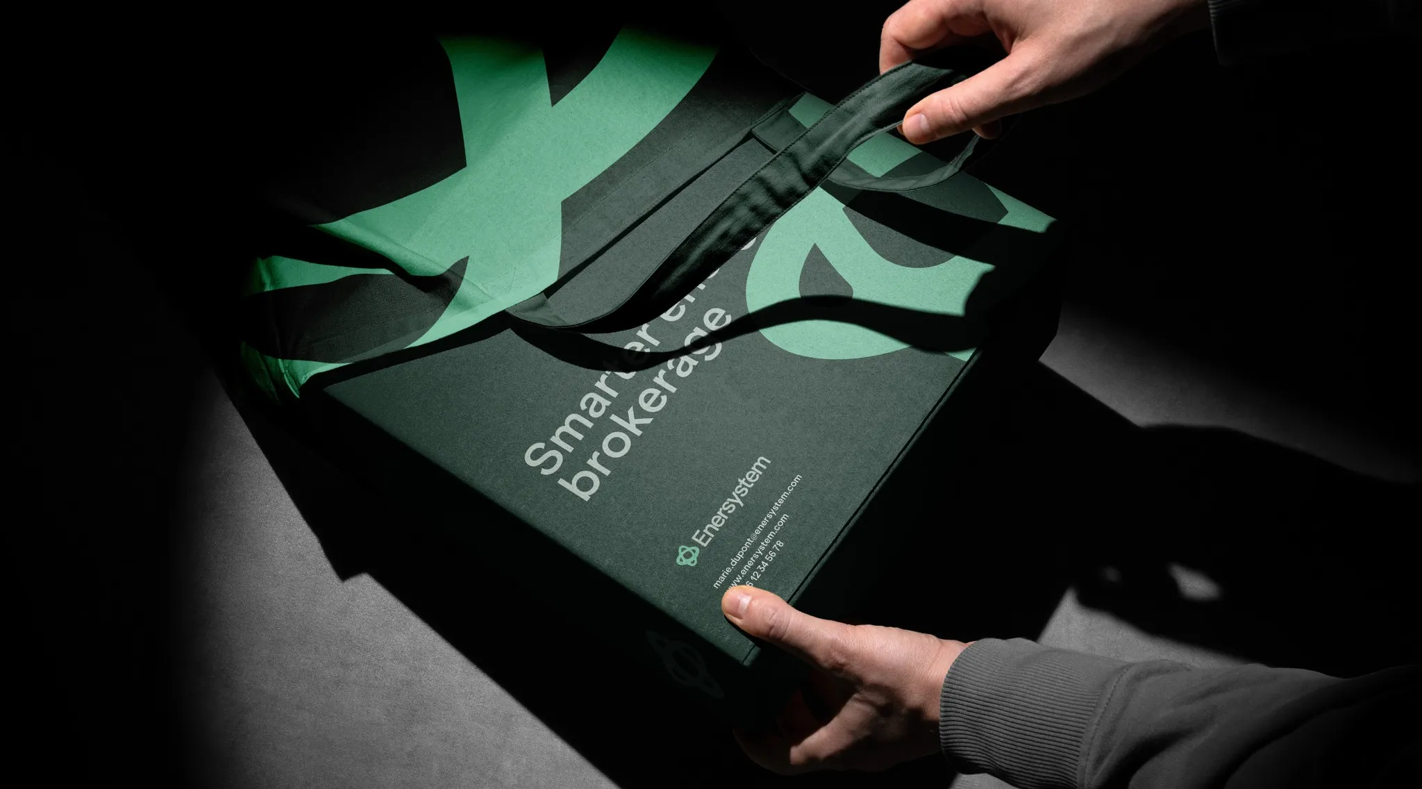
The symbol is the whole idea compressed: a sprout reaching up, a seed curled below, and the horizon line of soil between them. It works as a standalone mark, an oversized graphic device on apparel and tote bags, and a cropping element across signage.
The palette pulls from the ground rather than the leaf: olive, terracotta and a warm bone white, anchored by near-black for contrast in retail environments. Typography is a soft geometric sans: approachable enough for a weekend browser, confident enough to hold a billboard.