Short answer A restaurant logo has to work in very different places: a sign read from across the street, a menu read by candlelight, a square tile in a delivery app and a cup in someone’s hand. The best ones are simple, have a square version for apps and social media, and say something about the food and the mood rather than just “restaurant”. Skip the fork and knife, the chef’s hat and the steaming bowl. And plan your door and window for the hygiene rating you may have to display.
What should a restaurant logo make people feel?
People choose where to eat with their phone in hand. In a 2024 Narrative Research survey, 71% of Canadians said they always, often or sometimes look at a restaurant’s menu before a first visit, and in BrightLocal’s 2026 survey, 97% of US consumers said they read reviews for local businesses. Your logo is often the first thing they see: on a Google Maps listing, an Instagram profile or a delivery app.
It has one job there: to set the right expectation. Three things matter:
- The mood. Fine dining, neighbourhood bistro, family pizzeria or late-night takeaway: people should guess the price and the atmosphere before they read the menu.
- The food. A good restaurant brand hints at what you cook and how, without drawing a plate on it.
- Memorability. People need to find you again in a list of 40 places nearby.
| Type | Feel | Logo direction |
|---|---|---|
| Fine dining | Quiet, confident | A refined wordmark, lots of space, one colour |
| Bistro or café | Warm, local | Friendly type, a small signature detail, a warm palette |
| Fast casual | Quick, fresh | Bold type, a bright colour, a simple symbol for packaging |
| Takeaway and delivery | Easy to spot | A strong square mark that reads in a small app tile |
| Food truck | Playful, visible | Big shapes and colour that work from 20 metres away |
Where does a restaurant logo have to work?
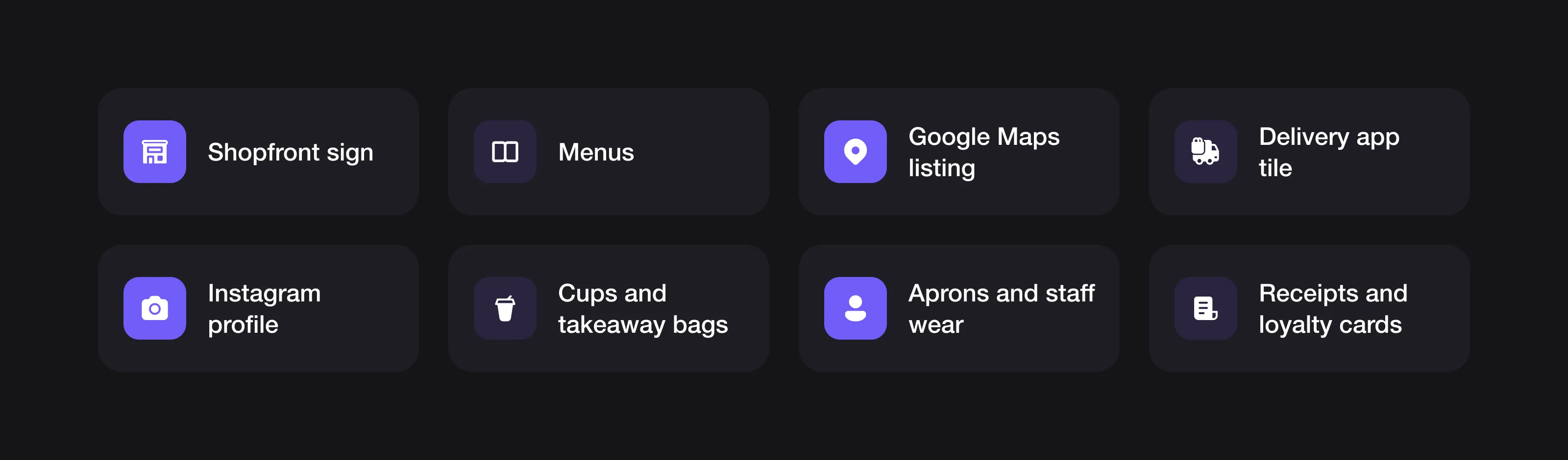 A restaurant logo works far beyond the sign above the door.
- The shopfront. Read from across the street, at night, often lit from above or behind. Fine detail disappears.
- Menus. Printed, laminated, chalked or on a QR page. Physical menus are far from gone: in a 2024 TouchBistro survey with The Harris Poll, 74% of US diners said they still prefer viewing a physical menu and ordering from a server.
- Delivery apps. DoorDash asks for a square store logo of at least 230 x 230 pixels. Deliveroo advises restaurants to avoid “large logos” in the hero photo on their page. On these apps, your logo is a small tile next to your food photos.
- Google and social media. Google Business Profile recommends photos of 720 x 720 pixels. On Google, Instagram and Facebook your logo usually shows as a small square or circle.
- Packaging. Cups, boxes, bags, stickers and napkins, often printed in one colour, on kraft paper, cheaply.
- Staff wear. Aprons, T-shirts and caps, usually embroidered or screen-printed.
So you need at least three versions: a full logo for the sign and menu, a square mark for apps and social media, and a one-colour version for packaging and stamps. Our logo sizes guide lists the dimensions for each platform.
What rules affect a restaurant’s front door and menu?
Your logo itself isn’t regulated, but what goes next to it on your door, window and menu sometimes is.
- Food hygiene ratings (UK). In Wales, food businesses have been legally required since November 2013 to display their rating in a prominent place, such as the front door, entrance or window. In Northern Ireland, it has been required since October 2016, at or near each customer entrance. In England, display is voluntary.
- Letter grades (New York City). Since 2010, New York City restaurants have had to post their inspection letter grade where it can easily be seen by people passing by.
- Calorie labelling. In England, businesses with 250 or more employees must show calories on menus since 6 April 2022. In the US, chains with 20 or more locations have had to follow the FDA’s menu labelling rule since 7 May 2018.
The lesson for your design: plan the door and window as a whole, so your logo, opening hours and required stickers sit together cleanly, and leave room on your menu layout for any information you must show. This guide isn’t legal advice; your local authority is the reference.
What colours work for a restaurant logo?
Colour sets the price point before anyone reads a word.
- Red, orange and yellow feel fast, warm and hungry. They’re also what most fast-food chains use, so they’re hard to own.
- Deep greens, browns and creams feel natural and local, and suit cafés, bakeries and farm-to-table restaurants.
- Black, white and one accent feels confident and premium, and suits fine dining and cocktail bars.
Two practical checks: does the logo still work in one colour on a kraft paper bag, and does it stand out in a delivery app full of red and yellow tiles? See our guide on how to choose logo colours.
Which fonts suit a restaurant?
- Serifs feel classic and crafted: bistros, wine bars, bakeries and fine dining.
- Geometric and grotesque sans serifs feel modern and clean: fast casual, coffee shops, delivery-first brands.
- Scripts and hand-lettering can feel warm and personal, but only if they stay readable on a sign at night and in a small app tile. Many restaurants use a script for the name and a simple sans for everything else.
Whatever you choose, test it on a menu at the size your guests will read it, in the light they’ll read it in.
What should a restaurant logo avoid?
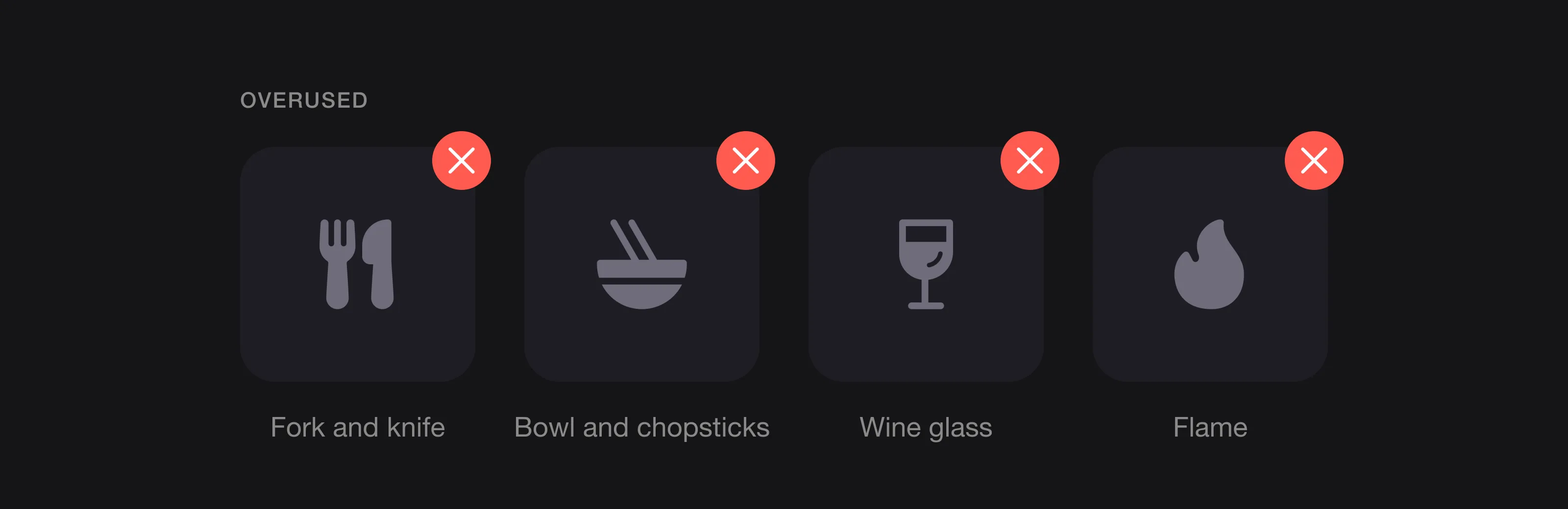 The symbols every restaurant reaches for.
- Forks, knives, plates and chef’s hats. They say “restaurant”, which your sign already does. They don’t say which restaurant.
- Steaming bowls, flames and wine glasses. Generic, and they fill in at small sizes.
- Too many details. A full illustration of your building, a mascot and a tagline won’t survive a delivery app tile.
- Fonts that copy a cuisine cliché. “Chopstick” lettering, “Mexican” fiesta fonts and “Italian” scripts can look like parody, or worse.
- Tiny text inside the logo. “Est. 2024” and “Fine food and drinks” disappear on a cup.
More patterns to avoid in our logo red flags.
What can you learn from Burger King, Dunkin’ and Pizza Hut?
Dunkin’ (2019). Dunkin’ Donuts shortened its name to “Dunkin’”, keeping its pink and orange colours and its familiar font. The company worked with Jones Knowles Ritchie, BBDO New York and Arc Worldwide. The lesson: you can change a name and keep recognition if the colours and type stay.
Burger King (2021). Burger King’s first complete rebrand in over 20 years introduced a simpler logo and a custom font called Flame, described as a more modern, digital-friendly design language. The agency Jones Knowles Ritchie created it. The lesson: a logo designed for small screens and packaging can still draw on the brand’s history.
Pizza Hut (2019). Pizza Hut brought back the red-roof logo it used from 1967 to 1999, as part of a return to its roots as the first national pizza chain. The lesson: an old logo customers remember can be an asset worth bringing back.
What they share: simpler shapes, bolder colours and logos that work on an app icon as well as on a building.
How can a small restaurant build a brand on a budget?
- Start with the logo system, not just one logo: a full version, a square mark and a one-colour version.
- Use one stamp for packaging. A one-colour stamp on kraft bags, boxes and cups costs far less than custom printing and looks deliberate.
- Make your menu the brand. The same fonts, colours and tone on the menu, the website and Instagram do more than any symbol.
- Photograph the food well. On delivery apps and Google, photos do most of the selling, and your logo frames them.
For more ideas, see startup branding on a budget. If you also sell packaged food, our guide to agriculture and food logos covers labels and packs.
Restaurant logo checklist
- One clear idea that says something about your food or mood, with no fork, knife or chef’s hat
- A full logo, a square mark and a one-colour version
- Readable on a lit sign at night and in a delivery app tile
- Works printed in one colour on kraft paper, cups and stamps
- Fonts tested on a real menu, at real size
- A door and window layout with room for your hygiene rating or grade card, if required
- Vector source files for sign makers, printers and packaging suppliers
FAQ
What makes a good restaurant logo?
A good restaurant logo is simple, sets the right mood and price point, and works everywhere: on a sign, a menu, a cup and a small square in a delivery app. It avoids generic symbols like forks, knives and chef’s hats.
What size should a restaurant logo be for delivery apps?
Delivery apps use a small square logo. DoorDash, for example, asks for a square store logo of at least 230 x 230 pixels. Prepare a square version of your logo at a much higher resolution, such as 1200 x 1200 pixels, so it stays sharp everywhere.
Should a restaurant logo show food?
Usually not literally. A fork, a pizza slice or a steaming bowl tells people you serve food, which they already know. A detail inspired by your cuisine, your neighbourhood or your story is more memorable.
What colours are best for a restaurant logo?
Red, orange and yellow feel fast and warm but are common in fast food. Greens, browns and creams feel natural and local, and black with one accent feels premium. Choose the colour that matches your price point and stands out locally.
How much does a restaurant logo cost?
From around €130 for a custom logo from a design service to several thousand euros with an agency. A starter brand with guidelines, stationery and a social media kit costs about €300 to €1,500 from a design service; see how much a brand identity costs, or try our logo cost calculator.
Sources
Checked on 28 October 2026.
- Narrative Research, Canadians and restaurant menus (April 2024)
- BrightLocal, Local Consumer Review Survey 2026
- TouchBistro, Diner trends report (with The Harris Poll, 2024)
- DoorDash Merchant Help, Common photo issues explained
- Deliveroo Help, Sending in your own images as a restaurant
- Google Business Profile Help, Photo guidelines
- GOV.UK, Food hygiene rating scheme; legislation.gov.uk, Food Hygiene Rating (Wales) Regulations 2013 and Food Hygiene Rating Regulations (Northern Ireland) 2016
- NYC Health, Letter grading for restaurants
- GOV.UK, Calorie labelling in the out of home sector: implementation guidance; FDA, Menu labeling requirements
- Dunkin’, Dunkin’ Donuts announces new brand identity (September 2018)
- Burger King, Burger King evolves visual brand identity (January 2021); Jones Knowles Ritchie, Burger King
- Restaurant Dive, Pizza Hut brings back iconic red roof logo (June 2019)
The bottom line
People decide where to eat in seconds, on a phone or from the pavement. Give them a logo that sets the mood, reads on a lit sign and in a tiny app tile, prints in one colour on a paper bag and skips the fork and knife. Plan your door, window and menu around it, and every touchpoint will look like the same place.
At Logomint, a senior designer creates your custom logo from €129, with first concepts in 48 hours, all source files and a 100% money-back guarantee. See the plans.