Short answer A consulting logo has one job above all: to make a corporate buyer feel safe putting your name in front of their boss. That means restraint, excellent type and a mark that looks right on a proposal cover, a LinkedIn page and an email signature. The firms that stand out skip the globes, swooshes and handshakes and own one simple, confident idea instead.
What do clients need to feel from a consulting logo?
Professional services are bought on trust before they’re bought on price. A procurement lead or a managing director usually meets you through a forwarded deck, a LinkedIn profile or an email, often before any call. Your logo is part of the evidence they use to decide whether you’re a serious firm or a side project.
Three feelings matter most:
- Credibility. You look like you’ve done this before, for companies like theirs.
- Clarity. Your thinking is sharp. A cluttered logo suggests cluttered advice.
- Discretion. Your brand won’t embarrass them when they share your report internally.
Notice what’s missing: excitement. A professional services logo needs to be noticed by the right people and then trusted. Distinctive, yes. Loud, rarely.
Where does a professional services logo actually have to work?
Most consultancies will never see their logo on a billboard. The touchpoints that win work are quieter and smaller:
| Touchpoint | Challenge | What it needs |
|---|---|---|
| Proposals and pitch decks | Sits on every slide, often next to the client’s own logo | A compact horizontal version that looks calm and balanced in a corner |
| LinkedIn company page | Shown as a small square image on your page and beside your posts | A square mark that reads at thumbnail size |
| Email signatures | Displayed very small, and images don’t always load | A simple, high-contrast mark that also works as plain text |
| Reports and letterheads | Printed, scanned and photocopied in black | A one-colour version with sturdy type |
| Office door or co-working sign | Often a small plaque among many | Clear lettering, no fine detail |
LinkedIn’s own specifications recommend a company page logo of 400 x 400 pixels, with a minimum of 268 x 268. A long horizontal firm name won’t fit that square, so a wordmark needs a square version first.
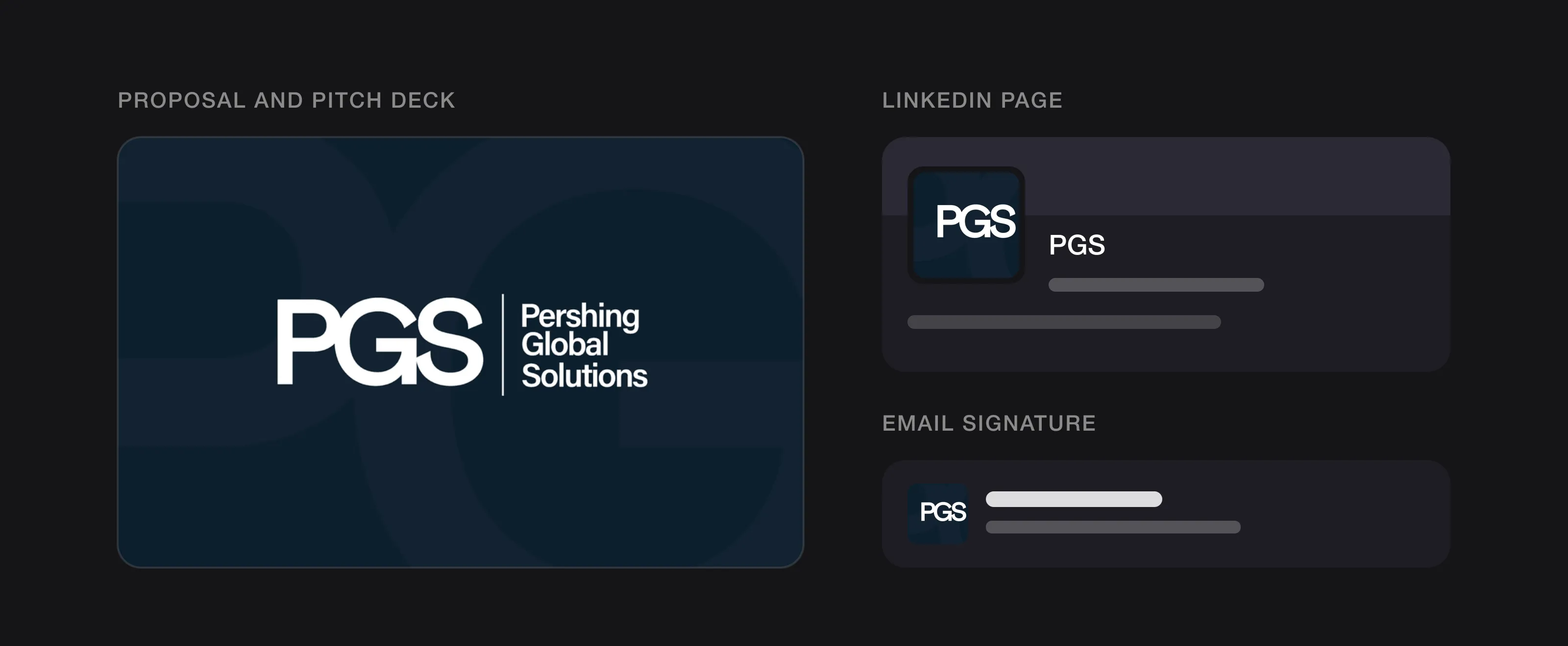 Where a consulting logo actually lives: the deck, LinkedIn and every email (PGS, designed by Logomint).
Should a consulting logo use the founder’s name or an invented one?
Founder-name firms (Smith & Partners, Laurent Conseil) borrow the credibility of a person. They suit law firms, accountants and boutique advisers whose clients are really buying one or two people. The risk is that the name feels small if the firm grows past its founder, or awkward if a partner leaves.
Invented or descriptive names (a coined word, a place, an idea) scale better and are easier to own. They need the logo to do more work, because the name carries no built-in reputation.
Either way, long names create a design problem. “Pershing Global Solution” or “Henderson, Clarke & Associates” won’t sit in a 40-pixel square. That’s where monograms come in.
Are monograms and initials a good idea for a consulting firm?
Often, yes. Initials are the natural shorthand for professional services: clients already say “KPMG”, not the full partnership name. KPMG’s own history describes the firm’s 1987 merger as resulting in the formation of Klynveld Peat Marwick Goerdeler, four surnames that most people now only know as four letters.
A monogram works when:
- The letters are drawn, not typed. Kerning, weight and the way letters meet should be adjusted by hand so the group reads as one shape.
- It has a full-name partner. Use the monogram for avatars and favicons, and the full name wherever people meet you for the first time.
- The initials are easy to say. Three letters that form an awkward sound will never stick.
Skip the laurel wreath or shield around the initials. That’s the look of a template.
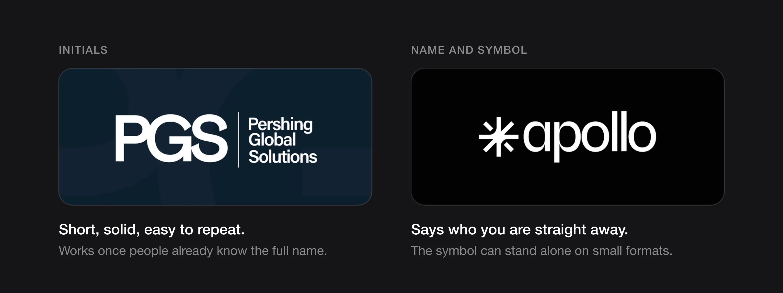 Initials or a full name with a symbol: two good routes for a firm (PGS and Apollo Studio, designed by Logomint).
What colours work best for a consulting logo?
Navy, charcoal and black dominate professional services for practical reasons: they look composed on a white document, they print well in one colour and they never clash with a client’s brand on a co-branded slide.
That’s also why they rarely help you stand out. Ask three questions instead:
- What will sit next to your logo? A muted, dark base with one accent colour sits more easily beside client logos than a bright primary.
- Does it survive a black-and-white printer? If your logo depends on colour to make sense, it fails on a scanned report.
- Can the accent carry the brand? A neutral logo plus one recognisable accent used across decks and reports can do more for recognition than the logo itself.
Our guide on how to choose logo colours walks through the process step by step.
Which fonts suit a consulting or professional services brand?
For a firm whose product is advice, typography is most of the brand.
- Clean grotesque or neo-grotesque sans serifs suit strategy, technology and B2B consultancies. They look current on screens and stay neutral next to clients’ logos.
- Sturdy serifs suit law, accounting and wealth advisory firms that want to signal heritage. Choose ones with solid strokes; delicate, high-contrast serifs break down in email signatures.
- A sans and a serif together is a strong option: a sans for the logo and headings, a serif for emphasis or pull quotes, giving warmth without losing precision.
Avoid scripts and novelty display faces. Your logo has to look right on a 40-page audit report.
What should a consulting logo avoid?
Professional services has its own tired symbols, each trying to say “global”, “growth” or “partnership”.
- Globes and world maps. Every second consultancy claims to be global. A globe says nothing about how you think.
- Swooshes and orbiting rings. They suggest motion and dynamism, but they come straight out of logo-generator libraries.
- Abstract arrows and chevrons. “Forward”, “growth”, “progress”. Your competitors have the same arrow.
- Handshakes and interlocking people. Partnership drawn literally. It reads as clip art and falls apart at small sizes.
- Puzzle pieces, lightbulbs and chess pieces. Visual puns for “solutions”, “ideas” and “strategy” that clients have seen hundreds of times.
If a buyer could swap your logo with a competitor’s without noticing, it isn’t helping you win work. Our list of logo red flags covers more of the patterns that quietly undermine trust.
How can a small firm look established?
A two-person consultancy pitching to a multinational needs to look like it belongs in the room. Consistency matters as much as the logo.
- Keep the logo simple. Large firms tend to have restrained marks. Fussy logos with gradients and multiple symbols read as small.
- Build a system, not just a logo. A horizontal lockup, a stacked version and a monogram, used the same way every time, signal a firm with standards.
- Template everything. A proposal template, a slide master and a matching email signature do more for perceived size than any symbol.
For more on getting this right without an agency budget, see how to build a brand identity on a startup budget.
Should each service line or practice get its own logo?
Usually not. Separate logos for “Advisory”, “Digital” and “Training” fragment your brand, and one strong brand looks bigger than five weak ones. Use a masterbrand instead: one logo, with the service line set as a descriptor in the brand typeface. Create a true sub-brand only when a practice sells to a different audience under its own name, and even then keep shared type, colour or a shared symbol.
What can you learn from McKinsey, Deloitte, Accenture and KPMG?
McKinsey & Company. McKinsey’s 2019 identity, created with Wolff Olins, didn’t throw the old logo away. The agency says it evolved the famous McKinsey logo to give it a more modern character and introduced a new typeface, Bower, named after partner Marvin Bower. Consultancy.uk reported that there was not a world of difference between the old and new logos, save being on two lines rather than one, with a deeper blue. For a founder-name firm whose name is its reputation, refining a serif wordmark rather than reinventing it makes sense.
Deloitte. Deloitte rebranded in 2003, and its own account explains that the team wanted a wordmark but felt it needed something more. The solution was a dot at the end of the name. It was first fuchsia; yellow, orange and light bronze were also tried before green won. The firm kept its full name even though, as the same page notes, acronyms dominated branding at the time. It shows how one small, ownable detail can turn a plain wordmark into a recognisable masterbrand.
Accenture. When Andersen Consulting renamed itself Accenture for 1 January 2001, the new wordmark was announced as the name in lowercase letters accented with the “greater than” sign, which the CEO said illustrated the firm’s intention to “point the way forward”. The “>” still sits above the “t” today, now in purple. The lesson: even an arrow can be ownable when it’s tied to the name’s own story rather than added as decoration.
KPMG. The clearest case of initials replacing a long founder name: four surnames became four letters, set as a bold wordmark. Clients will shorten your name anyway, so design the short version well.
Logos we designed for consulting and B2B studios
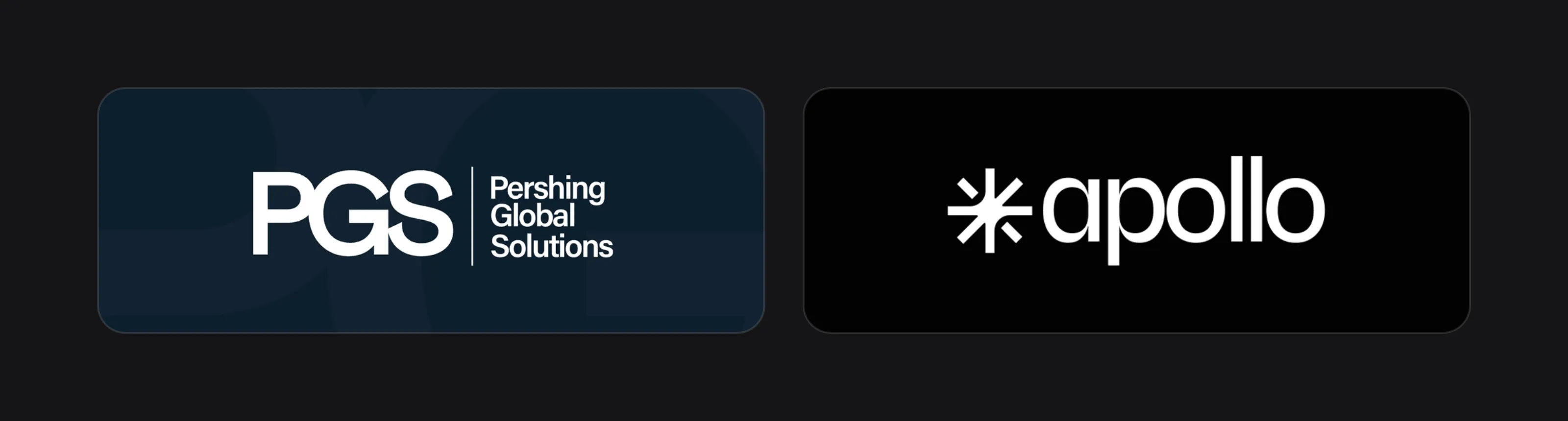 PGS and Apollo Studio.
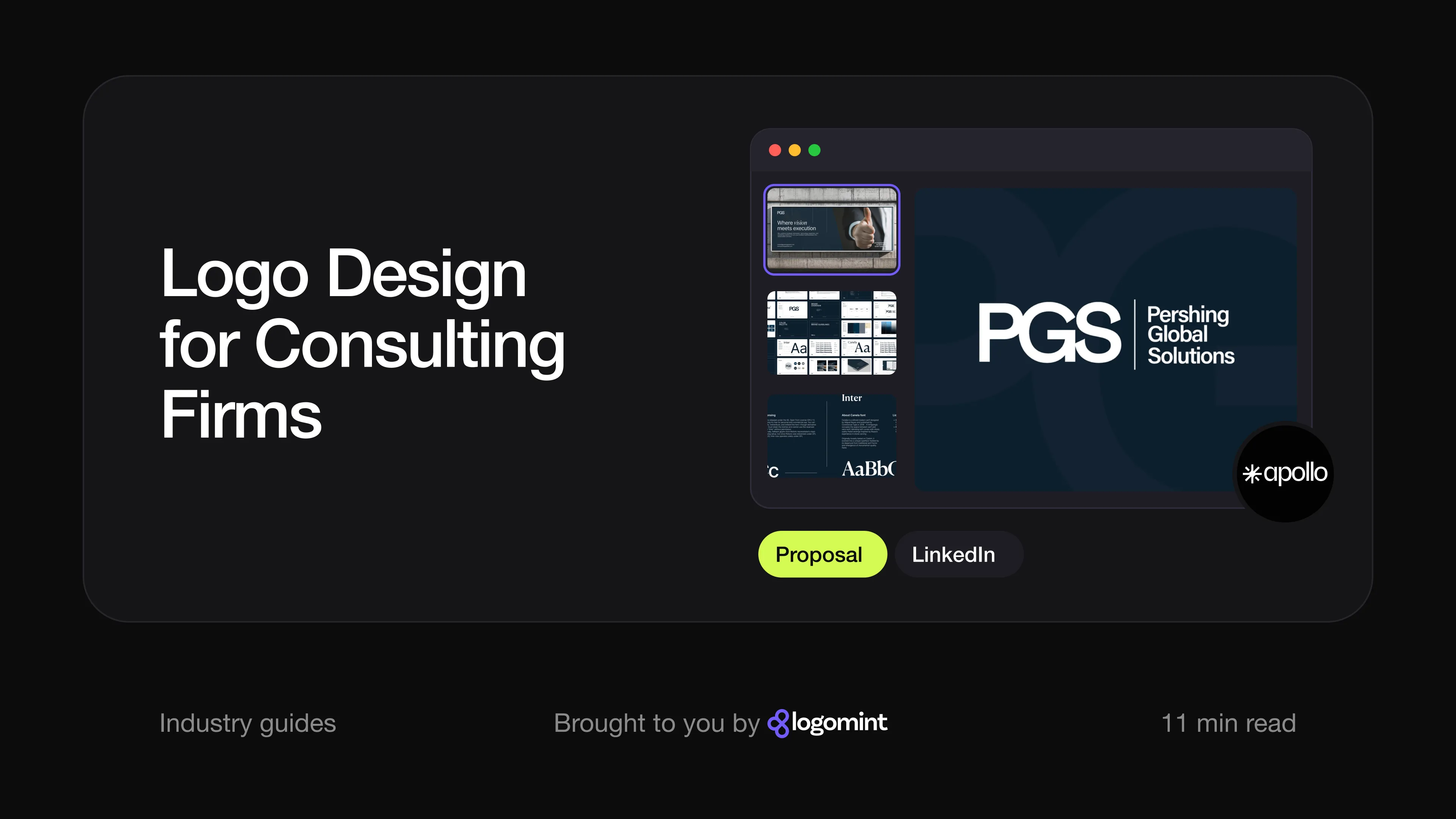
Pershing Global Solution (PGS), a technology consulting studio. PGS works on technology from AI systems to robotics, yet the identity looks composed rather than futuristic. There’s no globe, circuit or swoosh: the logo is a heavy, tightly spaced “PGS” monogram in a grotesque sans serif, with the letters set so close they read as one block. In the primary lockup it sits beside the full name, stacked on three lines and separated by a thin vertical rule. Four versions (horizontal, stacked, name only and monogram only) plus a circular monogram in six colourways cover avatars and favicons. The palette is gunmetal, Prussian blue, steel blue, a light oatmeal and white, a deliberately quiet set that looks at home on a proposal. Typography pairs Inter with the serif Canela, which appears in italics in the line “Where vision meets execution”. On the mockups the monogram works as a browser-tab icon, a small chest mark on a T-shirt and cropped large across a notebook cover. See the PGS case study.
Apollo Studio, a product design partner for tech companies. Apollo shows the other route: a symbol plus a wordmark. The wordmark is a lowercase “apollo” in a clean sans serif; the brand typeface shown in the identity is Bricolage Grotesque. The symbol is a star built from radiating arms, but the details stop it from being a generic asterisk: two diagonal arms are detached into short bars, and curved cuts at the centre form what the construction sheet calls “a subtle circular void”. The palette pairs two blues with a near-black dark blue and an orange accent. The symbol carries much of the brand on its own: in a blue circle as the social media avatar, cropped large on posts and on the guidelines book, while the full lockup runs on ID badges, business cards and vertically down the back of a T-shirt. See the Apollo Studio case study.
Consulting logo checklist
- One clear idea, with no globes, swooshes, arrows or handshakes
- Type you’d be happy to see on a 40-page report
- A square version (monogram or symbol) that reads at LinkedIn avatar size
- A compact horizontal version for slide corners and email signatures
- A one-colour version that survives printing and scanning
- A colour palette that sits calmly next to clients’ logos
- A plan for service lines: descriptors under one masterbrand
- Vector source files for print, signage and slide templates
- A design restrained enough to last ten years (see what makes a logo timeless)
FAQ
What makes a good consulting logo?
A good consulting logo is simple, uses strong typography and avoids generic symbols like globes and arrows. It should look credible on a proposal cover and still read clearly as a small LinkedIn avatar.
Should my consulting firm logo use my name?
If clients are buying you personally, a founder-name wordmark can work well. If you plan to grow beyond yourself or sell the firm one day, an invented or descriptive name is usually easier to scale.
Is a monogram a good logo for a professional services firm?
Yes, especially if your full name is long. Pair the monogram with a full-name lockup, and make sure the letters are adjusted by a designer so they read as one shape.
What colour should a consulting logo be?
Navy, charcoal and black are common because they look composed and print well. Choose one distinctive accent colour to help you stand out, and make sure the logo works in a single colour.
Sources
Checked on 15 October 2026.
- LinkedIn Help, Image specifications for your LinkedIn Pages and Career Pages
- KPMG, Our history (1987 merger, Klynveld Peat Marwick Goerdeler)
- Wolff Olins, McKinsey & Company (2019 identity, Bower typeface)
- Consultancy.uk, McKinsey & Company launches new visual identity (March 2019)
- Deloitte, Becoming the Green Dot (2003 rebrand)
- Daily Research News Online, New Name and Biggest Ever B2B Rebranding Campaign for Andersen Consulting (November 2000)
The bottom line
Consulting clients buy confidence, and your logo is one of the first places they look for it. Keep it restrained, invest in type, design a square version for LinkedIn and email, and skip the globes and swooshes your competitors already use. A small firm with a clear, consistent identity can look every bit as established as a large one.
At Logomint, a senior designer creates your custom logo from €129, with first concepts in 48 hours, all source files and a 100% money-back guarantee. See the plans.