Short answer A real estate logo has to be read in a few seconds from a passing car, survive as a tiny badge on a listing portal, and look trustworthy on a contract. That means a short, legible name, high contrast, a simple shape that works in one colour, and a style that matches your market, luxury or mass-market. Avoid the generic roofline unless you can make it yours.
What should a real estate logo make people feel?
Buying or selling a home is one of the biggest financial decisions most people make, and letting someone in to fix the boiler is a matter of trust. Whether you are an agency, a developer, a property manager or a home-service company, the logo has three jobs:
- Trust. People are handing you their keys, their savings or their home. The logo should look established and careful, not improvised.
- Local presence. Most of these businesses win on their patch. The logo has to be remembered after one sighting on a board or a van.
- The right price signal. A boutique agency selling villas and a high-volume lettings agent need different signals. Get this wrong and you attract the wrong clients.
Where does a real estate logo actually have to work?
Design for the hardest uses first. In this industry, that is rarely the website header.
- Yard signs and “for sale” boards. Read from a moving car, often for two or three seconds. Thin lines, small type and low contrast disappear.
- Listing portals and avatars. Your logo often appears as a small agency badge on a listing card, sometimes cropped to a square. Social, messaging and map profiles crop it to an even smaller circle.
- Windows and brochures. The logo sits next to large property photos and has to hold its own without fighting them.
- Vehicle wraps. For home-service companies the van is the biggest ad they own: seen in traffic, at angles, on panels broken by handles and wheel arches.
- Uniforms. Embroidered polos, caps and hi-vis vests. Fine detail fills in with thread, and gradients are not an option.
- Contracts and invoices. Small, often printed in black and white.
A practical test: print your logo at board size and look at it from across the road, then shrink it to a 40-pixel circle on your phone. If it fails either test, simplify it. You will also need the right files for sign makers and wrap printers; see which logo file formats you need.
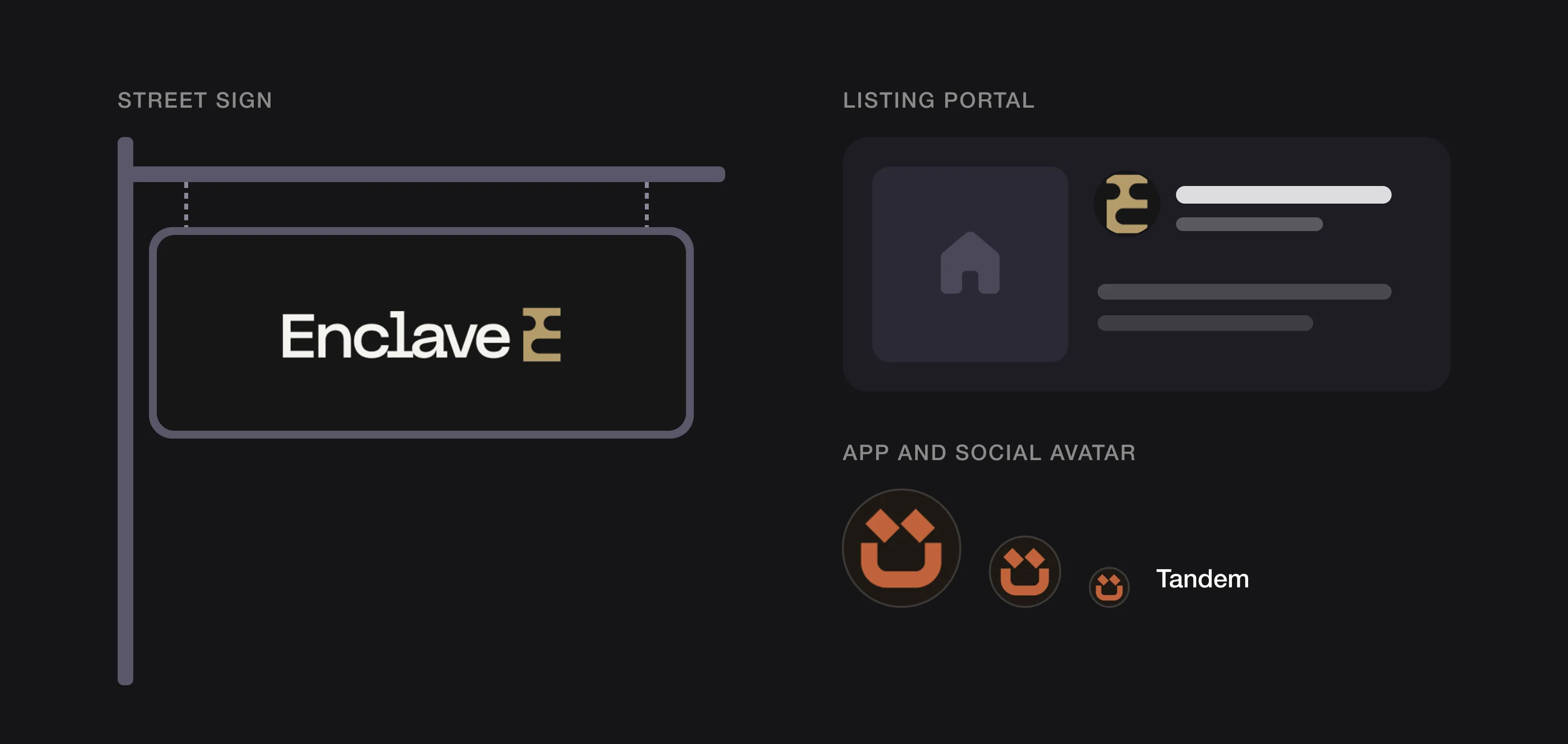 A real estate logo has to work on a street sign and as a tiny avatar (Enclave and Tandem, designed by Logomint).
What colours work best for a real estate logo?
No colour “means” real estate, whatever colour-psychology charts claim. What matters is contrast, distinctiveness in your market and how the colour reproduces on boards, vinyl and thread.
- Check the street first. Note the colours on competitors’ boards in your area. If every agency uses navy and white, a navy board is invisible.
- Contrast beats subtlety. Boards are read at distance and in bad light. Dark on light or light on dark works; mid-tone on mid-tone does not.
- Luxury usually means restraint. High-end agencies tend to use black, off-white and one muted accent such as gold or deep green. Mass-market brands can go brighter because their job is to be seen.
- Home services can be warmer. A warm, friendly colour often suits a company that visits people’s homes better than cold corporate blue, and it makes a van easy to spot.
- Plan for one colour. Embroidery, cut vinyl and black-and-white contracts all need a single-colour version.
Our guide on how to choose logo colours walks through the process.
Which fonts suit a real estate or home-services brand?
Legibility comes first. A name that is hard to read on a board costs you calls.
- For boards and vans, choose letters with open shapes, clear spacing and a sturdy weight. Very thin strokes blur at distance.
- For luxury agencies, a refined serif or a wide, calm sans-serif with generous spacing signals care. Keep hairline details out of the board version.
- For mass-market agencies and home services, a confident, friendly sans-serif works well. Rounded or geometric shapes feel approachable without looking childish.
- Keep the name short on the sign. “Smith & Partners Residential Property Consultants” probably only needs “Smith & Partners” on the board.
Keep the phone number out of the logo. It belongs on the sign layout, set large on its own line.
Should a real estate logo have a symbol?
It is not compulsory, but in real estate a symbol earns its place more often than in many industries, because so many uses are tiny: portal badges, avatars, app icons and embroidered chest logos. A compact symbol or monogram fills those spaces better than a long name squeezed into a circle.
A wordmark alone works when the name is short and distinctive, as Compass shows below. Either way, ask for a horizontal version for vans and boards, a stacked version, and a symbol or monogram for avatars.
Agent brands vs agency brands
Many agents want a personal brand; many agencies want their agents to look like one team. Both work with a clear hierarchy. An agency logo should sit comfortably next to agent names, photos and signatures. An agent’s personal brand works best as a simple name-based wordmark or monogram that sits beside the agency mark rather than competing with it, and it travels with you if you go independent later. If you work under a franchise, check its brand rules before commissioning anything.
What should a real estate logo avoid?
The biggest problem in this industry is the cliché. Rooflines, house outlines, keys, front doors, chimneys, skylines and swooshes over a roof appear in so many logos that they no longer say anything about you. For home services, the wrench crossed with a house is the equivalent. Cover the name and ask: could this belong to any of the fifty agencies in town? If yes, it is not doing its job.
A house isn’t forbidden, though. There are three ways to handle it:
- Tie it to your name or story, like a house built from shapes that explain the name, or a real building with a history, as Engel & Völkers does.
- Reduce it to one detail, such as a single distinctive angle, rather than a clip-art house.
- Leave it out. The board and the listing already tell people you sell houses. A letter, monogram or abstract mark is often more memorable.
Also avoid fine detail and gradients that vanish on boards and embroidery, long names in script fonts that are unreadable from a car, and copying the market leader, which makes you look like its cheaper version. More on that in why a logo can look cheap.
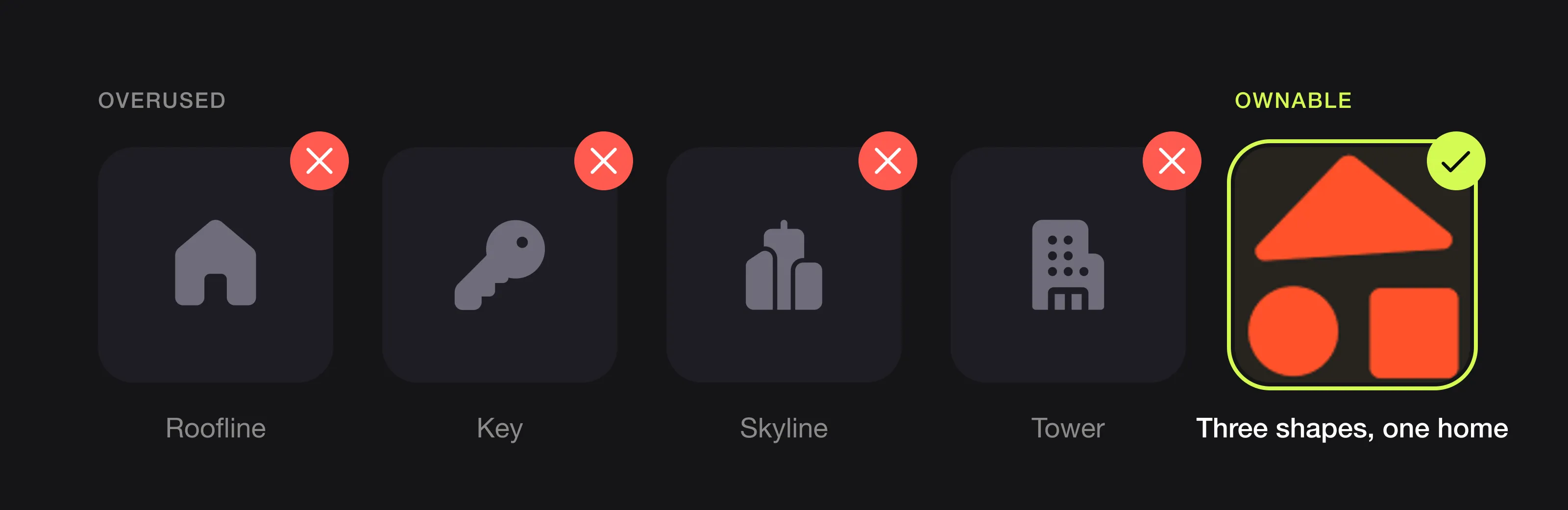 The symbols most agencies use, and a house that has a reason to exist (Trio, designed by Logomint).
What can you learn from RE/MAX, Compass and Engel & Völkers?
RE/MAX: own a pattern on the sign
According to the RE/MAX brand identity manual, the founders first created a red-over-white-over-blue property sign design. In 1978 the red, white and blue hot-air balloon made its first flight at the Albuquerque International Balloon Fiesta, and the following year it became the official logo, after being rejected the first time franchisees proposed it. A colour pattern on a sign became the brand, and the symbol is not a house at all. In 2025 RE/MAX introduced a simpler, “digital-first” balloon for social media and digital ads. Agent reactions were mixed, but the company’s survey found 78% recognised the new balloon without the wordmark. Even an iconic mark eventually had to work at small sizes.
Compass: one idea inside a wordmark
Compass, founded in New York City in 2012, uses an uppercase sans-serif wordmark with no house in sight. Creative Bloq reports that the company designed it in-house and that the letter O stands for a compass needle. A short name plus one clever detail can be enough, and it makes an agency feel modern rather than traditional.
Engel & Völkers: a specific house, not a generic one
Engel & Völkers was founded in 1977 in a townhouse on Hamburg’s Elbchaussee, and the company says the building still shapes its identity. In its 2023 brand refinement, led by Saffron with a custom typeface by Dalton Maag, the villa symbol was adapted and detached from the traditional wordmark. This is how a house can work for a premium brand: one real building with a story, not a generic roofline, able to stand on its own.
Logos we designed for real estate and home brands
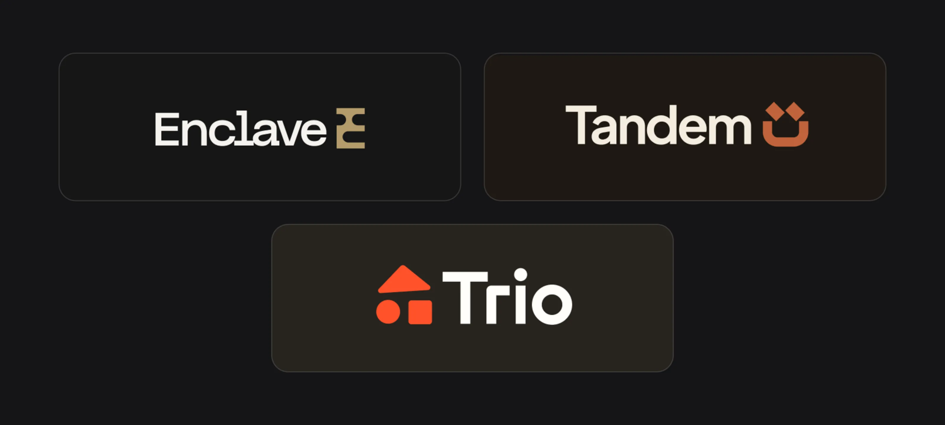 Enclave, Tandem and Trio.
Enclave
The Enclave board presents, in French, a business handling the acquisition and management of exceptional properties “en toute discrétion”. The symbol is a solid gold block with rounded notches cut into it, leaving the letter E, which suits a name about a protected, enclosed place. No roof, key or skyline. The palette is charcoal, cream and a muted gold used only on the symbol, with a clean, light-coloured sans-serif wordmark. The mockups show a business card, a large station poster featuring a villa with a pool, and an editorial poster with a quiet headline: the restraint luxury agencies tend to need.
Tandem
Tandem’s board reads “Your home, looked after.”, with photos of a tradesperson fixing a door lock and a technician carrying a toolbox: a home-services brand. The symbol is two tilted squares above a thick, rounded U, which reads as a smiling face, and the pair of squares echoes the name. No wrench, no house. The colours are warm terracotta, near-black and cream, with a bold, friendly sans-serif wordmark. One mockup shows the symbol alone in a small circle beside an app link, exactly the avatar-size use this industry demands.
Trio
Trio sells furniture and home essentials, shown on a street billboard (“The essentials to furnish your home”) and a mobile shop. Here we did use a house, but built it from three simple shapes, a triangle, a circle and a square, so the symbol explains the name. The board’s social post says it outright: “Three shapes. One home.” The red-orange symbol sits beside a heavy, rounded white wordmark on charcoal, and it holds up both on the large poster and in the small header of a phone screen. A house symbol works when it has a reason to exist.
The real estate logo checklist
- Readable from across the street on a printed board
- Recognisable as a 40-pixel circle (portal badge, avatar)
- Different from the competitors on your street
- No generic roof, key or skyline, unless it is clearly tied to your name or story
- Colour chosen for contrast and distinctiveness, not a psychology chart
- Works in one colour for vinyl, embroidery and contracts
- Horizontal, stacked and symbol-only versions
- Style matches your market: luxury restraint or mass-market visibility
- Clear hierarchy between agency and agent brands
- Vector and source files for sign makers and wrap printers
List these touchpoints when you brief a designer; our logo design brief template shows how. Boards and vans are expensive to replace, so aim for something that lasts: here is what makes a logo timeless.
FAQ
Should a real estate logo have a house in it?
It doesn’t have to, and a generic roofline makes you look like every other agency. Use a house only if it is tied to your name or a real story; otherwise a monogram, letterform or abstract mark is usually more memorable.
What colours are best for a real estate logo?
The best colour has strong contrast and isn’t already used by your local competitors. Luxury agencies often choose black, off-white and one muted accent, while mass-market agencies and home services can go brighter to stand out on boards and vans.
Should a real estate agent have their own logo?
It helps if you want to build a personal reputation or plan to go independent. Keep it a simple name-based wordmark or monogram that sits comfortably next to your agency’s logo, and check any franchise brand rules first.
How small does a real estate logo need to work?
Small enough to be recognised as a circular avatar or portal badge around 40 pixels wide, and clear enough to read on a board from a moving car. A separate symbol or monogram version solves the small end.
Sources
Checked on 15 October 2026.
- RE/MAX, Brand identity manual: how to use the brand (sign design, balloon history)
- RE/MAX News, The RE/MAX Balloon – Then & Now
- Real Estate News, New RE/MAX branding takes flight (2025 logo)
- Creative Bloq, The 8 best real estate logos (Compass)
- Engel & Völkers, About us (founding townhouse on the Elbchaussee)
- The Brand Berries, Engel & Völkers: an iconic brand refined (2023 refinement)
The bottom line
A good real estate logo is not a picture of a house. It is a short, legible name and a simple mark that people remember after one sighting on a board, a portal or a van, in a style that matches the clients you want.
At Logomint, a senior designer creates your custom logo from €129, with first concepts in 48 hours and a 100% money-back guarantee. See the plans and pick the one that fits.