Short answer A good logo design brief covers seven things: your business basics, audience, positioning, visual direction, deliverables, constraints and context. Copy the template below, fill in every section in about 30 minutes, and use the five examples to see what a clear, specific brief looks like.
Why the brief matters more than anything else
A common founder mistake is spending weeks on revisions that a 30-minute brief would have prevented.
Designers can’t read minds. The brief is how you hand over your vision, your audience and your constraints. A vague brief produces vague concepts; a specific brief produces concepts that feel right from the first round. It’s the single biggest factor you control in the whole logo design process.
The 7-part logo design brief template
Copy this structure and fill in every section. If you can’t answer something, say so in the brief rather than leaving it blank. That’s useful information for the designer too.
Prefer to answer questions instead? Our free logo brief generator asks them for you and builds the brief as you type, ready to copy or save as a PDF.
1. Business basics (3 minutes)
- Name: [final, not tentative]
- Tagline (if any): [one line]
- What you do: [one sentence, no jargon]
- How you make money: [subscription, product sales, services, marketplace…]
2. Audience (3 minutes)
- Primary audience: [be specific: “bootstrapped SaaS founders aged 28 to 45” beats “entrepreneurs”]
- Where they spend time: [LinkedIn, TikTok, trade fairs, local events…]
- What they buy today: [the alternatives you compete with]
- What they expect a brand like yours to look like: [the visual norms in your category]
3. Positioning (5 minutes)
- Category: [how customers would describe what you are]
- Differentiator: [what makes you different from the rest of the category]
- Premium or accessible: [where you sit on price]
- Three adjectives for the feel: [e.g. “minimal, trustworthy, modern”]
4. Visual direction (10 minutes)
- Five logos you love, with links: [any category; say what you like about each]
- Three logos you dislike, with links: [say what feels wrong]
- Colour preferences: [be specific: “deep navy and warm cream” beats “blue”]
- Colours to avoid: [if any]
- Logo style: [wordmark, symbol with wordmark, monogram, abstract mark]
- Styles to avoid: [e.g. “no gradients, no mascots”]
5. Deliverables (2 minutes)
- Main uses: [app icon, website header, packaging, signage…]
- File formats: [vector (SVG, AI, EPS or PDF), PNG, source file]
- Versions needed: [horizontal, stacked, icon only, one colour, white on dark]
6. Constraints (2 minutes)
- Hard requirements: [must work at 16 px, must work in one colour, must not resemble competitor X]
- Timeline: [when you need the final files]
- Budget: [being open about it helps the designer scope the work]
7. Context (5 minutes)
- Website or landing page: [link, if you have one]
- Other brand material: [pitch deck, social profiles, existing assets]
- Competitors: [five, with links, so the designer can avoid looking like them]
Total time: around 30 minutes. For help with colours and file formats, see how to choose logo colours and which logo file formats you need.
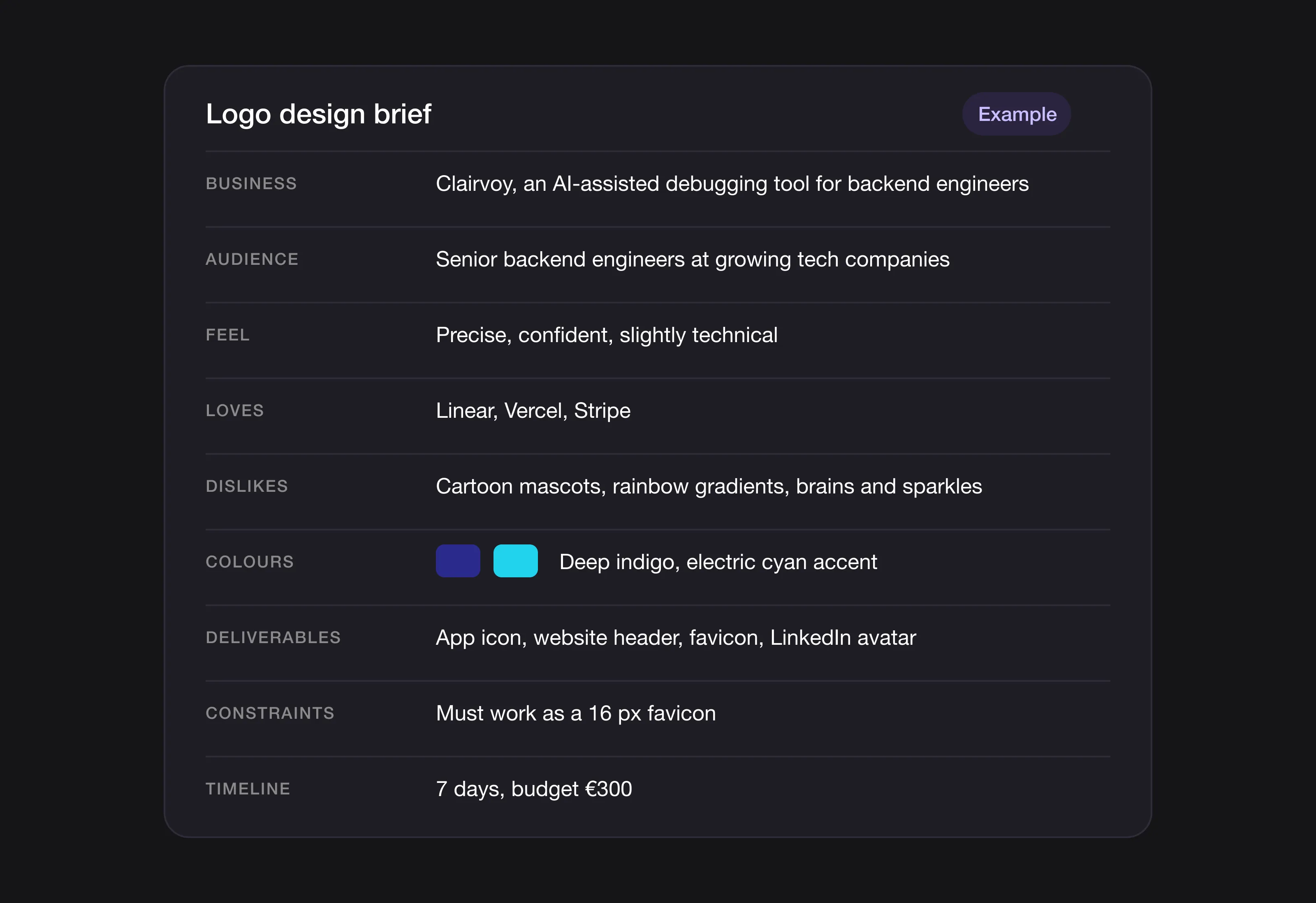 The template filled in, using Example 1 below (a fictional brand).
Five example briefs
The businesses below are fictional. They’re illustrative examples written to show how a filled-in brief reads across different types of company, not real clients. The brands mentioned under “loves” and “compared to” are simply the kind of references a founder might list.
Example 1: B2B SaaS (developer tool)
Business: Clairvoy, an AI-assisted debugging tool for backend engineers.
Audience: Senior backend engineers at growing tech companies, aged roughly 27 to 42, active on LinkedIn and developer forums.
Positioning: Premium developer tool. Compared to: Sentry, Datadog. Differentiator: explains the cause of errors instead of just logging them. Feel: precise, confident, slightly technical.
Visual direction:
- Loves: Linear (crisp), Vercel (minimal and bold), Stripe (professional but warm)
- Dislikes: cartoon tech mascots, rainbow gradients, obvious “AI” clichés like brains and sparkles
- Colours: deep indigo with an electric cyan accent, no gradients
- Style: wordmark with an abstract geometric mark
Deliverables: app icon (dark and light mode), website header, favicon, LinkedIn avatar.
Constraints: must work as a 16 px favicon; must not look like every other AI startup.
Timeline: 7 days. Budget: €300.
A possible direction: an angular geometric mark in deep indigo, a sharp sans-serif wordmark with tight spacing and a single cyan accent.
Example 2: e-commerce wellness brand
Business: Morning Grove, a mushroom-based coffee alternative sold online.
Audience: Health-conscious adults aged 30 to 45, mostly women, who discover products on Instagram and buy from organic shops.
Positioning: Premium wellness brand. Compared to: other functional coffee brands. Differentiator: single-origin sourcing and a short ingredient list. Feel: earthy, calm, premium.
Visual direction:
- Loves: Aesop, and apothecary-style packaging in general
- Dislikes: harsh geometric sans-serifs, primary colours, clinical “medical” looks
- Colours: warm cream base, sage green, soft terracotta accent
- Style: organic serif wordmark, optional botanical mark
Deliverables: packaging (tin and sachet), Instagram avatar, website, shelf display.
Constraints: must look good on a shelf and in product photos; must not look clinical.
Timeline: 14 days. Budget: €800.
A possible direction: a hand-drawn mushroom silhouette, a serif wordmark with a slight italic lean, and a cream and sage palette.
Example 3: personal brand (coach)
Business: Lena Hart, brand strategy coaching for solo creators.
Audience: Established solo creators on YouTube and LinkedIn who want to turn their audience into a business.
Positioning: Premium one-to-one coaching. Compared to: generic creator and productivity courses. Differentiator: a focus on brand strategy instead of general “grow your audience” advice. Feel: confident, editorial, personal.
Visual direction:
- Loves: newspaper mastheads, Kinfolk, Monocle
- Dislikes: clichéd pink and script-font “coach” branding, generic hustle aesthetics
- Colours: black and white, with warm paper cream as a secondary colour
- Style: editorial serif wordmark with a monogram option
Deliverables: YouTube thumbnails, LinkedIn banner, course platform, newsletter header.
Constraints: must feel editorial, not “coachy”; must work in black and white.
Timeline: 5 days. Budget: €300.
A possible direction: an “LH” monogram in a classic serif inside a subtle circle, with a matching full wordmark in black and cream.
Example 4: creative studio
Business: Halfmoon Studio, a four-person brand identity studio.
Audience: Funded startups and established e-commerce brands planning a rebrand.
Positioning: Boutique studio. Compared to: large international agencies (as an aspiration) and local studios. Differentiator: senior-only team, no hand-offs to juniors. Feel: crafted, opinionated, a little unusual.
Visual direction:
- Loves: Pentagram, Studio Dumbar
- Dislikes: generic agency logos with swooshes, cold ultra-minimalism
- Colours: muted earth tones with one unexpected accent (mustard or oxblood)
- Style: a custom wordmark with distinctive character
Deliverables: website, business cards, case study decks, email signatures.
Constraints: must stand out in a crowded agency market.
Timeline: 21 days. Budget: €1,500.
A possible direction: a custom-drawn wordmark with asymmetric letter pairs and an oxblood accent, used on its own without a symbol.
Example 5: early-stage app
Business: Fieldnote, a note-taking app for field researchers such as geologists, ecologists and archaeologists.
Audience: Field scientists aged 28 to 55, international, working on desktop and mobile.
Positioning: Niche productivity tool. Compared to: Notion (too general), Obsidian (too technical). Differentiator: works offline and is built for fieldwork. Feel: rugged, scholarly, practical.
Visual direction:
- Loves: Patagonia (outdoor heritage), Notion (clean software), classic field guides (scholarly)
- Dislikes: pastel “SaaS” palettes, cute app icons, generic pencil symbols
- Colours: deep forest green, warm bone, dark brown accent
- Style: sturdy serif or slab-serif wordmark with a simple map-inspired mark
Deliverables: app icon (iOS and Android adaptive icon), web app, marketing site, conference materials.
Constraints: must read at 16 px; must work in one-colour print for academic papers.
Timeline: 10 days. Budget: €400.
A possible direction: an “F” built from contour lines like a topographic map, a slab-serif wordmark, and a forest green and bone palette.
Common brief mistakes and how to fix them
1. “I’ll know it when I see it.” You probably won’t, and neither will the designer. Spend ten minutes listing five logos you love and why.
2. Only listing what you like. What you don’t want is just as useful. Add three logos you dislike, with a sentence on each.
3. Vague adjectives. “Modern” means little on its own. “Modern like Linear, not like a 2010s tech startup” gives the designer something to work with.
4. Skipping the audience. A logo for “startup founders” is different from one for “bootstrapped solo founders” or “funded B2B teams”. The more specific, the better.
5. Hiding the budget. Being open about budget lets the designer scope the work properly. Hiding it leads to proposals that don’t fit.
6. No examples. Links are the most useful input you can give. Five loves, three dislikes and five competitors cover most of the brief.
When you don’t need a full brief
Many design services, Logomint included, use a short interactive questionnaire that draws out the essentials (audience, feel, examples) in a few minutes. You don’t have to write a document from scratch.
Even then, arriving with your five loves, three dislikes and five competitors makes the questionnaire faster and the first concepts closer to what you want.
FAQ
How long should a logo brief be?
One to two pages, as with most creative briefs. Longer briefs usually contain more filler than useful detail. Every line should help the designer make a decision.
Should I include colour codes or leave it open?
Give a direction (“warm earth tones”) and add specific codes only if you feel strongly. Too prescriptive limits the designer; too open wastes a round on colours you don’t want.
What if I don’t know my audience yet?
Say so. “We’re testing audience X” is more useful than invented certainty, and the designer can keep the concepts flexible.
Should the brief include my website copy or pitch deck?
Yes, if you have them. Your tone of voice is part of your visual tone. A brand that writes playful copy shouldn’t have a stiff corporate logo.
What if the designer ignores the brief?
If the first concepts are completely outside the brief, raise it straight away and point to the specific sections. A good designer adjusts. Our guide on giving feedback to a logo designer shows how to phrase it.
Can I reuse a brief for another project?
Yes. Each project sharpens your thinking about your brand, so the second brief is usually better than the first.
The bottom line
Thirty minutes on a focused brief can save weeks of revisions, and it’s the step most founders skip. Use the seven-part template (or the free brief generator), fill in every section, and bring your five loves, three dislikes and five competitors. Any designer, freelancer, agency or service, will do better work with it.
Brief ready? At Logomint, a short questionnaire turns it into custom concepts from a senior designer within 48 hours, from €129, with a 100% money-back guarantee. See the plans.