Short answer A travel or mobility app logo is mostly seen as a small square: an icon on a crowded home screen, a thumbnail in an app store, a tiny mark in a notification, a marker on a map. Build it around one bold symbol that still reads at notification size, give it a colour your competitors don’t already own, and make sure it also works as a one-colour sticker on a car door. Skip the map pins, paper planes and globes: they say “travel”, but not your name.
What should a ridesharing or travel app logo make people feel?
Ridesharing and carpooling ask people to do something unusual: get into a stranger’s car, or let a stranger into theirs. Before anyone reads about ID checks or ratings, the logo helps them decide whether the service looks real. They want to feel three things:
- This is safe. Careful, consistent drawing suggests a company that checks its drivers. A clip-art logo suggests nobody is checking anything.
- This is easy. A simple mark suggests a simple app.
- This is the right one. When a car pulls up or a notification lands, people need to recognise the brand instantly.
Where will a mobility app logo actually be seen?
Most of a mobility brand’s touchpoints are small, fast or far away.
| Touchpoint | What it demands | What you need |
|---|---|---|
| Home screen | A rounded square among dozens of other apps | A symbol that fills the shape, no fine detail |
| App stores | A thumbnail next to rivals in search results | A mark that stands out from your category’s colours |
| Notifications | “Your driver has arrived”, shown tiny | A symbol recognisable at a glance |
| Map markers | Your mark or colour on a busy map | A shape and colour that contrast with map tiles |
| Car stickers and signage | Read from the kerb, by day and at night | A one-colour version with bold shapes |
| Outdoor ads | Billboards and bus shelters seen while moving | A short name and a high-contrast lock-up |
Apple lists where an app icon turns up: the Home Screen, search results, notifications, system settings and share sheets, and the system scales the icon down automatically for places such as Settings and notifications. For favicons, dark mode and tinted icons, see our guide to logo design for tech startups.
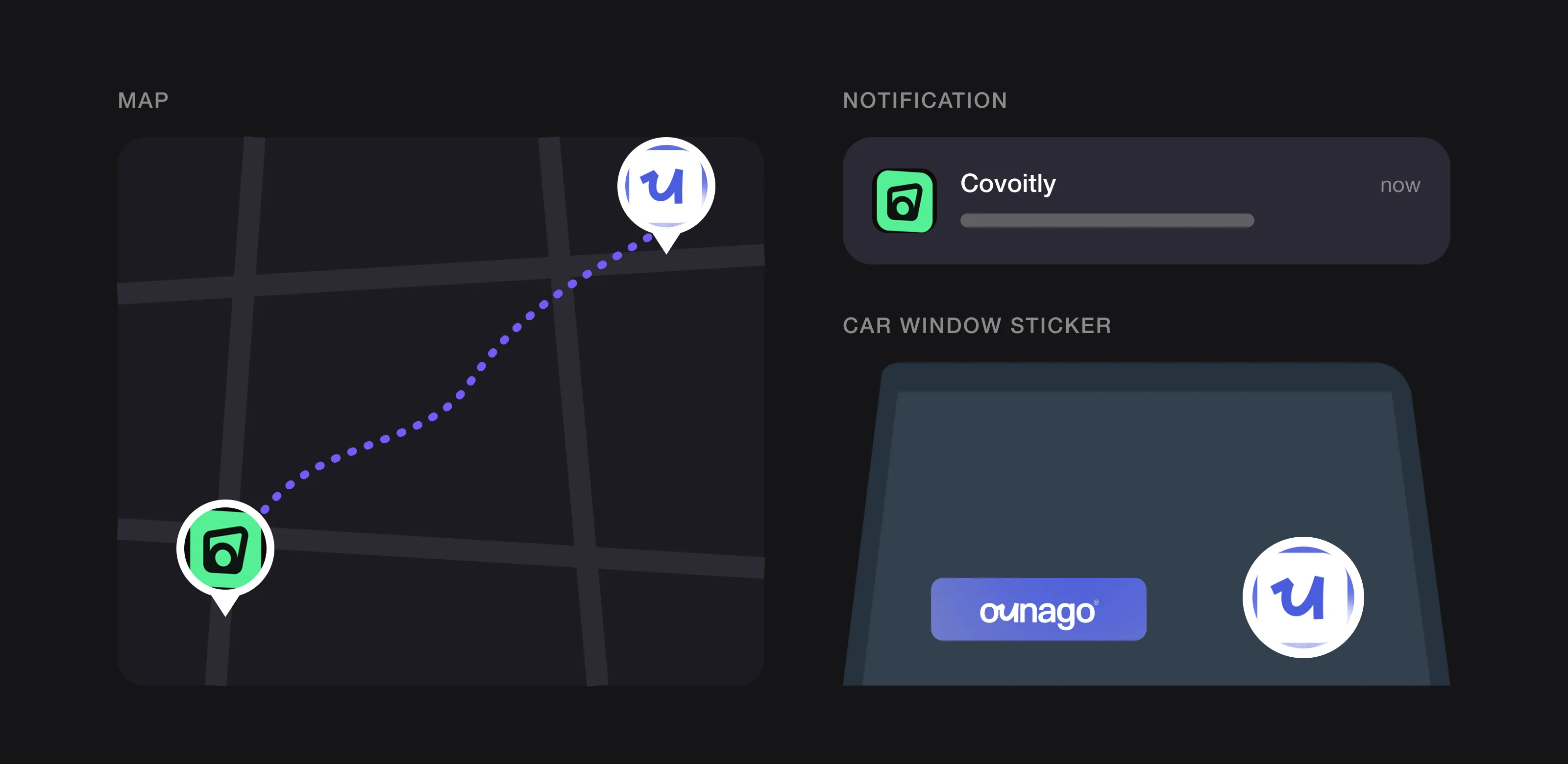 A mobility logo lives on the map, in notifications and on the car (Ounago and Covoitly, designed by Logomint).
How do you make an app icon stand out on a crowded home screen?
Design the smallest version first: if the symbol reads in a notification, it will work everywhere else.
- One idea, few shapes. Apple advises expressing an icon’s core idea with a minimal number of shapes, and warns that thin lines and fine details get lost at small sizes.
- Keep important shapes away from the corners. Google Play asks for a full square image and applies its own rounded mask, with a corner radius equal to 30% of the icon size. Anything tucked into a corner can be cut off. Its specifications also rule out text or graphics that promote offers or rankings.
- Test it on a real phone. Put your icon on a home screen next to your closest competitors. If it disappears among them, change the colour or the shape, not the size.
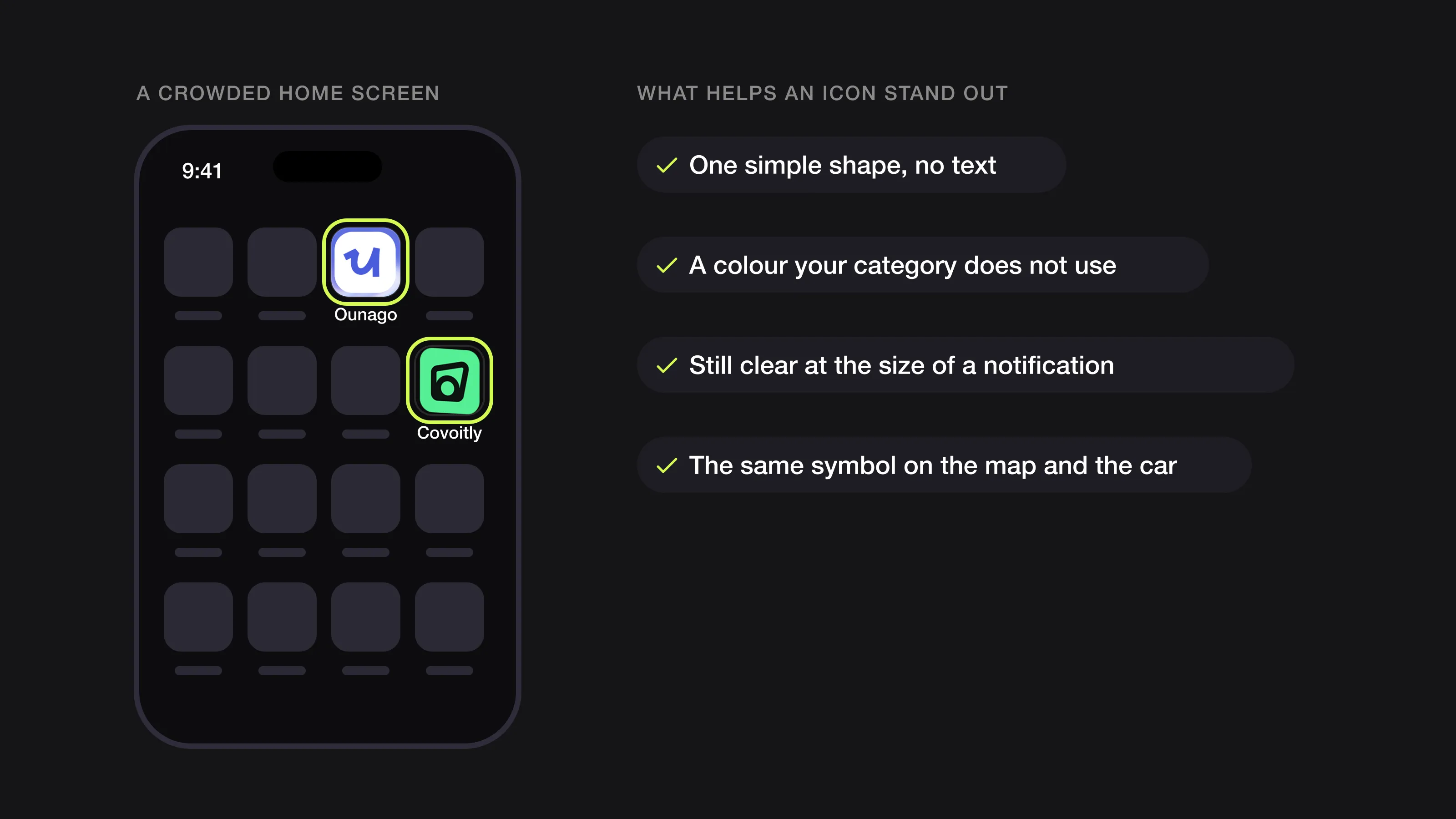 On a crowded home screen, one simple shape and an unexpected colour win (Ounago and Covoitly, designed by Logomint).
Should a mobility app logo be a symbol or a wordmark?
Most mobility apps need both: a symbol for everything small and square, and a wordmark for the website, ads and the side of a car.
- A symbol plus wordmark is the most practical set-up. The symbol becomes the app icon; the wordmark teaches people the name.
- A letter-based symbol (an initial or a ligature taken from the wordmark) ties the two together, so icon and name clearly belong to one brand.
- A wordmark as the icon only works when the name is very short and already well known. Apple recommends text in icons only when it is essential, partly because text doesn’t support localisation and is often too small to read.
What colours work best for a travel app logo?
No colour makes people trust a stranger’s car by itself. What colour can do is help people find you: in a row of icons, on a map and on a car at night.
- Map your category first. Put your competitors’ app icons side by side. If they are all black, green or blue, a different colour will be noticed faster.
- Check it against a map. Map tiles are mostly pale grey, green and blue, and many map apps use green, orange and red for traffic. A brand colour that blends in or looks like a traffic warning makes markers harder to spot.
- Think about the car. A sticker has to read on white, black and silver cars, so plan a white version and a dark one.
- Keep it to one main colour and a neutral. Extra colours belong in illustrations and ads, not in the logo.
Our guide to choosing logo colours walks through this step by step.
Which fonts suit a travel brand, and will they work in other languages?
Clean, sturdy sans serifs dominate transport because road signs and station signage have to be read quickly.
- Choose open, even letters. Very condensed or very light fonts blur at a distance.
- Make a few letters your own. A joined pair of letters or a distinctive “g” turns a standard sans serif into a wordmark people remember.
- Check every character set you need. If you launch in several countries, the brand typeface must cover their accents and, where relevant, other scripts.
The name matters as much as the font. Test it in each market’s languages before the logo is drawn. Short, easy-to-say names travel best, and a name that describes one vehicle can become a limit, as Bolt found (see below). Keep slogans out of the logo: ads can be translated, a slogan baked into the logo can’t.
What should a travel or ridesharing logo avoid?
Some ideas are so common in travel and mobility that they no longer point to any particular company:
- Map pins and location markers. Your logo will compete with every other pin, including those on the map itself.
- Paper planes, globes and aeroplane trails for travel booking.
- Arrows and swooshes suggesting movement.
- Winding roads shaped into an S or vanishing into the distance.
- Car silhouettes and steering wheels for ridesharing and rentals.
A familiar idea isn’t banned: a road or an arrow can still work if it grows out of your name and has a detail no one else has. The test is whether someone could tell your icon from a competitor’s in a notification. Our article on what makes a logo timeless explains why simple, owned shapes outlast literal pictures.
What can you learn from Uber, Lyft, BlaBlaCar and Bolt?
Uber: two rebrands in three years
In February 2016, Uber replaced its “U” icon with a system built on “bits and atoms”. Uber’s announcement said both the rider and driver icons put the bit at the centre, with local colours and patterns behind it, inspired by things like Mexico’s tiles and Nigeria’s ankara fabric; It’s Nice That reported bespoke palettes for each of the 65 launch countries. By September 2018 the brand had changed again: Transform reported a monochrome wordmark and a custom typeface, Uber Move, by MCKL, and noted that people had wondered where the “U” had gone. The lesson: a clever system is worth little if people can’t find your icon. The name was the asset.
Lyft: the brand on the car is a pickup tool
Lyft’s best-known early mark lived on cars: a fuzzy pink moustache on the front, later a light-up dashboard version called the Glowstache. In 2016, The Drive reported it was being replaced by a two-way dashboard beacon designed to ease pickups, with riders matching a colour on the beacon to find their car. Today Lyft uses a pink lowercase wordmark. The lesson: vehicle branding isn’t decoration. It answers the question every passenger asks on the kerb: which car is mine?
BlaBlaCar: a symbol about people, not vehicles
BlaBlaCar’s symbol looks like a pair of quotation marks. In its February 2026 identity update, the company said the symbol reflects conversation and the “B”s in BlaBla, and represents both driver and passenger. The update also introduced a new blue chosen partly for readability, including for users with visual impairments, and brought carpooling, buses and trains under one identity. The lesson: a symbol about the people sharing the ride stays relevant when the service grows beyond cars.
Bolt: a name that isn’t tied to one vehicle
In 2019, Taxify renamed itself Bolt. TechCrunch reported that the company dropped “taxi” from its name to cover more ways of getting around, including electric scooters, and quoted its CEO calling the old name too restrictive. The lesson: a short name that doesn’t describe one vehicle leaves the brand room to grow.
Logos we designed for travel and mobility apps
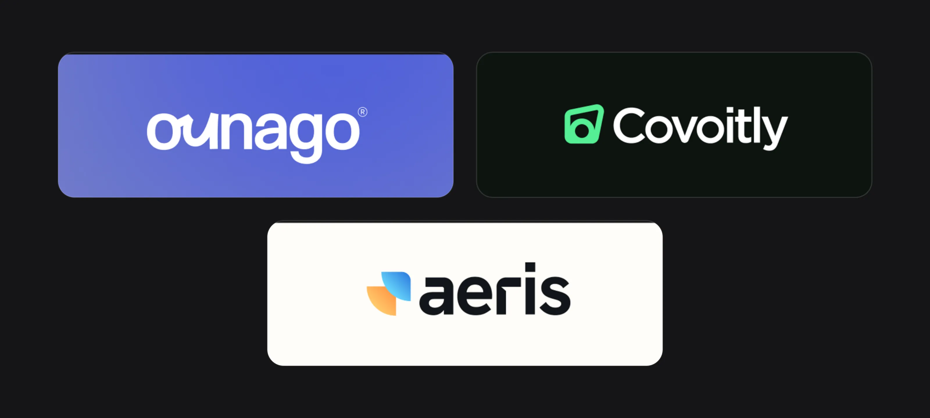 Ounago, Covoitly and aeris.
Ounago. Ounago is a community ridesharing platform connecting drivers and passengers across Africa; its name comes from the West African Pidgin phrase “U na go” (“let’s go”). The logo is a lowercase two-tone wordmark: “ou” in royal blue, joined into one flowing ligature, and “nago” in deep black, with an all-white version on blue. The brand guidelines on the board describe that ligature as the brand’s iconic element, its continuous curves suggesting a road, a journey and uninterrupted movement. It becomes the app icon, a blue mark on a white rounded square, shown on a French-language “your driver” notification, and a large cropped pattern on the envelope. Because the symbol comes from the name rather than a pin or a car, icon and wordmark always read as one brand, and the French copy on posters and app screens can change without touching the logo. See the full identity in our Ounago case study.
Covoitly. The board’s copy (“Where are you heading today? Don’t travel alone anymore.”) places Covoitly in carpooling. The symbol is a dark, slightly tilted frame with a circle in its lower corner, which reads as a car window with a passenger inside, without drawing a literal car. Bright mint green with near-black stands out next to the system apps: the board shows the icon on an iPhone home screen beside Calendar, filling its rounded square with no text. The rounded sans serif wordmark appears white on dark, or dark on a concrete billboard next to App Store and Google Play badges.
aeris. aeris isn’t a transport app, but it is an on-the-go one: the board shows a weather app (“Weather that keeps up with you”). The symbol is two rounded, petal-like quarter shapes meeting at a corner, one in a blue gradient and one in orange, suggesting sky and sun without drawing either. It works as an icon on a dark rounded square, and the same orange and blue reappear in the small “Sunny 29°” badges on the posters. The wordmark is a heavy lowercase sans serif in near-black on cream.
The travel app logo checklist
- The symbol reads at notification size and on a real phone’s home screen
- An app icon version with no text and no important shapes in the corners
- Light, dark and one-colour versions of every lock-up
- A sticker version that reads on white, black and silver cars from a few metres away
- A brand colour that contrasts with map tiles and doesn’t look like a traffic warning
- A name tested in every market’s language, with no slogan inside the logo
- Compared side by side with your closest competitors’ icons
- Vector source files for the app, the web, print and vehicle vinyl
FAQ
Should a travel app icon include the app name?
Usually not. Apple advises using text in icons only when it is essential, because it is often too small to read and doesn’t localise; a very short, well-known name is the exception.
Is a map pin a bad idea for a travel app logo?
It isn’t forbidden, but it is one of the most common ideas in the category and it competes with the real pins on the map. If you use one, it needs a detail that makes it yours, such as a shape taken from your name.
What colour should a ridesharing logo be?
Pick a colour your closest competitors don’t use, that stands out on a map and that can be printed as a sticker on cars of any colour.
How do I make my logo work on cars?
Prepare a simple one-colour version with bold shapes and no fine detail, in white and in a dark colour. Test it at full size on a real car door, in daylight and at night, before printing in bulk.
Sources
Checked on 15 October 2026.
- Apple Developer, Human Interface Guidelines: App icons
- Android Developers, Google Play icon design specifications
- Uber Newsroom, Celebrating Cities: A New Look and Feel for Uber
- It’s Nice That, Uber launches a new city-centric visual identity
- Transform, Uber’s brand is always on the move
- The Drive, Lyft’s getting rid of its signature pink mustache
- BlaBlaCar Newsroom, BlaBlaCar unveils new visual identity to embody its global travel platform ambition
- TechCrunch, Taxify rebrands as Bolt as it expands transport options beyond private cars
The bottom line
A travel or mobility app logo is judged in a notification, on a map and on the side of a car, often by someone in a hurry. Build it around one bold symbol that grows out of your name, choose a colour that helps people find you, and make sure it works in one colour on a car door.
At Logomint, a senior designer creates your custom logo from €129, with first concepts in 48 hours, all source files and a 100% money-back guarantee. See the plans.