Short answer A finance logo has to make people comfortable handing over their money, so it needs to look stable, careful and built to last. That doesn’t mean it has to be navy blue with a shield. The strongest finance and fintech logos pick one clear idea, use confident, readable type, and work as a tiny app icon and on a payment card as well as on a website.
What do customers need to feel from a finance logo?
People often meet a finance brand at a nervous moment: opening an account, moving savings, filing a tax return. Before they read a single word, your logo answers a quiet question: can I trust these people with my money?
That trust has two sides, and every finance brand has to decide where it sits between them:
- Stability. You’ll still be here in ten years, you’re careful, you follow the rules. Private banks, wealth managers and established accounting firms lean this way.
- Approachability. You’re easy to deal with, you speak plainly, you won’t make me feel stupid. Consumer fintech apps and advisers for first-time investors lean this way.
All stability feels cold; all approachability feels like a game, which is a problem when the product is someone’s savings. Signal both, with the balance set by your audience.
Why are so many finance logos navy blue?
Look at the logos on the cards in your wallet: Chase, Barclays, Visa, American Express and PayPal all lean on blue. There’s no scientific rule behind this. Blue is simply the safe choice: it reads as calm and corporate, it rarely offends anyone, and it avoids red, which on most Western trading screens and statements means a loss.
The catch is that when everyone picks the safe colour, it stops helping anyone stand out. That gap is exactly what the challengers used:
- Monzo launched its first cards in a bright “hot coral”.
- Klarna introduced its distinctive pink with its 2017 rebrand.
- Wise uses a bright lime green, about as far from navy as a payments company can go.
The lesson isn’t “avoid blue”. It’s to choose your colour on purpose. A wealth manager for retired clients may be right to use deep blue or green. A budgeting app for students that copies a bank’s palette has wasted its best chance to be noticed. Our guide on how to choose logo colours walks through the process.
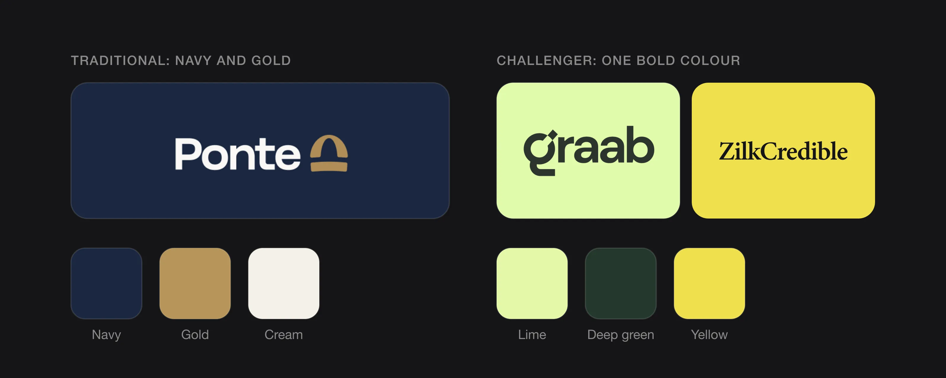 The classic finance palette next to challenger colours (Ponte, Graab and ZilkCredible, designed by Logomint).
What colours work best for a finance logo?
Rather than asking which colour “means trust”, ask three practical questions:
- What do your direct competitors use? If every adviser in your city is navy and gold, a dark green or a warm neutral will be remembered.
- Does it hold up next to numbers? Finance products are full of charts, gains and losses. If your brand colour is red or bright green, make sure it can’t be confused with “down” or “up” in your own interface.
- Does it work in one colour? Your logo will be embossed on cards, printed on statements and stamped on letters. If it only works in a gradient, it doesn’t work.
Deep blues, greens, charcoal and black with one accent are the common safe base. Bright challenger colours work best for simple, consumer-facing products, used consistently everywhere.
Which fonts suit a finance brand?
People read your name long before they decode a symbol, so type carries much of the trust signal.
- Clean sans serifs (geometric or grotesque) are the default for fintech. They read clearly on screens and feel modern without being playful.
- Serifs still suit private banks, law-adjacent accounting firms and wealth managers who want to signal heritage. Keep them sturdy; delicate, high-contrast serifs fall apart at small sizes.
- Avoid novelty type. Script fonts, distressed fonts and anything that looks hand-drawn undercut the sense of care people expect around money.
Test your choice at the size of a statement footer. Regulated firms sit next to small print constantly, and the logo has to stay legible there.
Should a finance logo have a symbol or just a wordmark?
Both work. The deciding factor is usually the app icon.
A wordmark (the name set in distinctive type) is clear and hard to misread, which suits accountants, advisers and B2B firms whose name is their reputation. A symbol or monogram becomes essential the moment you have a mobile app, because a full name rarely fits a square icon. Apple’s guidelines say to include text only when it’s essential to your experience or brand, and recommend that an icon express a single concept people instantly understand.
Many fintechs solve this with a strong first letter that can live on its own, plus a wordmark for everywhere else.
What should a finance logo avoid?
Finance has some of the most worn-out symbols in logo design. Each one made sense once; now they make you look like a template.
- Upward arrows and rising bar charts. They promise growth, which is an odd thing to promise when investments can fall. In the UK, the FCA requires that all financial promotions must be clear, fair and not misleading. A logo isn’t an advert, but a mark that shouts “guaranteed gains” sits awkwardly next to the risk warnings you’ll be required to show.
- Coins, dollar, euro and pound signs. They say “money” and nothing about you.
- Shields and padlocks. Meant to say “secure”, they now say “generic”.
- Classical pillars. The bank-as-temple look reads as old and distant to most younger customers.
- Stock icons from logo generators. Thousands of finance logos share the same swoosh-and-arrow. If you want to be trusted, looking like everyone else’s template is a classic red flag.
Where does a finance logo have to work?
| Touchpoint | Challenge | What it needs |
|---|---|---|
| App icon | A small square on a home screen, next to dozens of other apps | A simple symbol or letter that reads at a glance, and still works in the dark and tinted icon modes iOS now offers |
| Payment cards | Shares space with a chip and the card network’s mark | A compact version that works embossed, printed in one colour or on a coloured card |
| Statements and letters | Printed small, often in black only | A one-colour version with sturdy type |
| Legal footers and disclosures | Sits next to small regulatory text | Legibility at small sizes |
| Office signage and pitch decks | Has to feel credible to investors and partners | Horizontal and stacked layouts |
On the app icon, Apple notes that details may be hard to discern at smaller sizes, and that dark, clear and tinted icon variants are more subdued than the default. A thin outline symbol on a pale background often disappears in those modes, so test them before you commit.
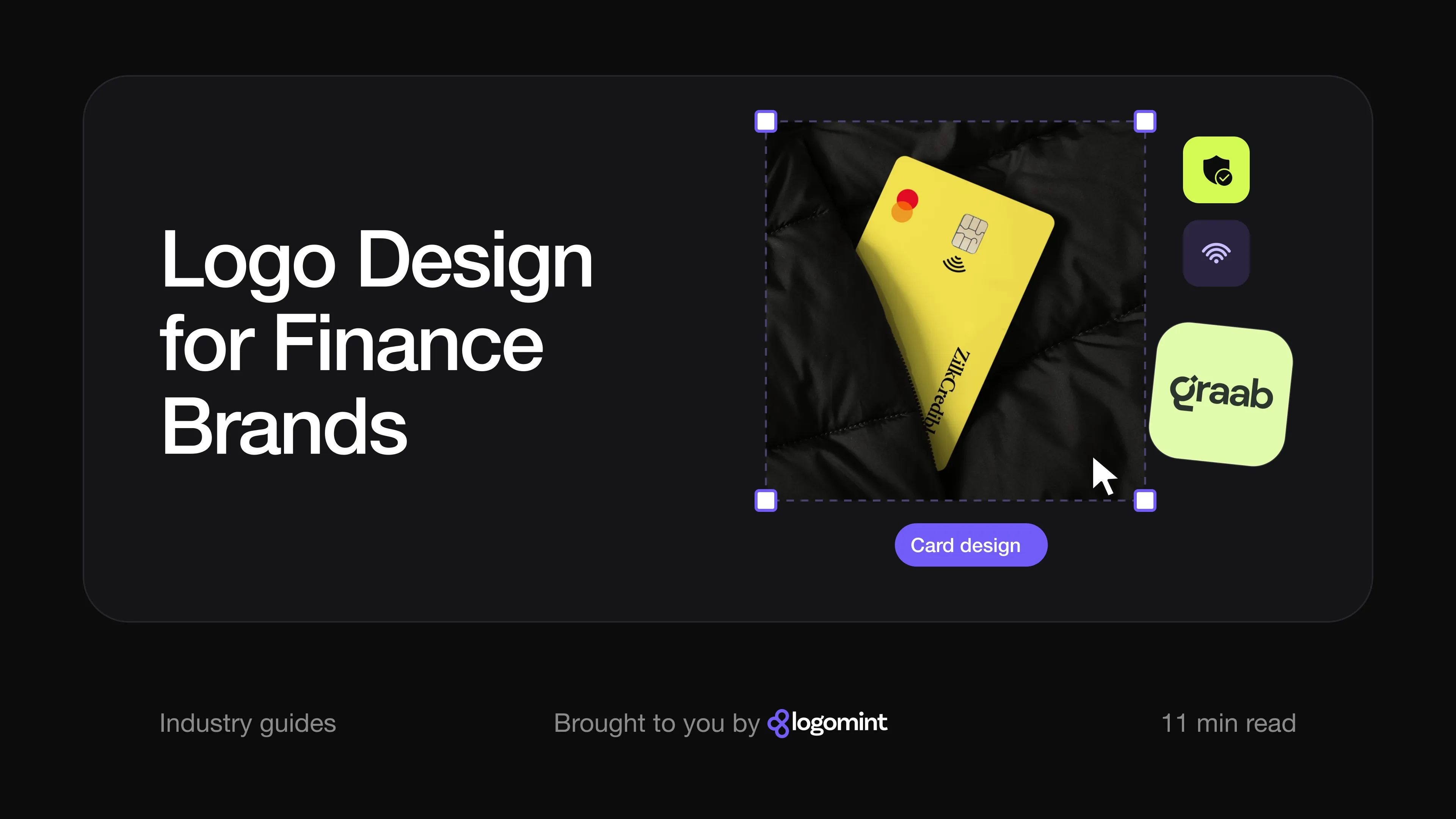
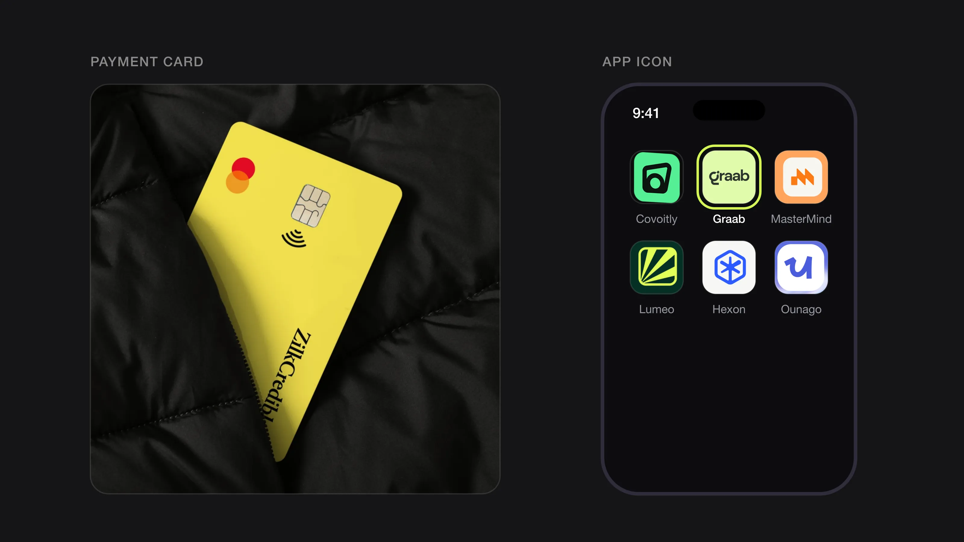 Two places a finance logo has to work: a payment card and a phone home screen (ZilkCredible and Graab, designed by Logomint).
How well-known finance brands handle their logos
Chase. The blue octagon is the classic traditional finance mark. It dates from 1961, when few American corporations were identified by abstract symbols, and was designed by Chermayeff & Geismar. It shows that “serious” doesn’t have to mean literal: there’s no coin, no column and no arrow, just a simple geometric shape that has survived decades of mergers.
Monzo. Monzo’s best-known brand asset is arguably its hot coral card rather than its logo. Its head of design wrote in 2016 that the team wanted a colour so unique and bright that could work as a conversation starter. It’s a reminder that in finance the physical card can carry the brand as much as the logo does.
Klarna. Klarna’s 2017 rebrand brought a new logo, graphic identity and checkout touchpoints, and the pink it introduced has stayed: in a 2024 refresh, Creative Review reported that the pink remained untouched while the wider palette was balanced with off-white and black. The logo itself is a plain wordmark; the colour does the distinguishing work.
Wise. When TransferWise renamed itself Wise in February 2021, it changed its logo and app names but, in its own words, kept its icon, the fast flag, as a symbol for money without borders. Keeping a recognised symbol through a rename is a good example of protecting the trust you’ve already built.
Logos we designed for finance brands
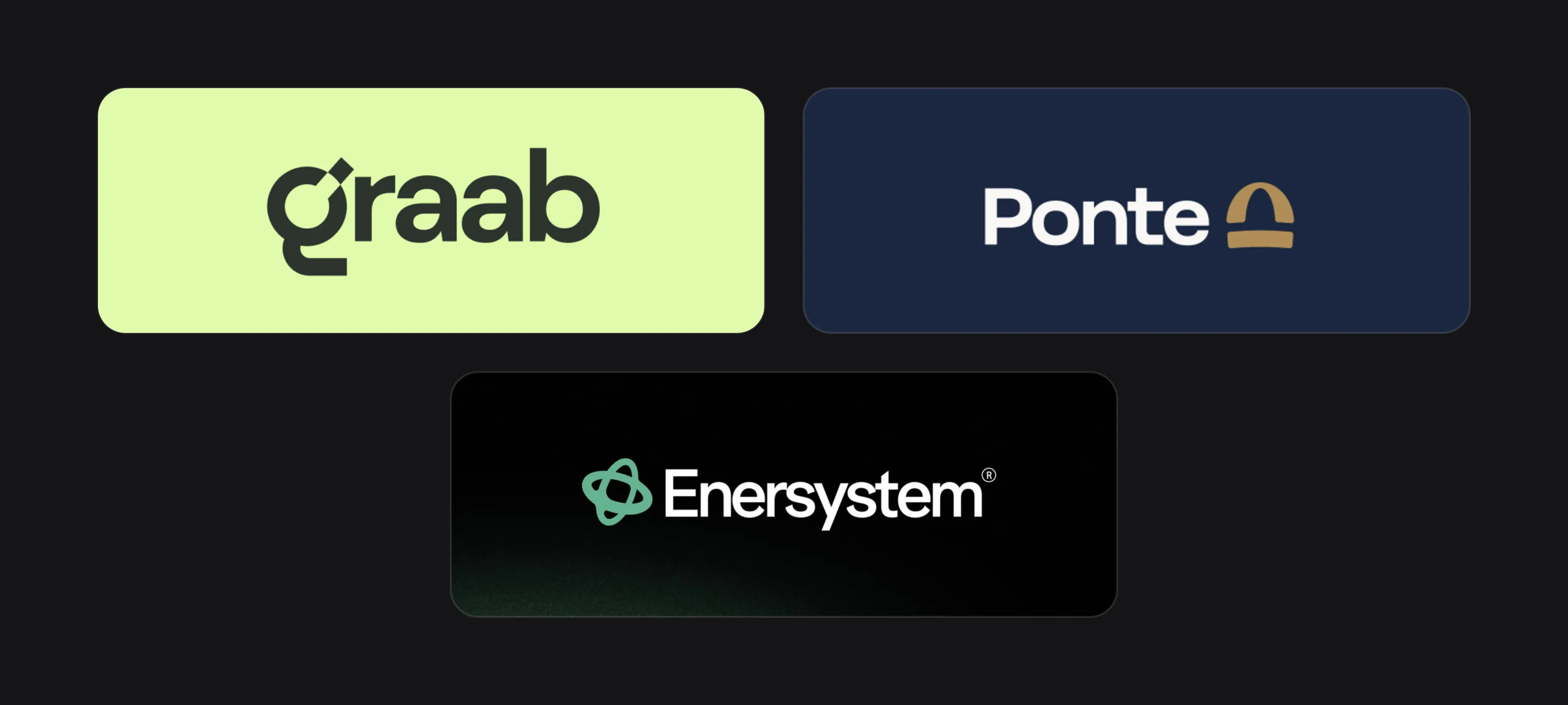 Graab, Ponte and Enersystem.
Graab, an investment app. Graab’s mission is to make investing simple and accessible, whatever someone’s experience. The logo is a lowercase wordmark in a heavy, rounded sans serif, which keeps it friendly rather than corporate. The “g” carries the idea: its round bowl is open at the top right, with a small tilted square sitting just above the gap, and its tail is cut into a straight, flat stroke. That “g” works on its own as the app icon, in pale lime on a dark green tile. The palette (near-black green with a soft lime) avoids both bank navy and the bright “money green” of trading apps. On the mockups, the wordmark sits cleanly on a payment card next to the card network’s mark, on business cards and on a tote with the line “Investing made simple.” The small upward triangle appears in the app’s interface as a data marker, where it belongs, rather than in the logo. See the Graab case study.
Ponte. The board presents Ponte as an investment banking firm, and this logo takes the traditional route with care. The palette is navy and a muted gold, the most classic finance pairing there is, but the symbol avoids every cliché: it’s a single arch resting on a flat bar, a bridge (ponte in Italian and Portuguese), backed up by the line “Every crossing, secured.” The wordmark is a clean, sturdy sans serif. The arch works alone as a small embroidered mark on a navy shirt and in a square app-style icon, exactly what a symbol should be able to do.
ZilkCredible. Shown here on a payment card, this one breaks the navy rule from the other side. The wordmark is a classic serif, set in black, which gives the name the weight and seriousness people expect from money. The card itself is a bright yellow, so it stands out in a wallet or a dark coat pocket. The wordmark runs vertically along the edge of the card, leaving the chip and the network mark room to breathe. A traditional typeface on a bold colour is a simple way to look both trustworthy and new.
Enersystem (an energy broker, not a bank). Enersystem isn’t a finance company, but as a broker it has the same problem: businesses have to trust it with large, recurring costs. Its symbol is a set of interlocking loops in mint green, with open spaces inside the form; the construction sheet describes those spaces as standing for clarity and approachability. Paired with a plain white sans serif wordmark on dark green, it reads as technical but calm, a useful reference for B2B finance brands that want to look modern without looking risky. See the Enersystem case study.
Finance logo checklist
- One clear idea, with no arrows, coins, shields or pillars unless you’ve reinvented them
- A colour chosen against your competitors, not by habit
- Type that stays legible at statement-footer size
- An icon or letter that works as an app icon, including dark and tinted modes
- A one-colour version for embossing, statements and letters
- Horizontal, stacked and icon-only layouts
- Vector source files for card printers, signage and app stores
- A design simple enough to still feel right in ten years (see what makes a logo timeless)
FAQ
What is the best colour for a finance logo?
There isn’t one. Blue and green are the safe defaults for established firms, while challenger brands like Monzo and Klarna stood out with coral and pink. Choose based on your audience and competitors, and make sure the logo still works in one colour.
Should a fintech logo look like a bank?
Only if you want to compete on the same terms as a bank. Most fintechs gain more from looking clear and approachable, as long as the type and structure still feel careful and stable.
Do I need a symbol for my finance app?
Almost certainly. A full name rarely fits a square app icon, so you need a symbol or a strong single letter that people can recognise on their home screen.
Are upward arrows a bad idea in a finance logo?
They’re not forbidden, but they’re one of the most overused finance clichés, and they promise growth that investments can’t guarantee. A more distinctive idea will be remembered for longer.
Sources
Checked on 15 October 2026.
- Apple, Human Interface Guidelines: App icons
- Financial Conduct Authority, Regulating financial promotions and adverts
- Logo Design Love, All about Chermayeff & Geismar (Chase octagon, 1961)
- Monzo Community, Don’t go, coral card! (post by Monzo’s head of design, June 2016)
- Creative Review, Klarna’s new look (February 2024)
- PR Newswire, Swedish tech bank Klarna launches Smoooth brand (August 2017)
- Wise, World, meet Wise (February 2021)
The bottom line
A good finance logo doesn’t need to shout “secure” or “growth”. It needs to look careful, clear and confident, and to keep working from a home-screen icon to an embossed card. Pick one idea, choose your colour on purpose and skip the clichés your competitors are already using.
At Logomint, a senior designer creates your custom logo from €129, with first concepts in 48 hours, all source files and a 100% money-back guarantee. See the plans.