Short answer A law firm logo has to earn trust in a few seconds: on a letterhead, an email signature, a LinkedIn profile and a website a worried client is reading late at night. The best ones are restrained and well drawn, with excellent type, a short version for small spaces and one ownable detail. Skip the scales of justice, gavels and columns: every competitor already uses them. And check your regulator’s rules: in England and Wales, your website must also show the SRA’s digital badge.
What do clients need to feel from a law firm logo?
People rarely shop for a lawyer in a good mood. They come with a dispute, a deal, a move or a loss, and they want someone they can trust with it. Reputation matters most: in a 2013 Legal Services Consumer Panel survey reported by Legal Futures, reputation was the factor most often mentioned in choosing a lawyer, by 72% of people. Research for the Legal Services Board later found that consumers see customer reviews as key to choosing the right lawyer.
A logo can’t create a reputation, but it can support one or quietly undermine it. Three feelings matter:
- Trust. You look established, careful and accountable.
- Competence. Your work is precise. A sloppy logo suggests sloppy drafting.
- Approachability. Especially for private clients, you look like people they could actually call.
The balance between the last two depends on who you serve. A corporate firm leans towards authority; a family or employment practice should feel calmer and more human.
Where does a law firm logo actually have to work?
| Touchpoint | Challenge | What it needs |
|---|---|---|
| Letterhead and engagement letters | Printed, signed, scanned and faxed in black and white | A one-colour version with sturdy type |
| Email signatures | Tiny, and images don’t always load | A compact mark that also reads as plain text |
| Website | Often seen on a phone first; in England and Wales it sits beside the SRA digital badge | A horizontal logo that stays legible small and doesn’t compete with the badge |
| LinkedIn and directory profiles | A small square image beside your name | A square version: monogram or symbol |
| Office signage | A plaque among others in a lobby | Clear lettering, no fine detail |
| Pitch documents and panels | Next to a client’s own logo | A calm lockup that sits well in a corner |
LinkedIn recommends a Page logo of 400 x 400 pixels, with a minimum of 268 x 268. A long partnership name won’t fit that square, so it needs a short version first.
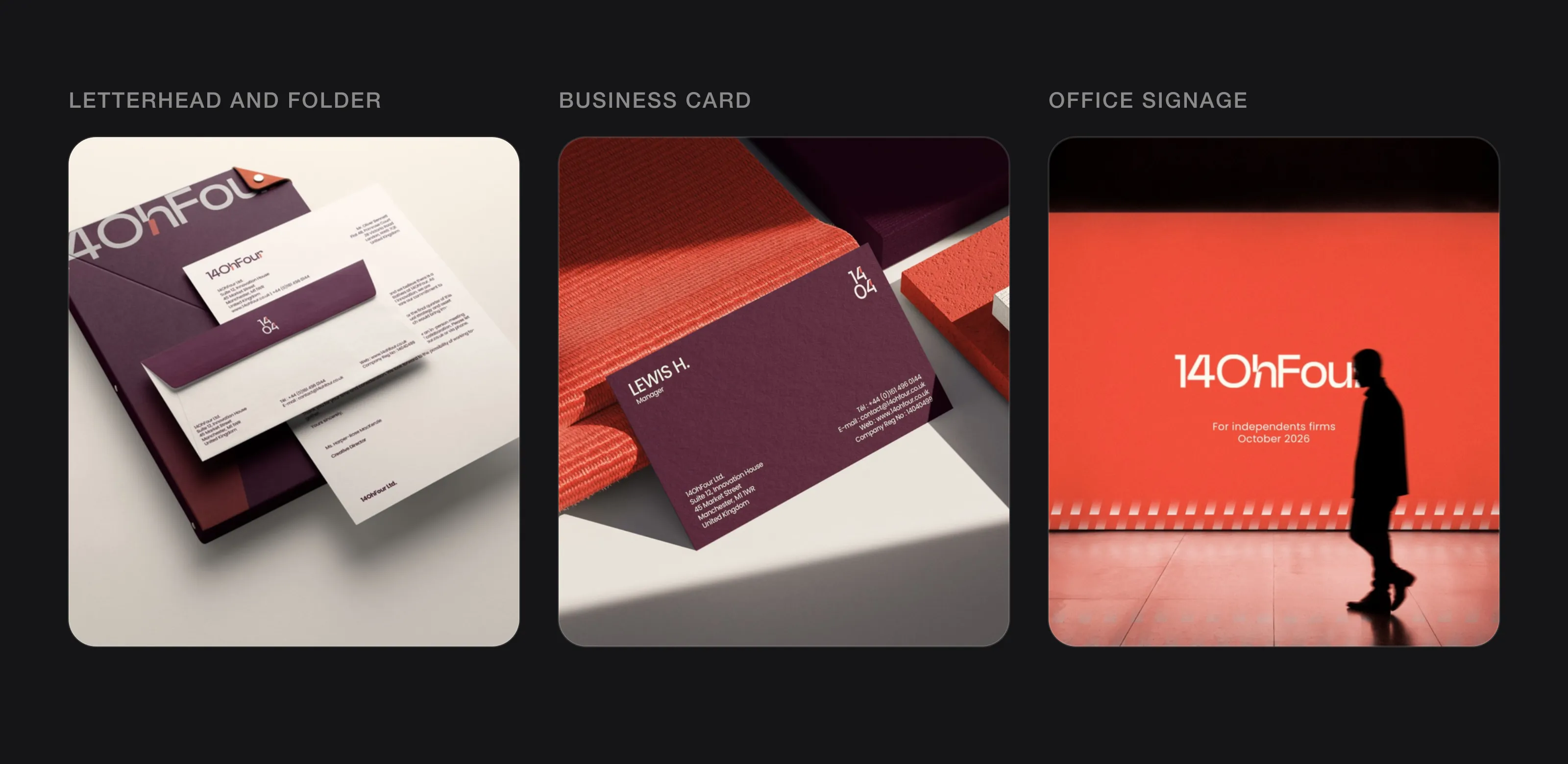 Where a legal brand lives: stationery, business cards and the office (14OhFour, designed by Logomint).
What rules apply to a law firm’s logo and name?
Logos themselves are rarely regulated, but how a firm presents itself is. Two examples:
- England and Wales (SRA). The SRA Transparency Rules require an authorised firm to display “in a prominent place on its website” its SRA number and the SRA’s digital badge. The badge started as voluntary and became mandatory on 25 November 2019. Plan your website header and footer with the badge in mind. The SRA Code of Conduct for Firms also says you must not mislead clients, the court or others, which applies to your name and branding as much as to anything else.
- United States (ABA). In August 2018, the American Bar Association deleted Model Rule 7.5 (Firm Names and Letterheads) and moved its substance into the comments to Rule 7.1, the general rule against false or misleading communications. States adopt their own versions of these rules, so check your state bar’s rules on trade names before you settle on a name or tagline.
Whatever the jurisdiction, avoid anything that could suggest an official status you don’t have: crests that look like a court or state seal, or names that sound like a public body. This guide isn’t legal advice; your regulator’s own guidance is the reference.
Partner names, initials or a trading name?
Partner-name firms (Smith & Partners, Laurent Avocats) borrow the credibility of people. They suit practices where clients are really hiring one or two lawyers. The challenge is length: three surnames and an ampersand don’t fit a LinkedIn square or a favicon.
Shorter names are a strong trend at the top of the market. In 2024, Freshfields Bruckhaus Deringer announced that its legal name would be shortened to “Freshfields”, with a new wordmark rolled out from October. A short name is easier to say, and far easier to fit in small spaces.
Monograms and initials solve the length problem for small spaces. They work when the letters are drawn as one shape (not just typed), when they’re easy to say, and when they sit alongside the full name wherever people meet you for the first time. If the firm is an LLP or a “professional corporation”, keep that descriptor out of the logo and set it in the legal line of your letterhead instead.
What colours work for a law firm logo?
Navy, black, deep burgundy and dark green dominate for good reasons: they look composed, print well in one colour and feel serious. They’re also why so many firms look alike. When Landor designed A&O Shearman’s identity, the agency described rivals competing for “boring blues and repetitive reds”, and gave the merged firm a vibrant green instead.
Three questions help:
- Does it survive a black-and-white printer? Engagement letters and court bundles will test it.
- Can one accent carry the brand? A dark base plus one recognisable accent on your website and documents often does more than the logo alone.
- Who are you for? A family practice can use warmer colours than a disputes boutique.
Our guide on how to choose logo colours goes through it step by step.
Which fonts suit a law firm?
For a profession that sells words, typography is most of the brand.
- Sturdy serifs signal heritage and precision. Choose ones with solid strokes; very fine, high-contrast serifs break down in email signatures and photocopies.
- Clean sans serifs feel modern and approachable, and suit legal tech, employment and private-client practices that want to look accessible.
- A pair often works best: one for the logo and headings, the other for body text, used the same way on every document.
Avoid scripts and “legal” blackletter. They look like certificates, not firms you’d call.
What should a law firm logo avoid?
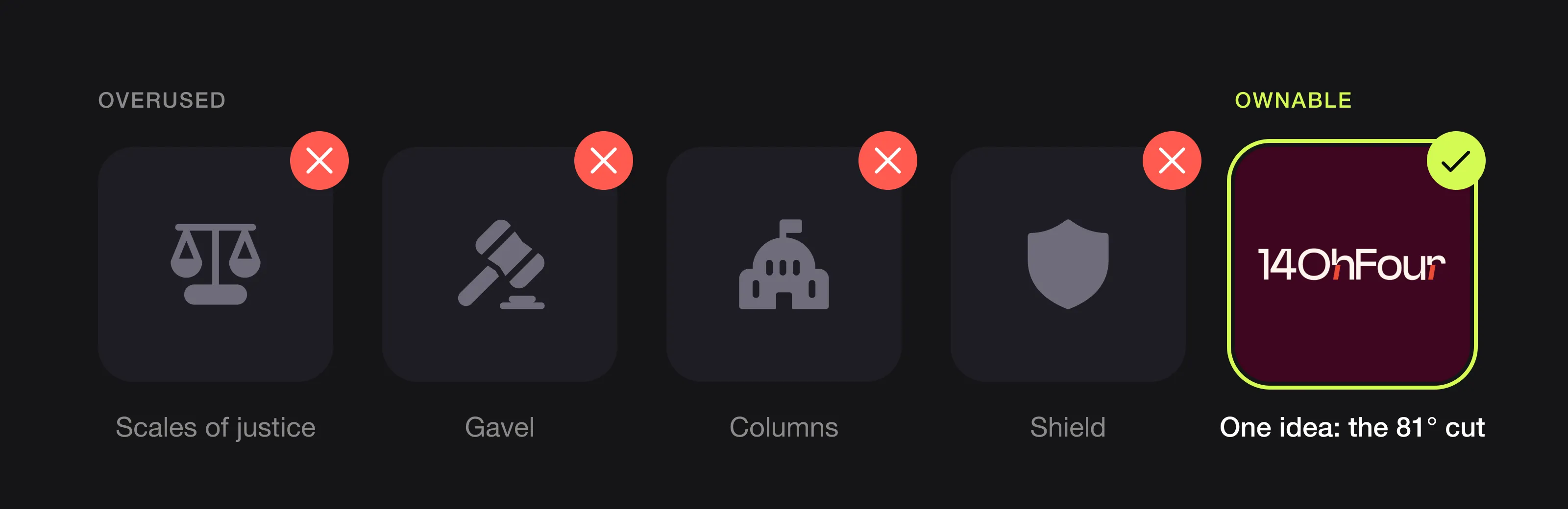 The usual symbols, and one ownable idea instead (14OhFour, designed by Logomint).
- Scales of justice and Lady Justice. The most used legal symbol there is. It tells people you’re a lawyer, which your name already does.
- Gavels. A gavel says “court” to clients who may never go there, and it’s in every legal clip-art library.
- Columns and courthouse façades. Meant to look solid; they read as generic and fall apart at small sizes.
- Shields, crests and laurels. They look like templates, and can suggest an official status you don’t have.
- Quills and open books. Clichés for “law” that clients have seen hundreds of times.
If a client could swap your logo with the firm next door’s without noticing, it isn’t helping you. More patterns to avoid in our logo red flags.
How can a small firm look established?
- Keep it simple. Large firms tend to have restrained wordmarks. Gradients and multiple symbols read as small.
- Design a system, not a single logo: a full lockup, a short version and a monogram, each used the same way every time.
- Template your documents. A letterhead, an engagement-letter template, a slide master and a matching email signature do more for perceived size than any symbol.
- Use descriptors, not sub-logos, for practice areas. “Employment”, “Real estate” and “Private client” set in your brand typeface under one logo look bigger than five separate marks.
For more on doing this on a budget, see startup branding on a budget.
What can you learn from recent law firm rebrands?
A&O Shearman (2024). When Allen & Overy and Shearman & Sterling merged, the combined firm’s logo kept elements of both, A&O’s font and Shearman’s dark palette, but in green, Legal Cheek reported. Landor & Fitch created the identity, including a custom typeface, and the firm launched under the new brand on 1 May 2024. The lesson: a merger is a chance to step away from the colours everyone else uses.
Freshfields (2024). The firm shortened its name and introduced a new wordmark. When clients already use a short name, a brand can follow them.
Gide (2025). The French firm revealed a new visual identity and website created by the agency Lonsdale, describing the new logo as “more memorable”. Even long-established firms refresh their identity to stay recognisable.
A legal brand we designed: 14OhFour
14OhFour is an independent AI consultancy for mid-sized UK law firms: a legal brand that has to win the trust of lawyers. Its identity avoids every legal cliché. The logo is a pure wordmark in a clean geometric sans serif, with one signature detail: a diagonal cut at exactly 81° on the “h” and the “r”. Spoken aloud, “Oh” is zero and “Four” is four, so the name becomes 14 and 04, and a compact stacked “14/04” mark covers favicons and social avatars.
That single cut runs through the whole system: the caret in the logo animation, slanted windows on posters, stripes on the illuminated office wall. The palette moves away from the expected legal blues: burgundy for seriousness, coral for energy, on a warm white. The identity covers stationery, business cards, a brand guidelines book, posters, staff ID badges, a social media kit and signage. See the 14OhFour case study.
If your firm is closer to a consultancy, our guide to logo design for consulting firms covers the overlap.
Law firm logo checklist
- One clear idea, with no scales, gavels, columns or crests
- Type that holds up on a scanned engagement letter
- A short version (monogram or initials) for LinkedIn, favicons and email signatures
- A one-colour version for letterheads and court documents
- Space planned in your website header or footer for your regulator’s badge, if required
- A colour palette that’s yours, not the default navy
- Practice areas as descriptors under one logo
- Vector source files for print, signage and document templates
- A design restrained enough to last ten years (see what makes a logo timeless)
FAQ
What makes a good law firm logo?
A good law firm logo is simple, uses strong typography and avoids clichés like scales of justice and gavels. It works in one colour on a letterhead, has a short version for small spaces, and has one detail that makes it recognisable.
Should a law firm logo use the partners’ names?
It can, if clients hire you for specific lawyers. Long partnership names need a short version, such as initials or a monogram, for LinkedIn, favicons and email signatures. Many firms shorten their name over time, as Freshfields did in 2024.
Are there rules about law firm logos?
Logos are rarely regulated directly, but how a firm presents itself is. In England and Wales, firms must display the SRA’s digital badge on their website and must not mislead clients. In the US, firm names fall under each state’s version of ABA Model Rule 7.1. Check your regulator’s guidance.
What colour should a law firm logo be?
Navy, black, burgundy and dark green are common because they feel serious and print well. To stand out, pick a distinctive accent colour, and make sure the logo still works in black and white.
How much does a law firm logo cost?
From around €130 for a custom logo from a design service to several thousand euros with an agency. A starter brand with guidelines and stationery costs about €300 to €1,500 from a design service; see how much a brand identity costs.
Sources
Checked on 28 October 2026.
- SRA, Transparency Rules (rule 4.1) and SRA digital badge
- SRA, Code of Conduct for Firms (paragraph 1.4)
- American Inns of Court, ethics column on the 2018 ABA advertising rule amendments (Rule 7.5 deleted, substance moved to Rule 7.1)
- Legal Futures, Survey: shopping around works for legal consumers (Legal Services Consumer Panel tracker, 2013)
- Law Gazette, Consumers love online reviews when picking a lawyer (Legal Services Board research, 2021)
- LinkedIn Help, Image specifications for LinkedIn Pages
- Legal Cheek, A&O and Shearman reveal new combined logo (2023) and A&O Shearman goes LinkedIn official (2024)
- Landor, A&O Shearman; Transform, Landor & Fitch behind new A&O Shearman brand identity
- Freshfields, Freshfields reveals refreshed brand (September 2024)
- Gide, Gide reveals a new visual identity and website (January 2025)
The bottom line
Clients choose lawyers on trust, and your logo is one of the first places they look for it. Keep it restrained, invest in type, design a short version for small spaces, plan for your regulator’s requirements and skip the scales and gavels. A small firm with a clear, consistent identity can look every bit as established as a large one.
At Logomint, a senior designer creates your custom logo from €129, with first concepts in 48 hours, all source files and a 100% money-back guarantee. See the plans.