Short answer There are seven common types of logos: wordmarks, lettermarks, pictorial marks, abstract marks, mascots, combination marks and emblems. They differ in what does the work: the full name, the initials, a symbol, a character, or a badge that holds everything together. For most new businesses, a combination mark or a well-drawn wordmark is the safest start, because people have to learn your name before a symbol can stand on its own.
Design platforms such as 99designs, Adobe, Squarespace and Wix describe roughly the same categories (Wix splits them further, into ten). Below is each type with its pros, cons, pitfalls and examples, including logos we designed where one genuinely fits.
What are the 7 types of logos?
The seven logo types fall into three groups:
- Text only: wordmark (the full name) and lettermark (initials).
- Symbol only: pictorial mark (a recognisable image), abstract mark (a non-literal shape) and mascot (a character).
- Text and symbol together: combination mark (side by side or stacked) and emblem (text inside a shape).
Most brands use a logo system (a main logo plus an icon or monogram), so a logo’s type usually refers to its main version.
What is a wordmark logo?
A wordmark (or logotype) is the company name set in a distinctive typeface, with no separate symbol. Spacing, weight and small custom details carry the whole design.
- When it works: the name is short and distinctive, and you want people to learn it from day one.
- Pros: it says your name every time; it is simple to apply consistently on screen and in print.
- Cons: it carries little meaning beyond the name; long names get small in narrow spaces; there is no natural square icon for an app or a social avatar.
- Pitfalls: typing the name in a stock font and calling it done, or chasing trendy letterforms (see what makes a logo timeless).
Examples: Google and Coca-Cola.
From our work: TalentIQ is a wordmark with no separate symbol: lowercase “talent” followed by a capital “IQ” in a clean sans serif, navy on light blue, and orange on the business card. The board also uses the letters “ta”, drawn on a construction grid, as a graphic. Veluvia is a lowercase sans-serif wordmark in cream on deep green, with an angled bar on the “e” as its quiet detail. On the serum bottles it runs vertically up the label: a wordmark can fit a narrow format when turned on its side.
What is a lettermark (monogram) logo?
A lettermark, also called a monogram, uses the company’s initials instead of the full name.
- When it works: the name is long or made of several words, or the logo has to live in small spaces. Squarespace notes that a lettermark can work as a favicon where a full wordmark wouldn’t.
- Pros: compact, easy to scale down, easy to apply on small items such as cards, pens and avatars.
- Cons: initials mean nothing to strangers at first, and many three-letter combinations look alike, so standing out takes careful drawing.
- Pitfalls: launching with the initials alone, before anyone knows what they stand for. 99designs suggests adding the full name to a new lettermark to build recognition. The other mistake is setting the letters with normal spacing, so they read as three separate letters rather than one shape.
Examples: IBM and HBO.
From our work: PGS is a heavy “PGS” in a grotesque sans serif, set so close the letters read as one block. In the primary lockup it sits beside the full company name, stacked on three lines and separated by a thin vertical rule. On its own, the monogram sits inside a circle in six colourways for avatars and small uses. We cover monograms for long company names in our guide to consulting firm logos, and the project itself in the PGS case study.
What is a pictorial mark?
A pictorial mark (or brand mark) is a recognisable image that stands for the brand, used without text.
- When it works: the name is hard to pronounce or translate, the brand sells across languages, or the core offer is stable enough that one image can represent it for years.
- Pros: works without words and gives you a ready-made app icon.
- Cons: as Adobe puts it, “it usually takes significant brand-building before a symbol can stand on its own.” A literal image can also box you in if the business changes.
- Pitfalls: the obvious image that every competitor already uses (a lightbulb for ideas, a globe for “global”, a roofline for property), and too much detail to survive at small sizes.
Examples: Apple’s apple and Target’s bullseye.
From our work: we have no symbol-only logo to show, so our pictorial example is a symbol inside a combination mark. Trio’s symbol is a house built from three simple shapes, a red-orange triangle for the roof, a circle and a square, so the image explains the name. The brand’s own social post spells it out: “Three shapes. One home.” It sits beside a heavy, rounded wordmark.
What is an abstract mark?
An abstract mark is a symbol built from geometric or non-literal shapes rather than a recognisable object. Its meaning comes from colour, form and repetition over time.
- When it works: no single object describes the business, or the company wants room to grow into new products without its logo pointing at one of them.
- Pros: distinctive and ownable; doesn’t date when the product line changes.
- Cons: people have to learn what it means. Squarespace says abstract logos need a strong brand identity first, and Wix warns they can feel vague unless paired with strong messaging.
- Pitfalls: generic swooshes, interlocking circles and random shapes with no idea behind them.
Examples: the Nike swoosh and the Pepsi globe.
From our work: aeris is a weather app (“Weather that keeps up with you”, as one of its billboards puts it). Its symbol is two rounded, petal-like quarter shapes meeting at a corner, one in a blue gradient and one in orange. There is no drawn sun or cloud, yet the colours hint at sky and sun. It appears alone on a dark rounded square, like an app icon, and beside a heavy lowercase wordmark on posters. Hexon’s symbol, described below, is abstract too.
What is a mascot logo?
A mascot logo is an illustrated character that represents the brand.
- When it works: family and consumer brands, food, sports teams, and brands whose marketing leans on social content where a character can appear in different poses.
- Pros: personality; a character can star in ads, packaging and posts.
- Cons: Wix notes that “highly detailed mascots don’t translate well on small materials.” 99designs adds that mascots aren’t suited to every industry and that illustration quality is critical.
- Pitfalls: a character that looks like clip art, no simplified version for favicons and business cards, and a drawing style that dates quickly.
Examples: KFC’s Colonel Sanders and the Michelin Man.
From our work: none of the logos shown in this article is a mascot. The nearest is Tandem, whose symbol reads as a smiling face, but it is a geometric mark, not a character.
What is a combination mark?
A combination mark pairs a symbol (pictorial, abstract or mascot) with the name, side by side, stacked, or integrated into one unit.
- When it works: for most new businesses. Adobe calls it “the most versatile and most recommended option for new brands.”
- Pros: people learn the name and the symbol together; one design gives you a horizontal lockup, a stacked version and an icon on its own.
- Cons: the symbol and the text have to be balanced; it can feel crowded; it needs clear rules for spacing.
- Pitfalls: a symbol and a wordmark that don’t look like they belong together (different weights, different moods), a symbol that falls apart when used alone, and a lockup so wide it shrinks to nothing in a website header.
Examples: Burger King and Doritos.
From our work: many of our logos are combination marks. Hexon pairs a clean sans-serif “Hexon” with a rounded hexagon enclosing a six-armed asterisk, in blue and white. The symbol works alone as an app icon, and its arms reappear as a large graphic on a poster. Lumeo’s symbol is a rounded square, the same shape as an app icon, with lime rays fanning out from one corner on deep green. It appears alone on a hanging shop sign. Tandem puts two tilted squares above a thick, rounded U, and the board shows the symbol alone in a small circle beside an app link.
What is an emblem logo?
An emblem places the name inside a shape: a badge, a seal or a crest. The text and the shape can’t be separated.
- When it works: brands that want heritage and authority, and logos that will live mostly on packaging, labels, uniforms or signage. 99designs names schools, organisations and food and drink brands among the usual users.
- Pros: looks established; strong presence; feels complete on a label or a cup.
- Cons: Adobe notes emblems are “often less flexible at small sizes.” Fine detail and small text inside the shape disappear in print and embroidery.
- Pitfalls: tiny text running around a ring, too many elements packed in, and no simplified version for social avatars.
Examples: Starbucks and Harley-Davidson.
From our work: none of the logos shown here is an emblem. Hexon’s hexagon encloses a symbol but not the name, so it stays a combination mark.
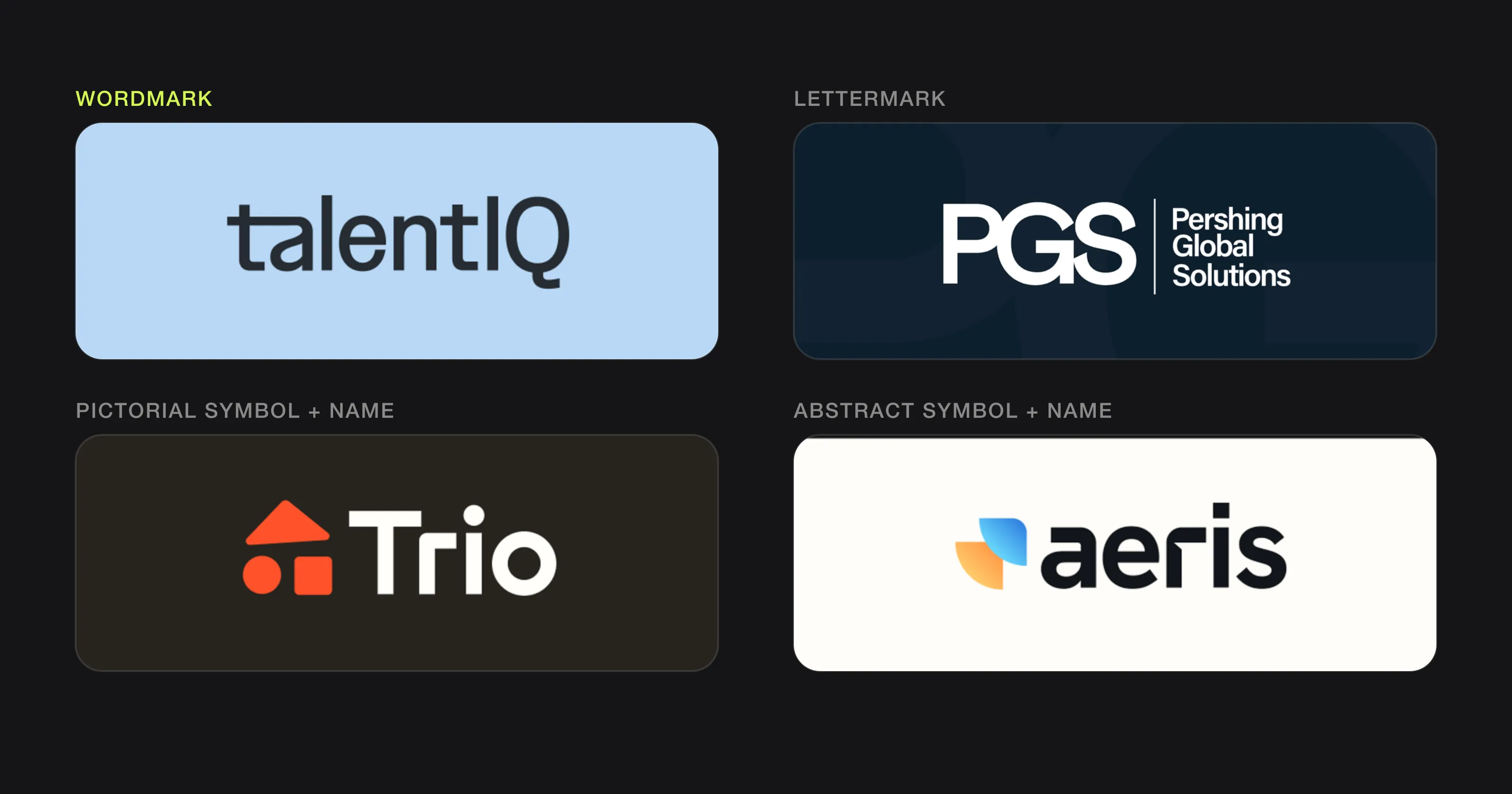 Four of the seven types in our own work (TalentIQ, PGS, Trio and aeris).
Which type of logo should you choose?
Start from four practical questions, not taste.
How long is your name? A short, distinctive name suits a wordmark. A long or multi-word name suits a lettermark paired with the full name, or a combination mark with a compact symbol. A name that is hard to pronounce or translate gains from a symbol.
How much can you spend on making it known? Symbol-only logos, especially abstract ones, only work once people have seen them next to your name many times. If your budget for brand awareness is small, let the name do the work with a wordmark or a combination mark.
Where will the logo appear most? List the five places your logo will be seen most often. If an app icon or a social avatar is on the list, you need a square symbol or a monogram. If packaging and signage dominate, a wordmark or an emblem can shine. Embroidery and merchandise call for simple shapes with no fine lines. Our guide to logos for tech startups goes deeper into the symbol versus wordmark question for apps.
Will it scale? Look at the logo at 16 pixels and imagine it across a building. Thin lines vanish, small text blurs, and detailed mascots and emblems need simplified versions. Make sure you receive vector files so it prints sharply at any size (see which logo file formats you need).
Then choose your main type and plan its variations (horizontal, stacked, icon or monogram) together from the start.
The 7 logo types at a glance
| Type | What it is | Best for | Watch out for | Examples |
|---|---|---|---|---|
| Wordmark | The name in distinctive type | Short, distinctive names | Long names, generic fonts | Google, Coca-Cola |
| Lettermark | Initials | Long or multi-word names | Initials mean nothing at first | IBM, HBO |
| Pictorial mark | A recognisable image | International brands, app icons | Clichés, needs brand-building | Apple, Target |
| Abstract mark | A non-literal shape | Brands that will grow or change | Meaning has to be learned | Nike, Pepsi |
| Mascot | An illustrated character | Family, food, sports brands | Detail at small sizes, wrong for serious sectors | KFC, Michelin |
| Combination mark | Symbol plus name | Most new businesses | Balance, crowded lockups | Burger King, Doritos |
| Emblem | Name inside a badge or crest | Heritage brands, packaging | Small text, low flexibility | Starbucks, Harley-Davidson |
FAQ
Which type of logo is best for a small business?
For most small businesses, a combination mark or a wordmark. Both put your name in front of people while they are still learning it, and a combination mark also gives you a symbol for avatars and app icons.
What is the difference between a wordmark and a lettermark?
A wordmark spells out the full name, like Google. A lettermark uses only the initials, like IBM, and suits names too long to read comfortably at small sizes.
What is the difference between an emblem and a combination mark?
In an emblem, the name sits inside the shape, so the two can’t be separated. In a combination mark, the symbol and the name sit side by side or stacked, and each can be used on its own.
Can I change my logo type later?
Yes. A common path is to start with a combination mark and use the symbol alone more often as people come to recognise it. Planning an icon version from the start makes that change easy.
Sources
Checked on 15 October 2026.
- 99designs by Vista, The 7 types of logos (and how to use them)
- Adobe Express, How to design a logo: step-by-step guide
- Squarespace, Types of logos by Sam Crawford
- Wix, 10 types of logos and how to use them effectively by Kylie Goldstein
The bottom line
The seven types of logos are tools, not styles. Pick the one that fits your name, your budget for recognition and the places your logo has to work. If you’re about to brief a designer, our guide on how to get a logo designed walks through the process step by step.
At Logomint, a senior designer from our team creates your custom logo from €129, with first concepts in 48 hours, all source files and a money-back guarantee. See the plans.