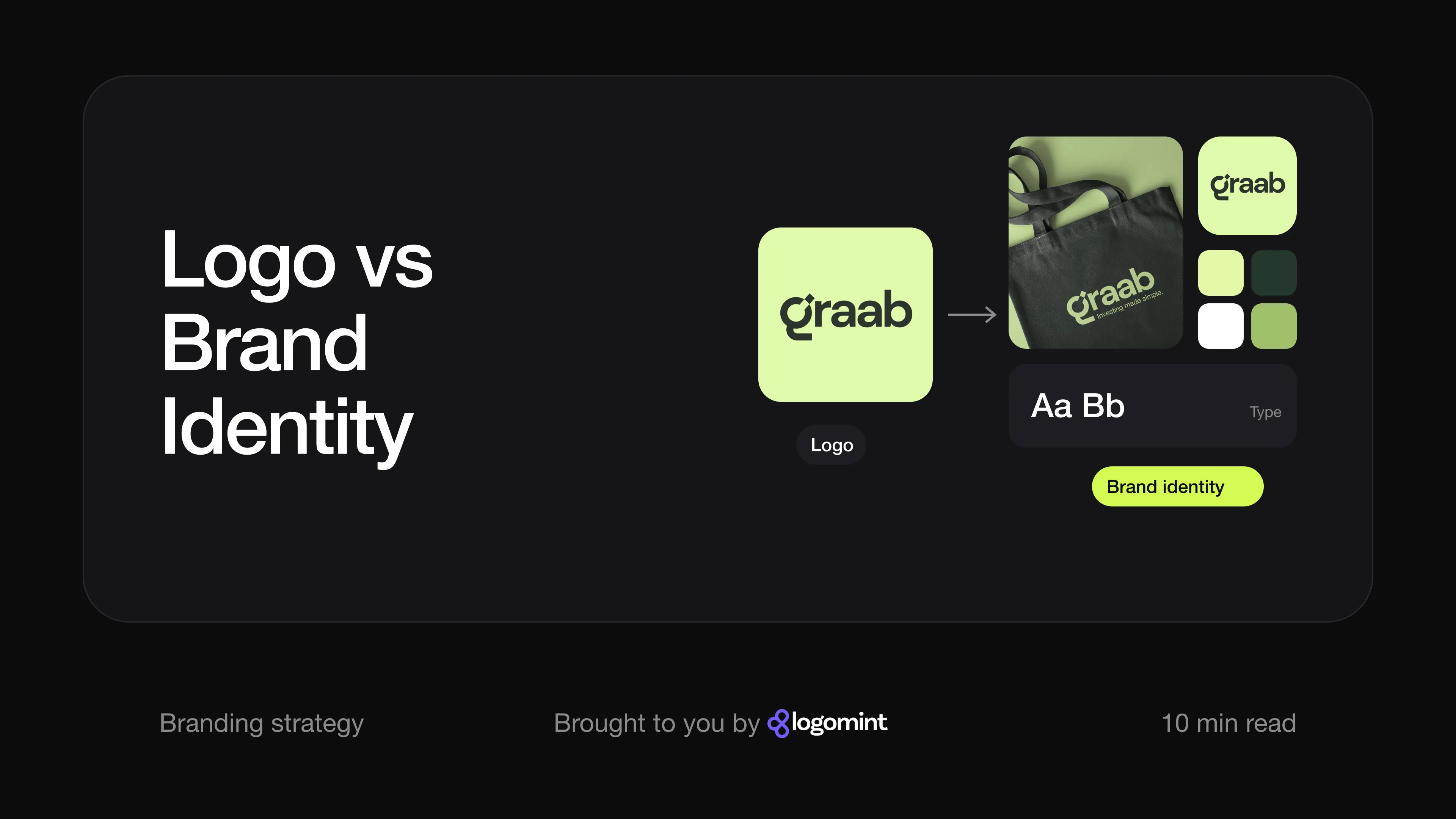
Short answer A logo is the mark that identifies your business. A brand identity is the full visual and verbal system around it: logo versions, colours, typography, imagery, tone of voice and the guidelines that tie them together. Your brand is what people actually think and feel about you, which you influence but don’t control. Most new businesses only need a strong logo and a few simple rules; you need the full identity once more people, channels and materials start using it.
What’s the difference between a logo, brand identity and a brand?
People use the three words interchangeably, and end up buying the wrong thing: a €5,000 “brand” when they needed a logo, or one logo file when they needed a system. Think of a person:
- The logo is your face. It’s how people recognise you at a glance.
- The brand identity is how you dress, write and speak. It makes you recognisable even when your face isn’t in the picture.
- The brand is your reputation. It’s what people say about you when you’re not in the room.
You design the first two. You earn the third.
What is a logo?
A logo is a graphic mark that identifies your business: a wordmark (your name set in a distinctive way), a symbol, or both together. A good logo is simple, works at tiny sizes and in one colour, and is supplied in vector format so it stays sharp from a favicon to a shop sign. (If you’re not sure which files you should have, see what logo file formats you need.)
A logo does one job: recognition. It can’t tell anyone how you sound or what your social posts should look like.
What is brand identity?
Brand identity, sometimes called visual identity, is the set of tools that makes everything you publish look and sound like the same business. It usually covers:
- A logo system: the main logo plus secondary versions, such as a stacked layout, a symbol on its own for app icons and avatars, and one-colour versions.
- Colours: a defined palette with exact codes for screen and print.
- Typography: the fonts for headlines and body text, and how to use them.
- Imagery: the style of photography, illustration, icons or graphic shapes.
- Tone of voice: how you write, from headlines to error messages.
- Guidelines: a document that records all of the above so other people can apply it correctly.
Brand identity design is the work of creating that system so it holds together across a website, packaging, social media, signage and documents.
What is a brand?
Your brand is the perception people have of your business. Branding author Marty Neumeier makes this point in The Brand Gap: a brand isn’t a logo, a corporate identity or a product, but a gut feeling, and a highly personal one.
That feeling comes from everything: the product, the price, how fast you reply, what a friend said about you. A strong identity helps people recognise and remember you, but no logo saves a business that keeps disappointing customers.
Logo vs brand identity vs brand at a glance
| Logo | Brand identity | Brand | |
|---|---|---|---|
| What it is | A mark that identifies you | The visual and verbal system around the logo | What people think and feel about you |
| Made of | Wordmark, symbol or both | Logo system, colours, fonts, imagery, voice, guidelines | Experiences, reputation, word of mouth |
| Who creates it | A designer | A designer or team, with your input | Your customers, shaped by everything you do |
| Can you buy it? | Yes | Yes | No, you build it over time |
| Its job | Recognition | Consistency | Trust and preference |
| Typical stage | Day one | Once several people or channels use it | Always, whether you manage it or not |
What’s included in a brand identity package?
Packages vary, so compare contents rather than labels. A complete small business identity usually includes:
- Primary logo plus secondary versions (horizontal, stacked, symbol only)
- Colour versions: full colour, one colour, white on dark and black on light
- Colour palette with HEX, RGB and CMYK codes
- Typography: chosen typefaces, with sizes and weights for headings and text
- Graphic elements and imagery direction: patterns, shapes and a photography or illustration style
- Brand guidelines document
- Stationery: business cards, letterhead, email signature
- Social media kit: profile images and post templates
- Mockups showing the identity in context
- Full file set: vector, print-ready and source files
Agencies often add strategy (positioning, naming, messaging), which is where prices reach the thousands.
What do brand guidelines contain?
Brand guidelines let someone who has never met your designer use your identity correctly. Even a short guide should cover:
- Logo usage: which version to use where, minimum size, clear space around the logo, and what not to do (stretch, recolour, rotate, add effects)
- Colour: the palette, exact codes, and which colours go on which backgrounds
- Typography: fonts, weights and a simple hierarchy for headings and text
- Imagery and voice: examples of photos that fit, and a few writing principles
- Applications: examples on real materials, such as a social post or business card
A ten-page guide people read beats a hundred-page book nobody opens.
When is a logo alone enough?
A logo, plus a couple of colours and a font you write down yourself, is enough when:
- You’re just launching. Your positioning may still change.
- You have few touchpoints. A website, an Instagram profile and an invoice template don’t need a rulebook.
- You’re the only person creating materials. The rules can live in your head for now.
- Your budget is tight. Spend it on a custom logo and keep the rest simple. Our guide to startup branding on a budget shows how to build the minimum kit with free tools.
What matters is that the logo is custom, in vector format and flexible enough to grow into a system.
When do you need a full brand identity?
Move to a full identity when one or more of these is true:
- Your touchpoints multiply. Packaging, signage, an app, ads, merchandise and events all need decisions a logo doesn’t make.
- Other people make things for you. Employees, freelancers, printers and agencies need rules, or each one will improvise.
- You see inconsistency. Three slightly different greens, a stretched logo on a banner, posts that look like five different companies.
- You’re raising money, entering retail or pitching bigger clients. A coherent identity makes a young company look organised.
- You’re rebranding. A new logo without a system around it tends to drift within months.
How do well-known brands use their identity systems?
Large companies publish their rules because so many people apply them. The principles scale down to a five-person business.
Slack: a logo that wasn’t a system. When Slack introduced its new logo in January 2019, it explained that the original had eleven colours, looked wrong on anything other than white, and had to sit at an exact 18-degree angle. Workaround versions meant its app icons looked different from each other and from the logo, and Slack said people didn’t reliably recognise it (Slack). The redesign, created with Pentagram, rebuilt the mark on a grid, cut the palette to four main colours with the original aubergine kept as an accent, and turned the logo’s shapes into the basis for icons and illustrations (Pentagram). The lesson: a logo that’s hard to apply consistently weakens recognition.
Spotify: clear, public rules. Spotify’s design guidelines say the green logo should only appear on black or white, with a black or white version everywhere else. They set a clear space equal to half the height of the icon, minimum sizes for screen and print, and a list of things not to do, such as rotating or stretching the logo (Spotify for Developers). Good guidelines are that specific.
Mailchimp: identity includes how you write. Mailchimp’s style guide describes its voice as plainspoken and genuine, with dry humour, and separates voice, which stays the same, from tone, which changes with the reader’s situation. It also says being clear matters more than being entertaining (Mailchimp Content Style Guide). Voice is part of the identity, not an extra.
What does a full brand identity look like in practice?
Three identities our team designed, and what turns each from a logo into a system:
Graab, an investment app. The logo is a lowercase wordmark in a heavy, rounded sans serif, with a small tilted square sitting in the open top of the “g”. From there the system grows. The “g” alone becomes the app icon on a dark green tile. The palette is a near-black green and a soft lime, with a mid green reserved for charts and the small upward triangles that mark growth in the app’s interface. Social posts follow a repeatable layout (logo top left, web address top right, big headline in a plain grotesque sans), and the voice stays short and reassuring: “Investing doesn’t have to be hard. With graab, it finally isn’t.” The same elements carry onto payment cards, business cards, packaging and an event screen. See the Graab case study.
post.r, a tennis brand. The wordmark sets “post” in a heavy lowercase sans, followed by a full stop and a calligraphic italic “r”. That one letter is the key to the whole identity: on its own it’s the Instagram avatar, and enlarged in bright green it sweeps across billboards beside tennis courts, street banners and campaign photos. Headlines repeat the logo’s contrast by pairing a bold sans with an italic serif, as in “For those who don’t miss.” The palette stays tight (deep forest green, bright green and a pale cream), so a gym bag, a water bottle, a website and a poster on a fence all read as one brand. See the post.r case study.
Cultiva, a cocoa cooperative. The logo pairs a tall, condensed, bold wordmark, whose “i” has no dot, with a cluster of rounded oval leaves in acid lime. The identity extends it in several directions: the leaf symbol sits in a dark circle as the social avatar, its outline becomes a faint pattern behind posters and the letterhead, and rounded pill-shaped tags (“Agriculture durable”, “Cacao”, “Bio”) label photos and posts. Photography focuses on hands, cocoa beans and seedlings, and the symbol also appears painted on a building wall. See the Cultiva case study.
In each case everything else was built from the logo’s shapes, colours and attitude. That’s the difference between a logo and an identity.
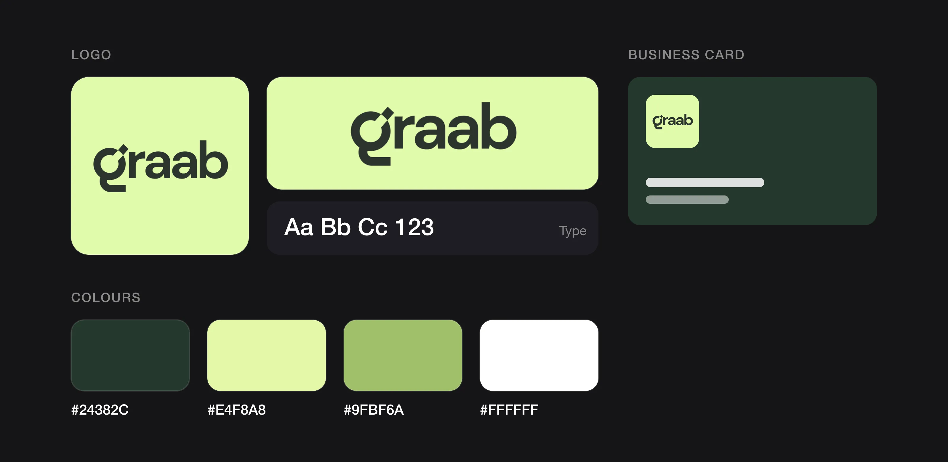 A logo is one piece; the identity is the whole kit (Graab, designed by Logomint).
How do you grow from a logo to a full brand identity?
You don’t have to build everything on day one. A sensible path looks like this:
- Start with a custom logo, including a symbol version and one-colour versions for icons and avatars. A clear logo design brief helps your designer plan for later use.
- Write down your colours and fonts, taken from the logo, with exact codes. Our guide on how to choose logo colours explains how to build a palette.
- Make templates for social posts, presentations and invoices: the cheapest consistency tool there is.
- Add a short guidelines document when the first freelancer, employee or printer starts working on your materials.
- Extend the system as touchpoints arrive (packaging, signage, an app), reusing what exists rather than inventing.
- Review once a year for drift, and fix the rules, not just the one-off mistake.
FAQ
Is a logo the same as a brand?
No. A logo is a mark that identifies your business. Your brand is the overall perception people have of you, shaped by your product, service and every interaction, with the logo as one small part.
What is brand identity, in simple terms?
It’s the consistent set of visual and verbal elements, such as logo versions, colours, fonts, imagery and tone of voice, that makes everything you publish recognisably yours. Brand guidelines record it so others can use it correctly.
Does a small business need brand guidelines?
Not on day one if you’re the only person making materials. Once a freelancer, employee or printer starts working on your brand, a short guide with logo, colour, font and voice rules saves time and prevents inconsistency.
How much does brand identity design cost?
Agencies charge thousands once strategy is included, while a design service can deliver a logo with guidelines, stationery and a social media kit for a few hundred euros. Compare what’s included, not the package name.
Sources
Checked on 15 October 2026.
- 33voices, The Brand Gap (Marty Neumeier on what a brand is)
- Slack, Say hello, new logo (16 January 2019)
- Pentagram, Slack (case study)
- Spotify for Developers, Design guidelines
- Mailchimp Content Style Guide, Voice and tone
The bottom line
A logo gets you recognised, a brand identity keeps you consistent, and your brand is what people decide about you. Start with a strong, flexible logo and build the full identity when more people and places use it.
At Logomint, a senior designer creates your custom logo from €129, with first concepts in 48 hours, vector, printable and source files, full ownership and a money-back guarantee. Need more than a logo? Premium (€299) adds brand guidelines, stationery design, a 3D mockup and a social media kit. See the plans.