Brand identity · B2B marketing agency
Symphony
How Logomint designed the Symphony identity for a B2B marketing agency: an orbital 8-disc symbol, a custom-cut wordmark, lilac and citrine, print and social.
- Client
- Symphony
- Industry
- B2B marketing agency
- Year
- 2026
About the project
Symphony is a premium B2B digital marketing agency for technology, finance and professional services brands. Most of its future clients don’t lose to better competitors; they lose to fragmentation, with search, paid media and the website run in separate silos by different teams. Symphony does the opposite: one senior team plans, runs and measures them as a single connected system. The identity had to carry the quiet authority of a consultancy and the exact polish of a tech company, with none of the noise of a typical agency.
The symbol is that idea made visible. Eight oval discs orbit a central hub, each caught at a different phase of its turn. The hub is the client’s website, the anchor of the system; the discs are search, paid media, content and data, moving in sync around it. It works on its own, down to a 24-pixel favicon, as an app icon and as an oversized graphic on bags and posters.
The wordmark is drawn from Fustat, with sharp, parallel diagonal cuts at the ends of its stems, ascenders and descenders: a small custom detail that makes the name impossible to set from a standard font. The palette rejects loud startup colours for executive calm: Lilac and Citrine as precise accents on deep Onyx, with a warm Bone instead of stark white. Fustat carries the whole type system, and the voice follows the same rule: direct, composed, and never theatrical. “Many instruments. One synchronized system.”
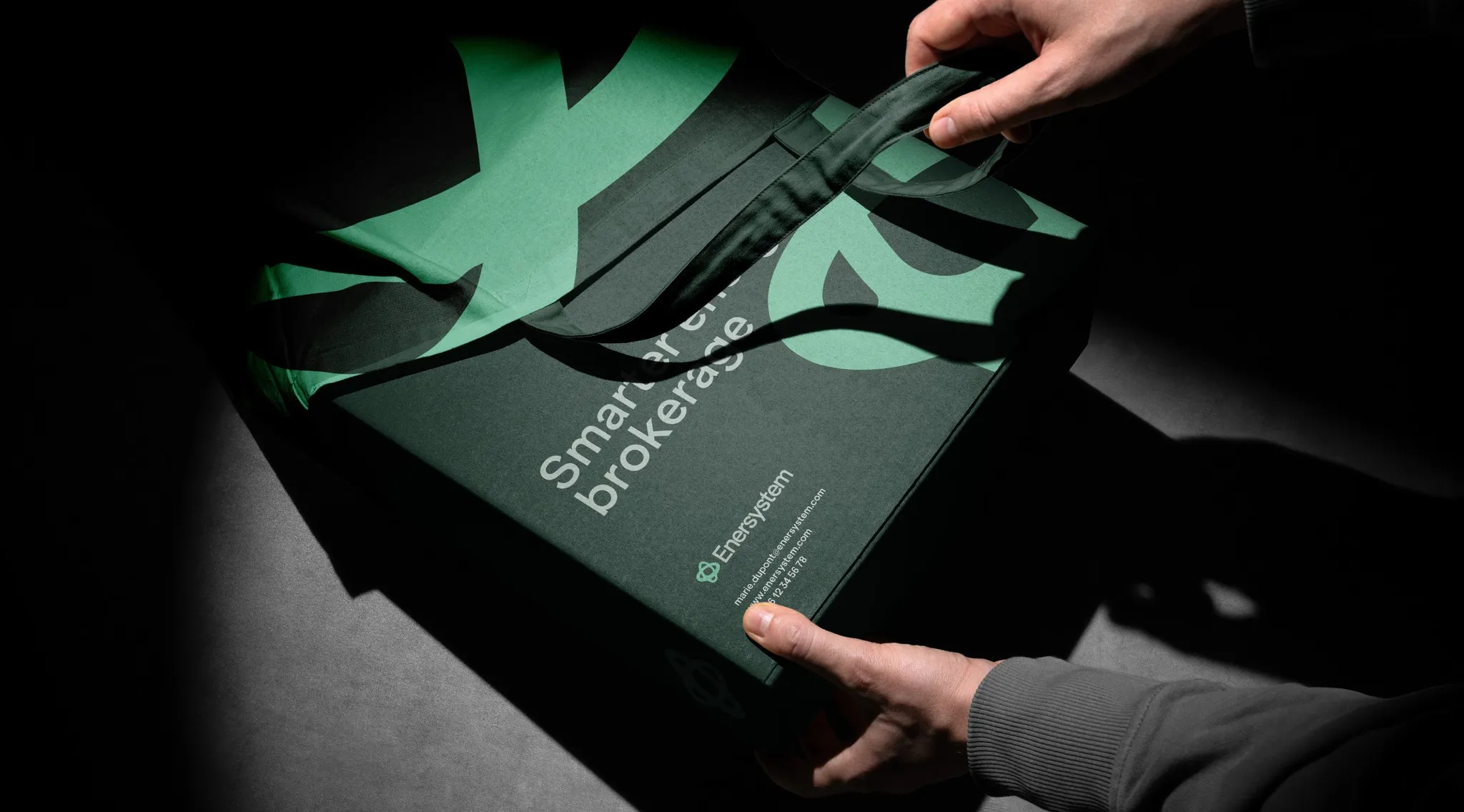
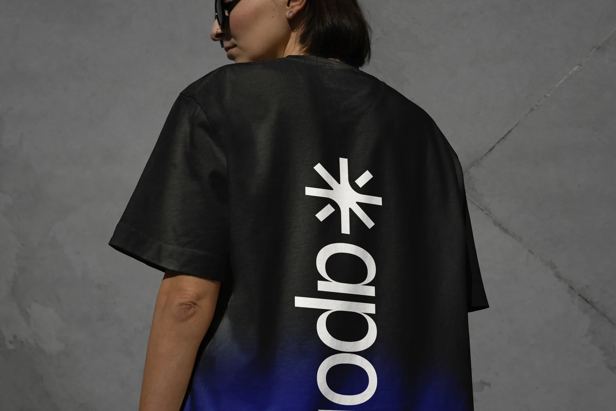
The identity runs across a logo animation, brand guidelines, business cards, a social media kit, posters, an app icon and favicon, and merchandise.